Show Me Your SketchUp
-
-
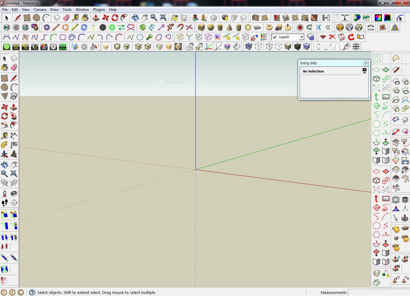
Michael, you have many toolbars I have never seen before.

-
Its interesting to see how many people have the standard large tool set docked in the same place. I am kinda shocked to see the layers pallet closed on most peoples. I have entity info and layers open all the time.
-
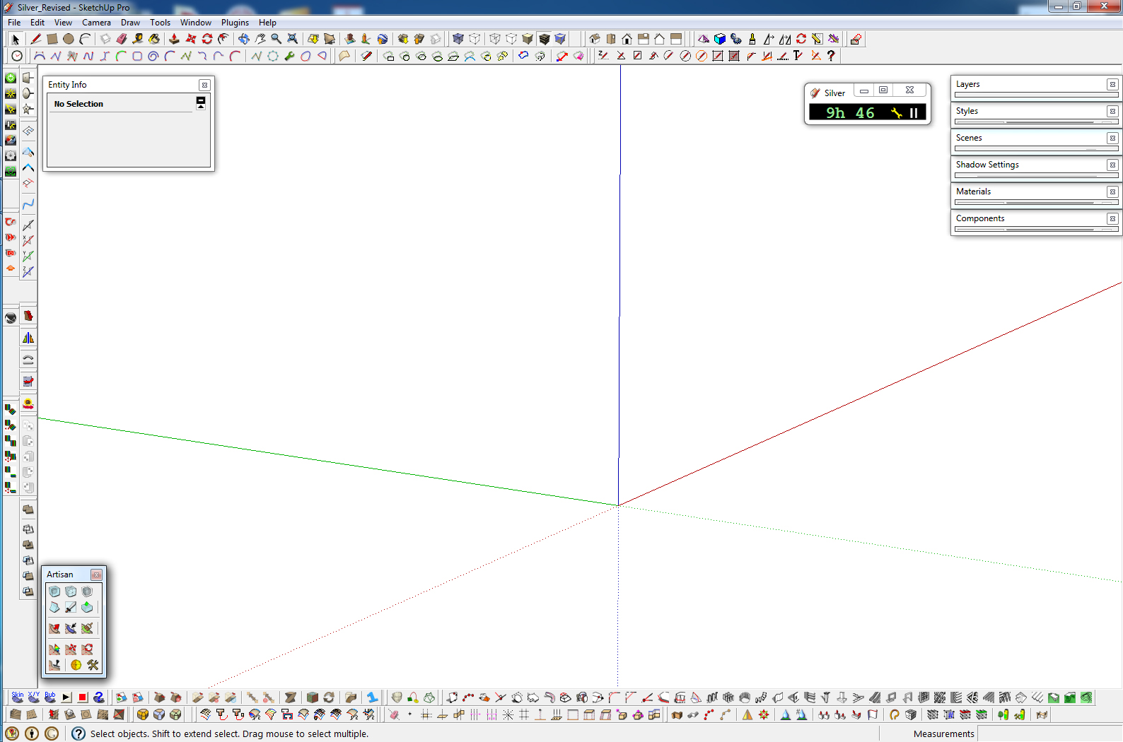
Here's mine. I try to organize toolbars by groupings. Drawing plugins together, mesh manipulation plugins together, render plugins together, etc. Since they tend to get scrambled so often, it's easier to remember the layout.
-
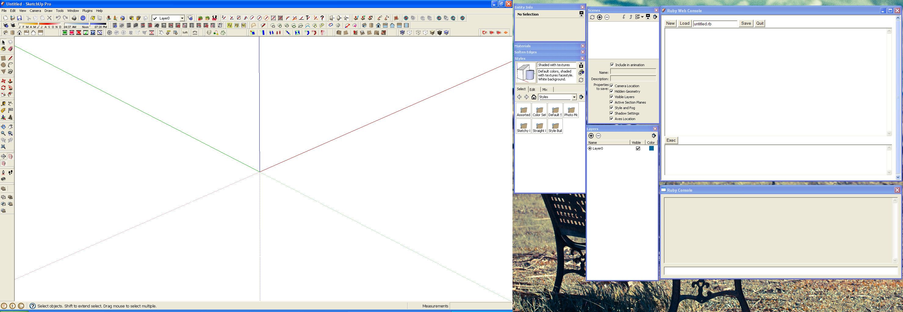
ok, here is mine. I use 2 monitorsat work. I keep all floating windows on my 2nd monitor.
Like Gaieus I also use Sizer to get exact proportions to my SU window because I need to match image exports fairly often. My toolbars change a lot. I turn them on and off all the time. I uninstall plugins very often by moving them out of the plugins folder. Then put them back later when I need them again. I use my SU UI very dynamically, it would be awesome if it was built to be more flexible naturally instead of having to sort of run the show manually.
Thanks for starting this thread John,
Chris
-
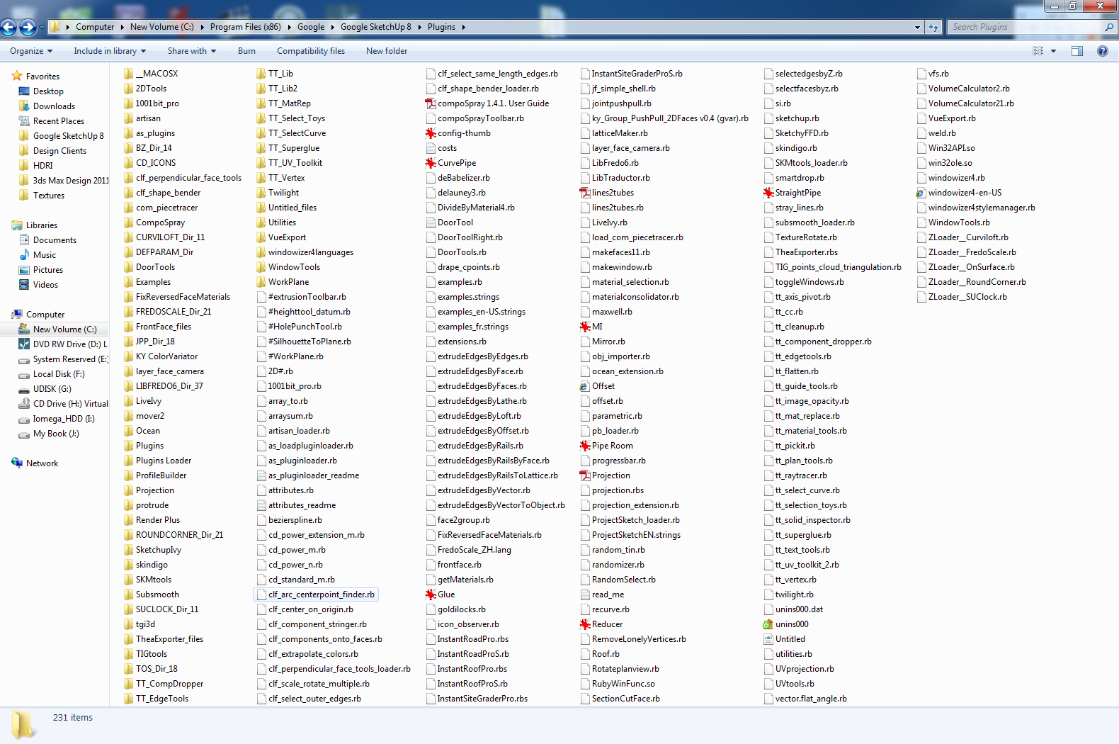
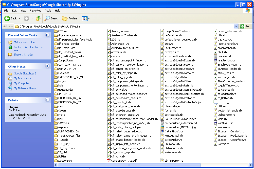
oh yeah, and my current plugins I have installed.
-
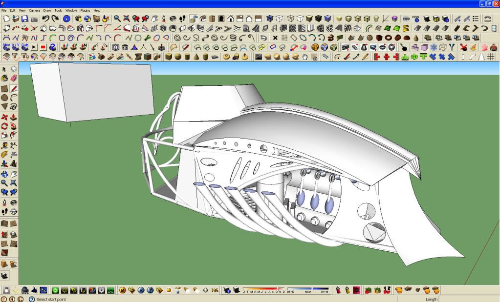
here is mine...
-
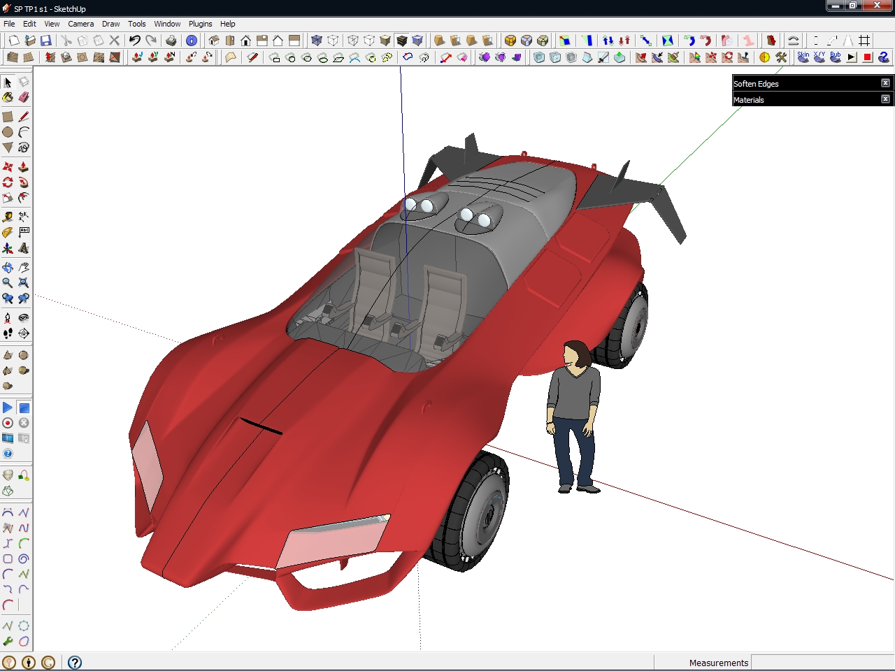
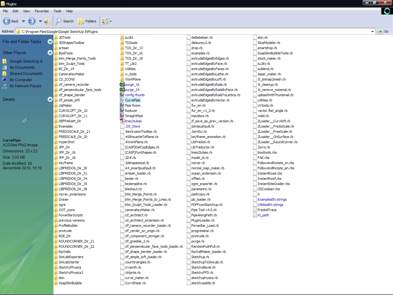
My setup
-
@chris fullmer said:
...My toolbars change a lot. I turn them on and off all the time. I uninstall plugins very often by moving them out of the plugins folder. Then put them back later when I need them again. I use my SU UI very dynamically, it would be awesome if it was built to be more flexible naturally instead of having to sort of run the show manually...
Ditto. I have many disabled toolbars and even disabled plugins which I use less frequently. Despite the very important and useful improvements with toolbar restore and such, I would also love to see some further development here.
-
I love the simplicity of the SU toolset and like to focus on getting the best out it by not having a cluttered workspace. Had that on previous softs. I also run very few plugins...
-
-
............su5
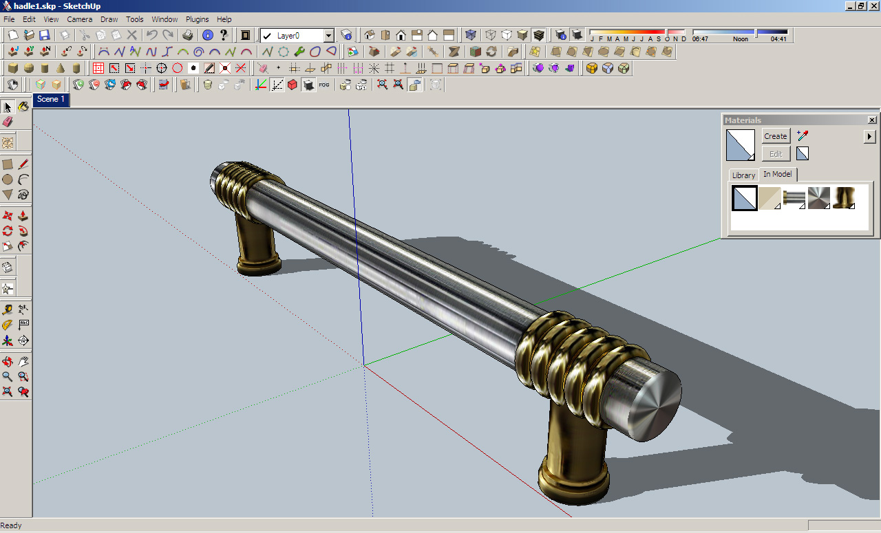
.............su7
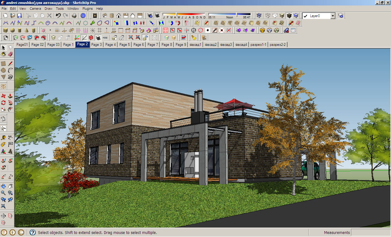
-
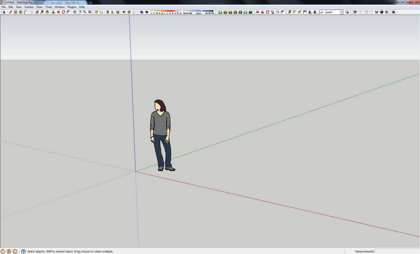
KISS....Keep it simple Silly....I can't stand more than one row of Icons. I rarely have the floating dialog items up unless I need them. And then as soon as I no longer need them they get closed. I'm all about screen real estate and I want the work area to be the biggest possible area.
Screen Resolution 1920x1200
-
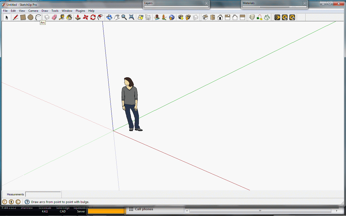
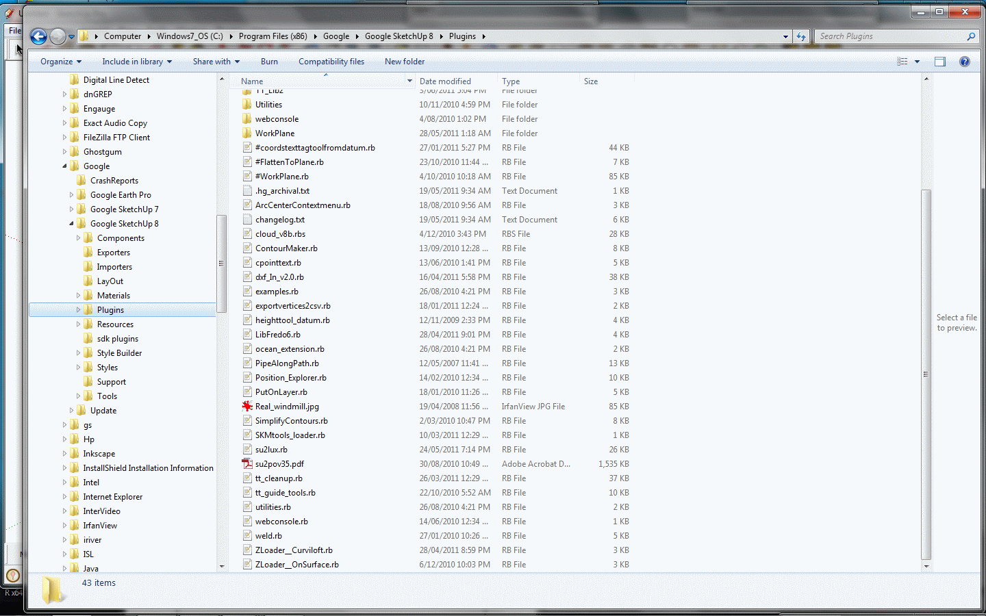
I'm not an intensive user - a lot of terrain work, and measuring. Some point cloud and DXF/DWG import export for survey details, and some rendering. I use specifiic plugins (Put on Layer, Pipe along path, co-ords tag, points cloud) extensively.<p>
Screen shot and Plugins folder below.
-
Hi,
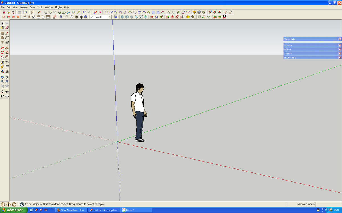
I know it must be redundant but is there a solution to save the settings of the menu bar?

-
@leminilab said:
Hi,
I know it must be redundant but is there a solution to save the settings of the menu bar?

Do you mean the toolbar positions? Yes, there is in version 8.
-
Here is mine.
-
I have dual screen setup at work.
- I put all the toolbars as crammed up as possible - trying to maintain their positions so I remember where everything is.
- the different windows I let float around on the second screen, because when they stick together, things get lost outside of the screen.
- I've got just about every key on the keyboard mapped to a function or plugin... If I've got something mapped I try to keep it's toolbar off.
(I've got an idea for a separate thread for everybody's keyboard shortcuts, if that interests anyone)

-
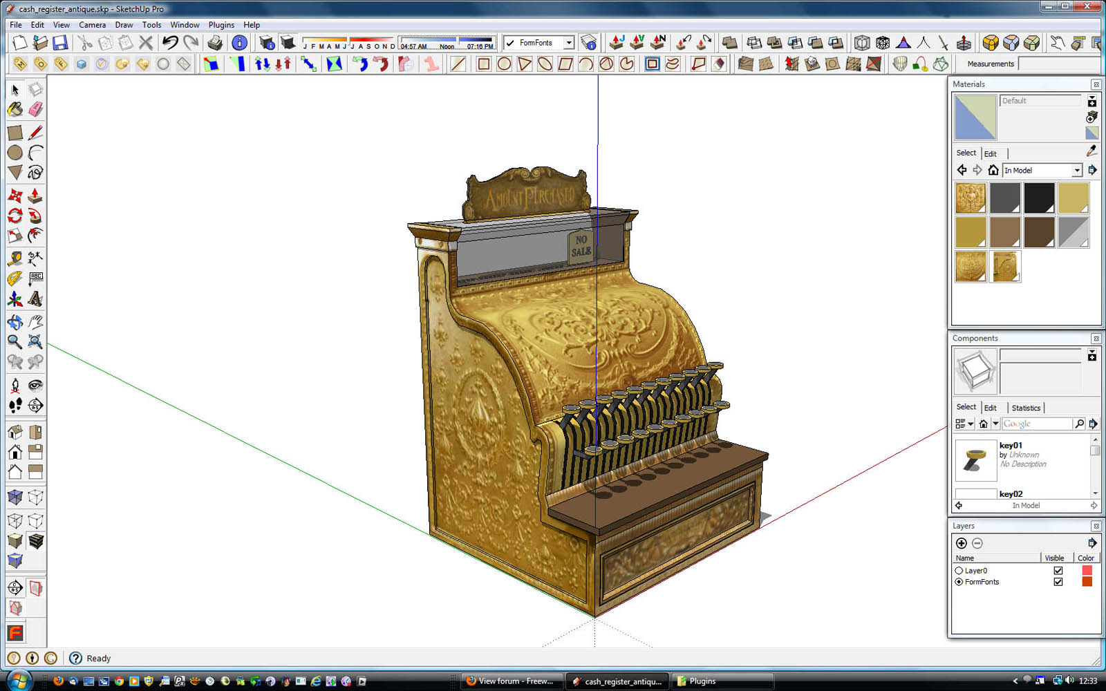
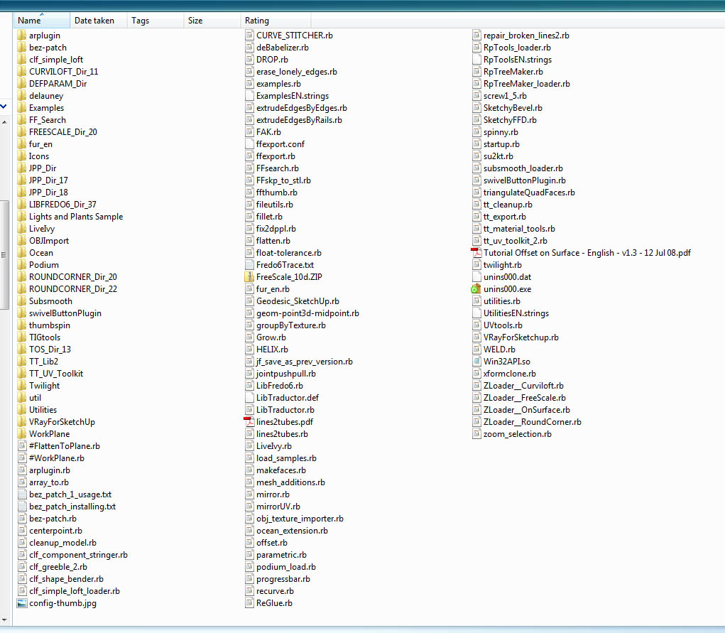
... and mine.
I really don't like to have the bars more than 2 icons wide/deep; I'd rather find them on the menus than take up any more real estate; and frankly, icons are harder to find the more rows and columns you have...and all those slight delays add up. However, the 3 palettes are open all the time. It would be nice if you could crush the Materials a little smaller, but there seems to be a limit beyond which it won't shrink any further.
-
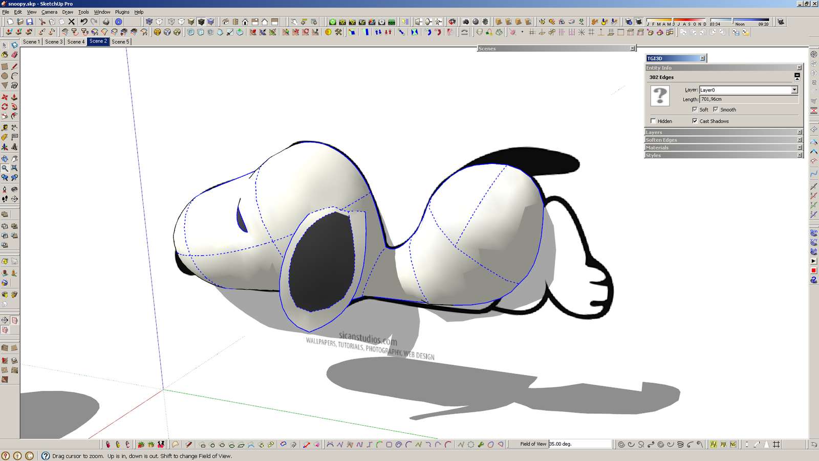
And here's mine - single screen.
It has never been so crowded before, because I have used very few plugins in the past. Now I'm trying out a lot of them, and probably I'll remove those that I don't use. And I'll probably move that right side single bar to the left side and make it a 3-col? I use shortcuts for everything, including show/hide dialogs/panels, so it's quick to get a clean screen.
Hello! It looks like you're interested in this conversation, but you don't have an account yet.
Getting fed up of having to scroll through the same posts each visit? When you register for an account, you'll always come back to exactly where you were before, and choose to be notified of new replies (either via email, or push notification). You'll also be able to save bookmarks and upvote posts to show your appreciation to other community members.
With your input, this post could be even better 💗
Register LoginAdvertisement


