Architectural models - untextured, unrendered
-
This thread is intended to be concerned with the underlying design and its modeling, unobscured by post-production and graphisizing, if you will. I find precious little of that kind of thing around here and so am left a bit curious and hungry as I love architecture, which for me is really the bones more than the frosting. I prefer not much frosting on my bones, you see. I know there are worlds of fine work going on out there and am sad none of it gets posted here. So please post some if you have it and want to share, regardless of flavor; bits and pieces are good, partial or unfinished, as they make up the whole; with or without explanation. Personally, I don't have much to offer, but am happy like most to be making some progress.
-
Very nice! Keep posting.
There's a variety of things posted here. It ebbs and flows. Some rendered some not. I like it all. You never know what you're going to see.

-
Nice detailed work brookefox!

I agree with your sentiment to some degree - it seems lately that the auto-mdding wip's are the most active. I don't mind the rendered posts at all - but it is great to see some native su work. Your level of detail is great for this stair / railing / deck combination. If I can ask - what do you do with this when you are done in sketchup? Also - I think the furniture on the firstlanding in the first image would make it a little hard to navigate the stairs.
Bytor
-
I didn't mean to disparage textures and renders, just looking for something else. It's certainly a matter of taste and fitness to the task at hand. These shots are of a home renovation, the production docs of which I am trying to produce with SU/F. Problematic to be sure, and perhaps a mistake, but I am well on my way just the same.
The furniture works OK for me as the stair down that back way will be rarely used.
Thanks much for your input.
-
Thin of skin need not apply, of course.
My pics are of an unpaying gig, otherwise I have no idea whether or not I could indulge in my attempts at accurate modeling.
-
I like!
-
Nice project and what a traveling

-
I know that this is a dumb question, but how did you create the animation? Was it done with scenes, or did you use some kind of plug-in?
Great project by the way
 .
. -
Really nice..especially the video presentation!
I prefer the native SU work myself but with work being thin right now I find it necessary to offer many options to my clients.I did find some highly detailed native SU works in the past on this forum.
Highly detailed models like this come to mind:
http://forums.sketchucation.com/viewtopic.php?f=81&t=17265&hilit=delineated+styleMaybe a forum section that encourages native SU work would be good?
Robert
-
Excellent work, I enjoyed the traveling too.


-
Robert and Michalis...thanks for taking the time.

-
Brooke, great work and one of the best animations I have seen.
I'm also a fan of NPR and native sketchup, I took your first post as an invitation, so here's my contributions.
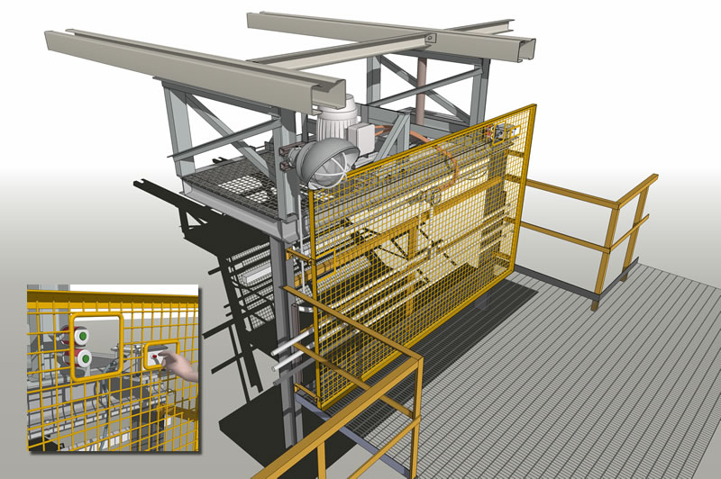
The first one was to demonstrate a safety barrier modification. (Native SU exported at 3000px wide and resized).
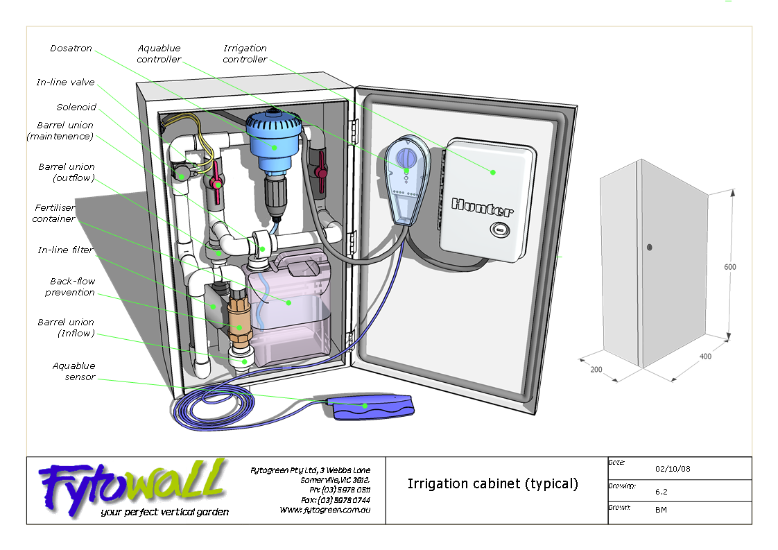
The second I have shown here before in another context but it got some comments relevant to this post, I think. (Layout)
Baz

-
Nice work Baz!
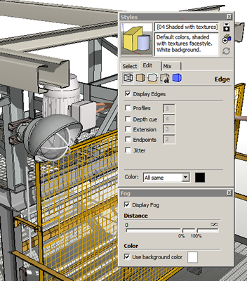
Would be it possible for you to post your style settings for both of these images?
Brooke, could I request the same from you also?I'm really enjoying this thread...it's quite inspiring

Robert
-
Hi Robert, saw your 'elevations' post. ( http://forums.sketchucation.com/viewtopic.php?t=29351#p256221 ) Nice stuff.
As to your question: just standard settings apart from fog in the first image. I might have vectorized the layout image, can't remember, but in any case it doesnt affect the output at this size.
Baz
-
Very nice animations, brookefox. Very nice!
-
Baz, thanks to you and ecofeco, and thanks to you for posting, and a nice model image at that. The thread is, as you observed, open and eagerly inviting more participation.
Robert, my style settings are nothing, really... I'll add a pic later.
-
Very neat views and videos. I like this sort of work too. A few questions and a comment.
-
With the illustration of many thinner elements such as decks and steel members, do you have problems with lines of the far sides of objects showing through? How do you prevent this? Is it due to all the round edges that you don't see this?
-
Are you an engineer? I.E. how do you develop your steel designs?
-
In the videos the shadows seem to advance evenly with the sequence of shot transitions. Did you time them to continue evenly over several scenes or are these simply long (and well designed) transitions? Works well.
-
I find most animations where the camera reverses itself, either zoom in--then out, or pan--then reverse pan... very distracting. I know this is common in SU animations including my own. BTW did you edit the animation after SU export?
-
-
- With the illustration of many thinner elements such as decks and steel members, do you have problems with lines of the far sides of objects showing through? Not particularly, though I do have plenty of probs often enough.
How do you prevent this? Lack of coincidental faces and edges, I guess.
Is it due to all the round edges that you don't see this? I don't think so.
- Are you an engineer? No, I'm a architect fantasist.
I.E. how do you develop your steel designs?
They are not developed. My next step is to bring the engineer on board. The idea was to model it sufficiently to give him an idea of where I'd like to open the discussion. I hope I can report back at a future date with how things evolve. I must be open to change for reasons of poor concept and economic reality.
- In the videos the shadows seem to advance evenly with the sequence of shot transitions. Did you time them to continue evenly over several scenes or are these simply long (and well designed) transitions? Works well.
Thanks. It's a nice set of bones, on a nice site. Nothing calculated, just eye-balled. In this case the east side (carport) shows morning shadows and the west (deck) side shows the afternoon shadows, with the camera moving around the south side.
- I find most animations where the camera reverses itself, either zoom in--then out, or pan--then reverse pan... very distracting. I know this is common in SU animations including my own. BTW did you edit the animation after SU export?
No editing, and really too much and rather jerky camera movement. Not that easy for me to do precisely, with the transitions being somewhat unpredictable. Certainly practice and some learning would help (me).
-
@brookefox said:
- With the illustration of many thinner elements such as decks and steel members, do you have problems with lines of the far sides of objects showing through? Not particularly, though I do have plenty of probs often enough.
How do you prevent this? Lack of coincidental faces and edges, I guess.
Is it due to all the round edges that you don't see this? I don't think so.[/i]
Thanks, I guess you don't run into that problem. If I leave as much as 1-2" between a line and a covering surface--not coincident--and view the surface from some distance, the lines bleed through,looking dotty. So the answer I suppose, is not to zoom out too far in such a case.
-
@pbacot said:
Thanks, I guess you don't run into that problem. If I leave as much as 1-2" between a line and a covering surface--not coincident--and view the surface from some distance, the lines bleed through,looking dotty.
Oh yes, for what its worth, I have that problem, too.
Hello! It looks like you're interested in this conversation, but you don't have an account yet.
Getting fed up of having to scroll through the same posts each visit? When you register for an account, you'll always come back to exactly where you were before, and choose to be notified of new replies (either via email, or push notification). You'll also be able to save bookmarks and upvote posts to show your appreciation to other community members.
With your input, this post could be even better 💗
Register LoginAdvertisement


