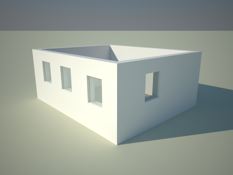
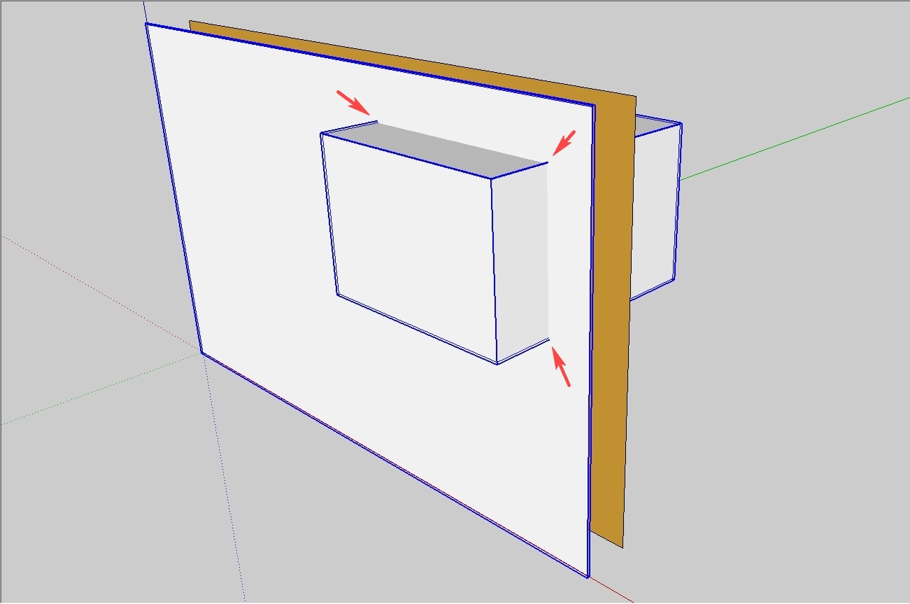
How does this window work? ;)
-
This is how it renders in V-Ray straight from the box. Same as you get in SU.
I wonder if I can make a plugin which can iterate over the windows and find there they intersect on the other wall face and insert an cut-through opening in the correct place. And also link the extra opening to the proper window component so if you mode or scale it, it will sync automatically. That would be a solution which would minimize the amount of work.

-
so, it was a riddle after all.

-
@ecuadorian said:
sigh....
For a minute I thought SketchUp had finally evolved into Super-ArchiCAD.(And I left a dumb comment in the Youtube video
 )
)Me too, me too..
-
@xrok1 said:
so, it was a riddle after all.

Okay, if you meant "riddle" like that, it was.

Yet it's straight SU modelling as "workarounds" in SU are considered "normal strategy" -
I'm getting pretty close to generating a cutout component on parallel faces to cutout components. Got to find a good way to manage and keep track of them.
Though, this Solid Front Face - Transparent Backface method can prove it self quite useful for presentations where you want some kind of X-Ray effect at times.
-
@thomthom said:
Though, this Solid Front Face - Transparent Backface method can prove it self quite useful for presentations
True, just imagine a case when you quickly need to change different openings to present ideas to a client. If you are careful enough, they will never realise that these windows don't actually cut that inside face.
-
Not only that, but you can fake section cuts in custom shapes...

-
Nice one Gaieus. It renders OK in Podium as well.
-
Thanks Sid.
I don't think it's very original (i.e. I am sure that only reinvented the wheel). It's obvious that there is no "real" solution for double cutting components so for different purposes we can use different workarounds (or their combinations).
-
Is there a possibility to identify where edges of a component intersect with faces of other component? Because if it is, then on that face can be added vertexes inside the component on intersection coordinates, then add lines. Finally delete the inner created face. In this way, the component cuts trough how many faces it intersects.

-
Gaieus
Still very good workarround if you are still designing. Saves a lot of time.

Thomthom
"I'm getting pretty close to generating a cutout component on parallel faces to cutout components. Got to find a good way to manage and keep track of them."
That sounds like very good news. -
@sepo said:
Thomthom
"I'm getting pretty close to generating a cutout component on parallel faces to cutout components. Got to find a good way to manage and keep track of them."
That sounds like very good news.Generating the opposite cutouts where easy. Trying to keep track of them all and ensure that all new components placed also cuts double is more work.
-
you guys are giving me a headache just thinking about this
could have sworn that Renderplus or one of those tools had a multi-line wall, just trying to think where I imagined I saw it
what amazes me is that google haven't co-opted a lot of these scripts as "standard" functionality. I sometimes wonder if there is a reluctance to make google too powerful (I know the idea of sketchup is to be simple) but everywhere I turn people are not using it for "simple"
-
@sceyefeye said:
...I sometimes wonder if there is a reluctance to make google too powerful (I know the idea of sketchup is to be simple) but everywhere I turn people are not using it for "simple"
I wouldn't necessarily like Google to adopt many things. Plugins are for that. The reason is that SU is used by so many people for so many purposes that all these functions cannot be adapted.
So currently some use this plugin while others use that plugin. This is much better this way IMO. Google should be focussing on improving the core product (as several of the members here keep expressing it) and AFAIK in SU 7 it was already essentially improved since plugins can work MUCH faster now than before.
-
Google SketchUp's development team seem to follow the KISS Principle:
http://en.wikipedia.org/wiki/KISS_principle -
I do like the plugin method of making applications. Look at Firefox. It's the plugin that makes it. That people can adapt it to fit as they like. But it sure would be nice if there where more things exposed in the SU API. For SU8 I'd be satisfied if it was purely a stability and bugfix release for the core engine but with more things exposed to the API. Improving it as a platform, not as application.
-
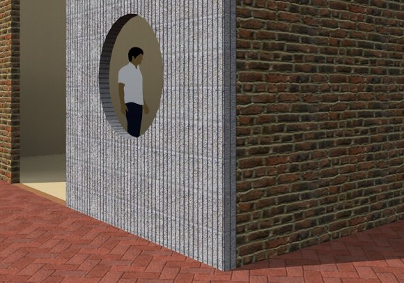
Gai, the double-cut can be done with a single dynamic component. This hole in the wall came from Scott Lininger... It isn't a "proper" window, but is designed to apply a hole in the center of the wall segment. You can scale the wall thicker, thinner, wider, taller and it always cuts properly! It's a good example for a nested dynamic component. (Rendered with IDX Renditioner.)
William

-
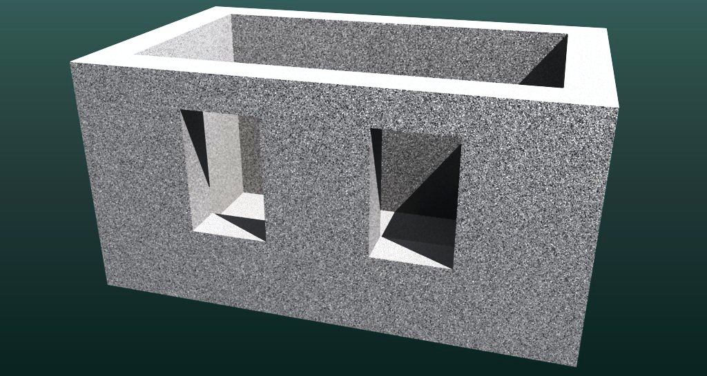
Ah yes, William, but if you look at it from this point of view: that whole wall segment is just a "standalone" window component which of course can be scaled

You can do the same with the front face of this model and it's not even dynamic!
[attachment=0:34ob4oem]<!-- ia0 -->http://WWW.jpg<!-- ia0 -->[/attachment:34ob4oem]

-
Yes, but the difference is that, no matter how you scale it (the dynamic component), the hole will be circular, and the same size.
-
Well, I could surely have made those windows circular in my example - doesn't really matter. They also remain of the same size - or am I missing something here?

Hello! It looks like you're interested in this conversation, but you don't have an account yet.
Getting fed up of having to scroll through the same posts each visit? When you register for an account, you'll always come back to exactly where you were before, and choose to be notified of new replies (either via email, or push notification). You'll also be able to save bookmarks and upvote posts to show your appreciation to other community members.
With your input, this post could be even better 💗
Register LoginAdvertisement


