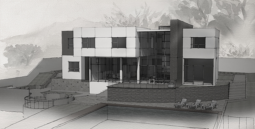
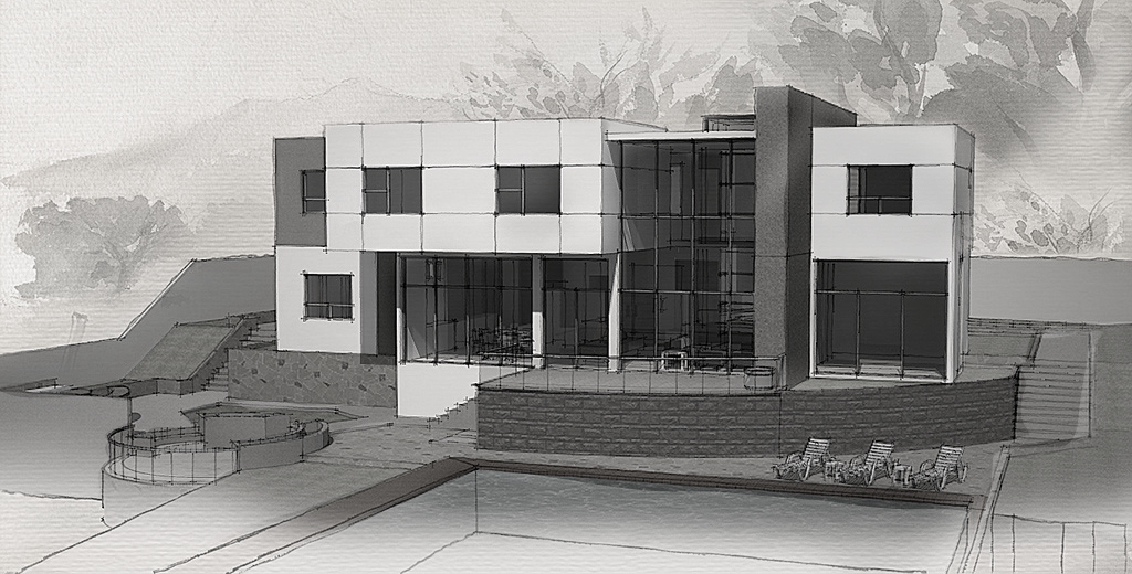
Nice job, but I want to make some recommendations:
If you turn the image into grey-scale and squint, you can see that it lacks a little bit in mid-tones. If you create a little contrast in the range of values it would possibly make the image a little stronger.

 (-not perfect but you get the idea)
One other thing you could consider trying is to change the deeper values in your image to blues (cool shadows) or browns (warm shadows). Colours in traditional media are normally mixed to avoid greys and blacks and this may move your image one step closer to a true watercolour style.
Finally let the 'wash' gradient run through to the edge of the image. At the moment it looks like a soft shadow in the foreground (cast by the building) which conflicts with the direction of shadows on the columns.


