There ya go: WOW!
Oops, your profile's looking a bit empty! To help us tailor your experience, please fill in key details like your SketchUp version, skill level, operating system, and more. Update and save your info on your profile page today!
Urasik Extensions | Lots of new extensions to check out Learn More
T
Offline
Posts
-
RE: Push/Pull Tower + model/render challenge, page 2
Sweet! (What about trying a grey-scale sky and reflections? :`)
-
RE: Ancient Rome - Cell Temple Rendering and HDR merge WIP
Just dandy...love the ominous white accents!
-
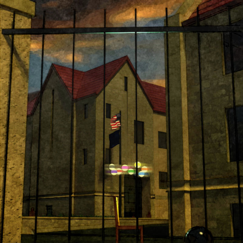
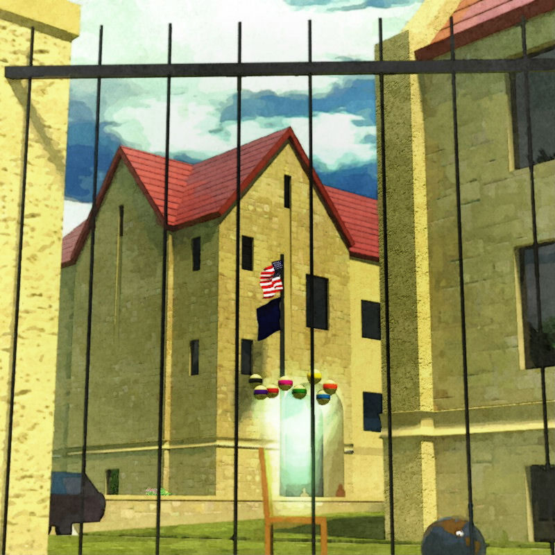
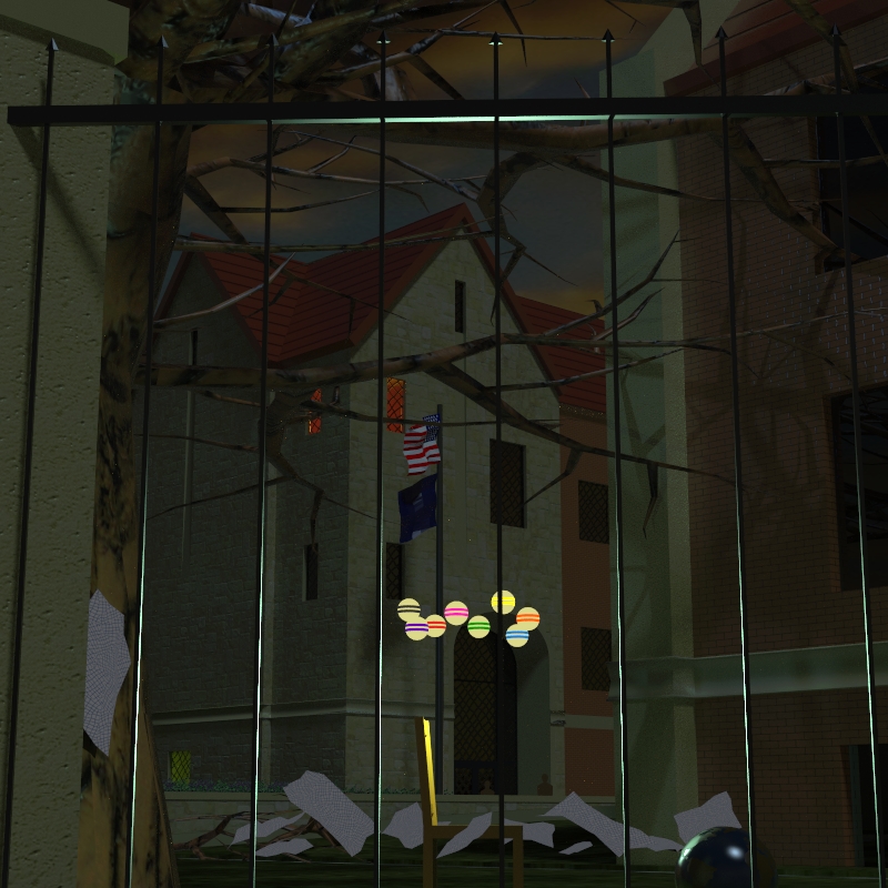
RE: Wip: for Pete...:`) FINISH !?!
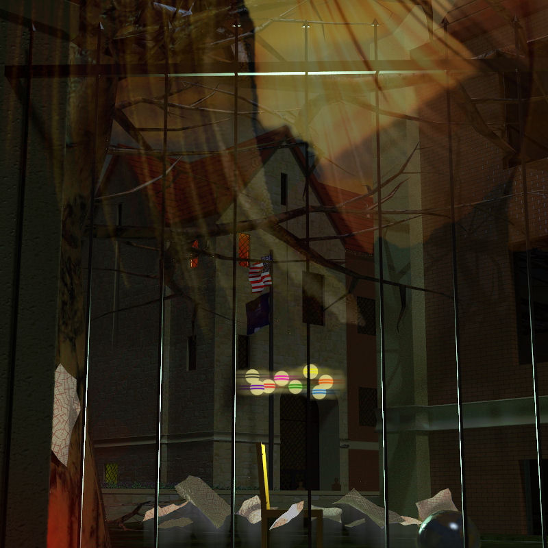
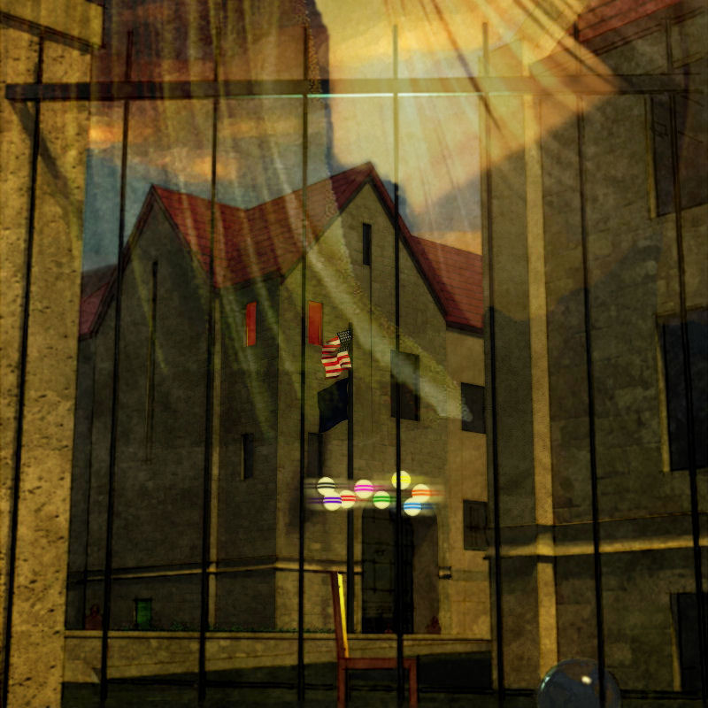
Peter...if I understand your choices, I'll say: a bit of both. Some of the effects are saved as layers in PSP so I don't have to redo them, but the model is changing/morphing (as limited by the saved effects...sadly sometimes?) and new renders are taken; also, I've started adding more matte painting techniques from earlier renders, so morphing and accumulating that way as well.
I keep going back to the model at this point because I'm learning and enjoying Twilight, and because I am often surprised and more pleased by the lighting effects it captures over the ones I try to create in PSP. I've attached the last raw render below (base for the image above).
Some background: Pete(Solo) asked me the other day "what's with the chair popping up in the renders?" and explaining some about my MFA work (drawing and printmaking) got me itchin' to do another "painting". The chairs are personified, intented to be, impersonating without loading the image with all the gestural, expressional, and emotional baggage the human form carries with it, and also, more importantly, has projected on to it by each viewer. (I also freely admit I didn't then, and don't now, have the drawing skill to use it in such complicated imagery :`) I wanted the images themselves to convey the gesture, expression, and emotion.
To answer the questions: "What does this mean? What does that signify?" I will at this point only say that some of the stuff is metaphor, some of it is visual trickery, and some of the stuff is just stuff.
-
RE: Tomsdesk website...
Juan, the site was left at the default (and maybe the max free, I didn't check) 800x800 pixels hoping no one would have your problem...can't imagine what's going on? Anybody else having to scroll to see it all? Here's a full screen capture (reduced here to 600 wide) from my machine:

-
RE: Tomsdesk website...
"...very warm and easy to navigate..."
"...shows very clearly what you do..."
"...made my eye 'bounce' around the screen, enjoyably ;) ..." (nice save, Mike :`)Just what I was going for, thanks: relieved to know!
Miguel, "tongue-in-cheek" I think is the general meaning...I use it as "there's a hint of knowing smart-ass in this sincere and friendly comment".
-
RE: Tomsdesk website...
Thanks, Guys...Rich, I found the UI extremely easy to learn and manipulate to my needs (once I found all the limits of "free"...of course :`)
-
RE: Job
Here in the states anyone can design anything...but getting a building permit for almost any project will require construction drawings (different from design drawings, of course you know) stamped by an architect or engineer (and it is illegal for them to stamp drawings completed without their direct supervision :`)
-
Tomsdesk website...
...finally lauching my new/first: whadaya'll think?
-
RE: Thomas' WIP
Wow...another winner! Every style here is done quite well, Thomas...great!
-
RE: Wip: for Pete...:`) FINISH !?!
Croquet...you're right: they're missing the center white stripe :`)
-
RE: Npr render with twilight a la Majid and Tom
Hey Baz, wish I'd jumped in earlier 'cause you've been led way away from an image I found quite delightful...hope you still have that setup and scene as I'm commenting about that first one :`)
First off, homey is a bit different than homely in my mind...and homey is a good word for the impression I got from the first image(s): a private sanctuary separated from the outside and nestled under the protection of a canopy of trees...a family's safe place. Now if the house was intended to be the focus of the image, rather than this feeling of home, I would agree with the changing of the scene: moving in, losing some of the barrier, down playing the trees...in fact, I'd probably go much further than you did, and so, nevermind all that follows. But if not, I'd go another way :`)
Okay, things I really! like:
The different paths to be followed...the road continues on unimpeded (a shallower angle without as much break at the grass could amplify this rapid pass by) (also some rutting or other discoloration like a shadow could enhance that corner of the image without causing distraction); into the drive slowing to a halt (the simplicity of the image here forces the viewer to do this mentally...I think, and is powerful) (again, some shadows cast would distract from the drive material tiling...could be enough?)
The private spaces hinted but not shown...the corner around the fence on the right is a great anchor here (but in my opinion needs something more, another splash of color through the slats...maybe a red trash can?) but outside the corner is pretty "dead" (you can't show the road litter that would always be trapped there in reality, but something unimportant there might help?); the little vista into the yard and grove beyond is for me the best part of the composition: it draws me in, it makes me look thru the fence (and so enlivens it's simplicity), it make me feel the volume of the house...cool! And the white structure of the covered porch jutting into it is kinda sexy...:`)
Don't lose the bike! Love the bike! It leads me across the expanse of drive, it makes me consider the steps, the entry, then the house...it slows me, warms me, brightens me to what I will encounter inside. Don't lose the bike! (In my opinion :`) (If appropriate, I might even try adding another...somewhere around the right side of the drive, peeking out from behind the fence?)
I think the potted plants reinforce the stages of entering the house, and show off the uncovered porch pretty much hidden in the shadows (I might consider changing up the repetition...maybe using blue and white chinese pots in the shadows?)
The Twilight render (don't you love this program!) and the post-pro work is lush and juicy, just right IMO! (I think using the grass edge Fletch recently provided on the TwilightRender forum would help the edge of yours, and maybe increasing the scale of your grass material would defeat some of the tiling? And again here, a shadow may do a lot to help?) (I've been playing with rendering pavement a bit wet to get away with "vast" areas of it in the foreground with some success; also been doing a second render with the scale of material increased a bunch, then "combining" the two in PSP with the eraser tool?)
The dark canopy created by the trees, and especially the volume it creates for the lawn beyond, is quite special...I've never created such a realistic volume with my trees: Wonderful! and thank you for the study aid! (I'm thinking it's only the saturation and maybe even more the combination of colors that distracts...but, for me at least, not by much: at all, though I would try to adjust it.) The white of the sky doesn't work for me, I must say (and maybe some blue there would cool down that searing yellow tree at the edge of it?)
A couple of things about my trees:
My early trees were indeed quite "hot" (saturated)...dialing down the saturation in SU helps them alot. To add further control I will sometimes export the png from SU (right click on the leaf-bunch png) then change it to "greyscale" in PSP and rename. Importing it back into the tree is usually much easier if you copy one of the trees, explode, then erase it later. This action will give you a leaf-bunch component in the SU component browser that is vertical and un-rotated. You can then replace the old image with the new inside an instance of this component by simply selecting the lower-left corner of the old (I usually explode the old and group the face and 4 edges so I have corners to snap to) as you place the import, holding the button down and draging the new to perfect scale as it snaps to either the right or top edge of the old. Then erase the old and all your trees are updated. Now you can change hues and tones just like my newer trees.
Also you'll notice the reflection of some of the trees in the windows are looking at the edges of the leaf-bunch pngs, since the trees are facing the camera location rather than the "reflection incidence"...looks pretty bad most times, feels pretty bad all the time once you notice and know what it is. Now that I'm using Twilight too, I've been figuring the angles, then rotating the off-image trees (after exploding them not to face the camera) to match for good reflections...don't know what else to do since this is the nature of the face-me beast.
Anyway, I like it! And I want to see more rather than different!