Just a quick one
-
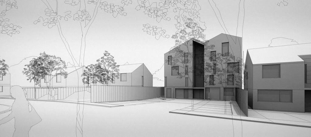
Quick massing model:
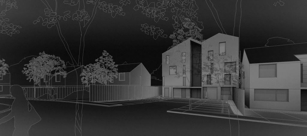
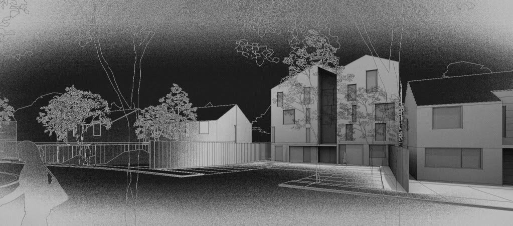
3rd image is a mixture between 1st and 2nd . The actual image I presented to the client was the first one, I just did the other two for fun...they kinda look like screen prints.


-
Sweet style. Digging the last one!

-
Nice, new...very nice!
-
Very nice clay render, simple and effective. Oli did you inverted image in PS for last 2 images?
-
Very nice style, congrats "Just a quick one"?

-
hi thanks for the comments. I will post some other views, there are lots more houses on the site.
sepo the second image is a solarized version of the first one (in photoshop filters>'solarize'). I then selected the blacks using 'color range', copied and pasted over the first image to produce the third image...with some masking here and there I cant remember. I was gonna add colour but its only a massing model to communicate the levels.
I will post the CAD trees on monday because I have made them into 2D face-me components....quite useful for these things.
-
Mate this is very similar style to the first image of yours I ever saw posted - I LOVE IT!!
No sucking up - Seriously one of the better styles I've ever seen! They really do grab my attention!
Hello! It looks like you're interested in this conversation, but you don't have an account yet.
Getting fed up of having to scroll through the same posts each visit? When you register for an account, you'll always come back to exactly where you were before, and choose to be notified of new replies (either via email, or push notification). You'll also be able to save bookmarks and upvote posts to show your appreciation to other community members.
With your input, this post could be even better 💗
Register LoginAdvertisement


