@ntxdave said:
@tk0001 said:
Dave,
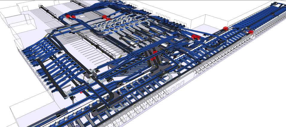
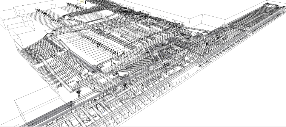
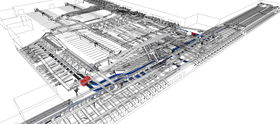
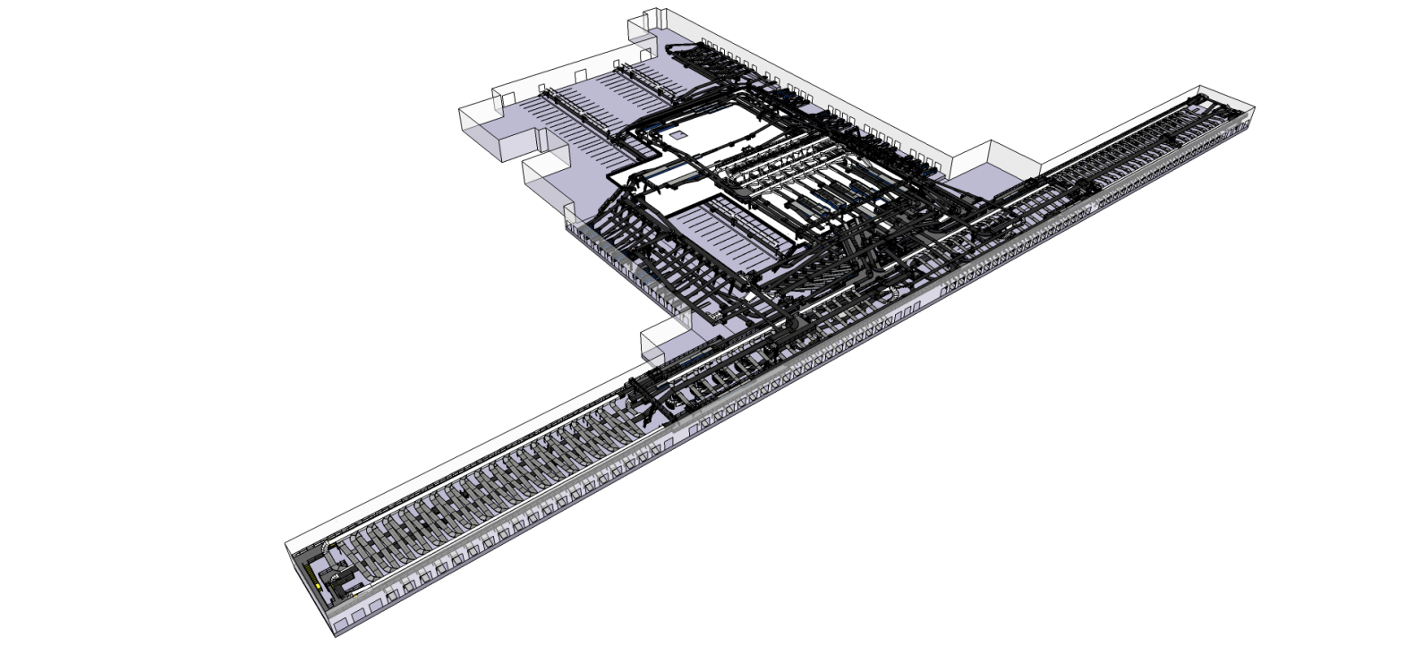
I think the technique I used here would work well for you, as long as the views are relatively close to the camera. The further you pull away, the more the dark edges jumble up the background "unhighlighted" information. The model I'm working on is of a facility that is rather large, so I want to try to dampen the background stuff as much as possible.
What I really wanted to do was replicate the view SketchUp gives when you double click on a group, but with transparency in the surrounding information. I'm close. Hopefully I can get there.
Yes, it probably would however, that means all of my groups would have to be duplicated plus there is the camera distance issue. The car wash runs anywhere from 135' to 155' long. Therefore, the lines could be an issue.
My other point is that everything is centered around presenting in a paper driven environment (which I fully understand since a one of the primary uses is for the builders and etc.). However, today's environment also needs to be a little more multimedia focused as well. As you described about the monitor, we also present our proposed layouts from time to time with touch screen monitors. One of my dreams would be somewhat similar to what you were describing/wanting. It would be really neat if I could bring up one of my models/layouts, double click on a piece of equipment (component/group) and have it highlighted or the rest of the equipment hidden (like double-clicking on a group).
I have looked at some presentation tools that support 3D models but they do not give me the capability to "cycle through" the various pieces of equipment in my model/layout.
Guess I am just living in a dream world Wish I was a good enough coder to go off and develop something on my own.
Good luck in your pursuit, Dave. Hopefully an adequate solution will be presented in this thread one of these days.
FYI, to give you some perspective, if you refer to the "Highlighted" image above, the outside dimension of the blue highlighted equipment is about 300'.


