Stop the violins! Please stop the violins.
Done in sketchUp, yes? What a great story board tool.
Stop the violins! Please stop the violins.
Done in sketchUp, yes? What a great story board tool.
Ah, I got you. It would look bad to have all your people and trees trapped in a glass sheet. 
Yes, KT can render objects transparently. Unfortuneately I am not a KTguru yet, but I do know that if you rename a material with the addition of a thin glass extension, you will be able to see through it.
In the attached rendering the glass tube area was rendered in KT. Becauase I have not yet learned the program, I hand rendered the restor the product with PhotoShop.
I did tweak the KT area in PhotoShop as well but that was mainly to blend the two styles so they worked as one. KT does a very convincing glass which can be colored and textured.

In addition to Legoretto and Barragan, There is a bit of Mondrian as well. In addition to the client being reinvigorated by the renders, the manufacturer of the dispensing machines has been on my website for the last two days looking around. I still need to fix a lot of reversed surfaces and other problems. I had a texture disappear for some other reason and in the left interior corner of the bottom render their is some kind of psychedelic lighting glitch going on. I might have to ask the Kerky team what they think it is.
Graphic punch is a survival response to low budget. The high punch low detail route.
Left to my own devices I might attempt the modern equivalent of a Gothic cathedral.
Oh and regarding hot-hot-hot, this is Phoenix and we are in the midst of global warming. Last night was th first time I turned the heater on because it has dropped to a frigid 70 degrees.
I made a couple doors for my house here in Phoenix and thought I would share them with you. The neat thing is they are three plys of plywood. If anyone is interested we can discuss any tricks involved in getting good results. You know, stuff like not applying varnish out doors in a dust storm.
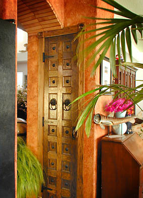
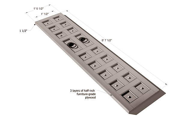
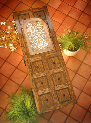
The black dots are Mexican "clavos." The strip inside the post and styles is an embossed bass wood trim. Not exactly the Ghiberti doors but I was short on gold.
Notice the arch next to the pantry door. That is made of strips of saltillo tile. Grouting the bottom side of horizontal surfaces is like nailing jello to a tree. My tip there is wear goggles and a shower cap.
Do any of you have architectural projects in the Southwest US needing architectural photography?
If so, lets talk.
Here is a project that I started but thought I might have some communication problems with. However I got back from dinner and found a message from the client saying awesome job.
I am a fan of the bold colorations of both Ricardo Legoretto and Luis Barragan.
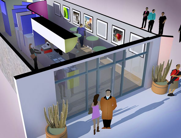
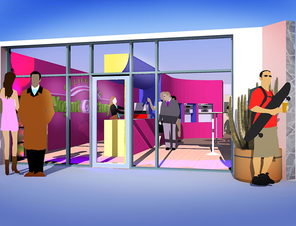
Not a problem Fletch. I am kind of new at this and forgot about purging. I would do it tonight but I am kind of sleepless and it is 2AM. I have a couple projects that clients are waiting for and over thanksgiving I found out I am to be a "a seanathair mo chroi."
That is Gaelic for "beloved grandfather."
So I am behind on everything.
Anyhow what you say makes sense. I need to study the mechanics of the different lights and rendering methods because my final render (at the largest size allowed in Kerky) took five solid days of computer time. I still have a few tweaks to do in PS.
Bom Dia, what part of Brasil. I visited once while doing a story on Banco Bradesco. I was in Sao Paulo and Alphaville during the first elections after the military rule. Can't remember what year that was? It has been a while.
Maybe it would help if the link to sketchucation went right to the new forums and then had a link to the old forums rather than the other way around. Does that make sense?
Just a thought, but how about some neutral density glass in the light fixtures like the pendant and the sconces. Right now all the attention goes to the lamps which are burned out highlights.
I guess what I am saying is that the lamp should not be an emitter. It should be colored glass and have an emitter on the inside just like the real world.
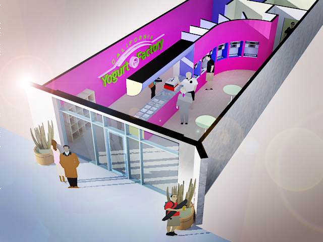
You have inspired me to do something similar. I would like to start immediately, but I have a design client that wants an interior for a yogurt shop and a designer that wants some architectural photography of new kitchens and baths. It will probably be 2008 before I can try my hand at a card.
You did a superb job on the design and the lighting. Excellant.
The columns are so much a part of the character of the space, it is a shame they blend into the shadows.
You might try two false self emitters (very tall and and narrow placed just beyond and between the columns and aimed at the columns.
It will change the whole character of the scene.
Being false you can see right through them, but they should wrap a beautiful light around those columns.
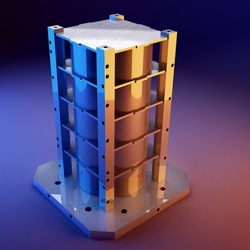
Kim I used SU, Kerkythea, and I breathed on it with Photoshop. The secret was building a SU photo studio to to shoot it in.
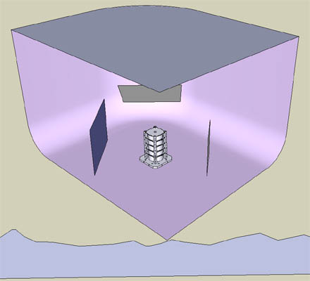
Not only did I build the object but I built the total surrounding environment, in this case a photo studio. Photographers joke about wanting skyhooks instead of light stands with feet that spread all over the place and trip you as you set up the shot. Now I have skyhooks and cordless lights and all the power I could ever use.
Bruce, was there a flood? I see a high water mark on the walls.
--Roger
http://www.azcreative.com
Kris thanks. I could find nothing in the warehouse and did not want to step up to the cost of FormFonts. However the work in formfonts was inspiring. So it looks like I will do my own model made a little easier as I have one sitting in the driveway. I think I can get 90 percent of the effect for about 50 percent of the work with some minor simplifications. If you hear me searing, you will know that I was wrong.