The California Yogurt Factory
-
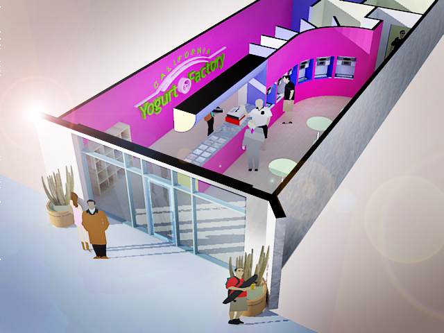
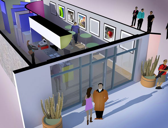
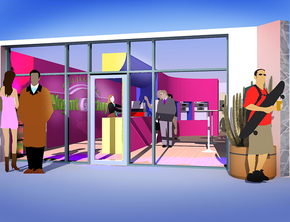
Here is a project that I started but thought I might have some communication problems with. However I got back from dinner and found a message from the client saying awesome job.
I am a fan of the bold colorations of both Ricardo Legoretto and Luis Barragan.


-
In addition to Legoretto and Barragan, There is a bit of Mondrian as well. In addition to the client being reinvigorated by the renders, the manufacturer of the dispensing machines has been on my website for the last two days looking around. I still need to fix a lot of reversed surfaces and other problems. I had a texture disappear for some other reason and in the left interior corner of the bottom render their is some kind of psychedelic lighting glitch going on. I might have to ask the Kerky team what they think it is.
Graphic punch is a survival response to low budget. The high punch low detail route.
Left to my own devices I might attempt the modern equivalent of a Gothic cathedral.
Oh and regarding hot-hot-hot, this is Phoenix and we are in the midst of global warming. Last night was th first time I turned the heater on because it has dropped to a frigid 70 degrees.
-
Those look great, Roger.
The only criticism, but it is just my personal preference/opinion, is that the 2D people look too flat, especially in the view from the above. -
This is a low budget project. I have to put most of the effort in to some problem solving rather than the rendering. If it was only about rendering I would have photographed some real people from matching angles.
I was thinking about making the people translucent gray forms to downplay them, what do you think about that approach?
-
My first thought was to use 3d people, but I think ghost people would work even better. Their colors wouldn't distract from from the architecture. Just my two cents.
-
With regards to the people cut-outs, in my own work I generally avoid them; however, in these renderings I find they work exceptionally well. I find here that the way they read as "cardboard cut-outs" is suited to the bold graphic character of the renderings.
Regards, Ross
-
Wow! You've really managed to make those colours scream! Hot-hot-hot! If I was walking down the street I'd certainly take notice --- and I'm sur the impulse to go in for a treat would take over!
I like what you've done very much. I particularly enjoy how much graphic punch you've coaxed out of the renders.
Regards, Ross
-
I would love to see your design images, I think I was also contacted by this owner for design work..mysteriously cancelled, would love to see what "won out" over me.
Hello! It looks like you're interested in this conversation, but you don't have an account yet.
Getting fed up of having to scroll through the same posts each visit? When you register for an account, you'll always come back to exactly where you were before, and choose to be notified of new replies (either via email, or push notification). You'll also be able to save bookmarks and upvote posts to show your appreciation to other community members.
With your input, this post could be even better 💗
Register LoginAdvertisement


