Holiday Card... Final.
-
I think it came out great! I like the wire '2007' (I assume that's what it is at bottom right, cut off), nice touch.
-
Looks Amazing to me!!!
-
hey, thanks guys!

eric..just noticed the cut-off too...editted it and made the image a bit smaller..
-
Nice. I love it.
-
That looks great, Jason
-
looking good.
which render did you use ?
-
I love it. Makes such a great card!
-
Just out of curiosity have you made one where your logo is not on a white background so that just the text is on the ornament and not the white frame?
I think it very cool you have a great sensibility for design and have mastered the rendering process.
-
phil..i did not try that because i though the '21' would blend in too much....and i didnt really want to change the color of the ball..
alexander...this is maxwell render
-
You have inspired me to do something similar. I would like to start immediately, but I have a design client that wants an interior for a yogurt shop and a designer that wants some architectural photography of new kitchens and baths. It will probably be 2008 before I can try my hand at a card.
You did a superb job on the design and the lighting. Excellant.
-
great job, jason. it is in itself a xmas gift. i am sure people who get it will be very happy.
-
Great work jason, had not seen your post before, thanks for sharing!
Patrice
-
Jason, awesome job! My address is.....

-
Really, really nice and inspiring, Jason!

Thanks for sharing!
Cheers
Kim Frederik
[%(#A9C33A)KT Team] -
thanks everyone...glad you are as happy with it as i am

and tina..i've always got extras..hit me with your address...haha.. amazingly, i think i have almost 100 cards to send out.. last year it was probably half that..
-
...just came across my card from last year (have been rebuilding my MacBook after a hard drive failure :-/)...

-
This is really funny...
 I remember that card from last year, when you posted it at the old SU Forum...
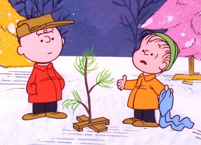
If I recall correct, someone suggested that the x-mas tree should be similar to the Charlie Brown tree...
Any way - I feel that this years holiday card looks much better...

(made that sound as if the one from last year didn't look good, which isn't true, cause it was also nice...)

-
haha...no, i'm totally with you, frederik.... looking back on this, it could've been way way better!
-
..so i finally got this card sent out last week.. and obviously this is 'good', but i've heard from some friends that lots of people (obviously not in the 'know') think its just a photo! haha..obviously that is a compliment, but still.. then it misses the point...i figured putting my logo on the ball would seal the deal that it was a rendering..haha
Hello! It looks like you're interested in this conversation, but you don't have an account yet.
Getting fed up of having to scroll through the same posts each visit? When you register for an account, you'll always come back to exactly where you were before, and choose to be notified of new replies (either via email, or push notification). You'll also be able to save bookmarks and upvote posts to show your appreciation to other community members.
With your input, this post could be even better 💗
Register LoginAdvertisement


