Very convincing pebbles, I assume you modeled a few then used the fur plugin to distribute them. what we're the settings you used on the fur plugin? Also it looks like (but hard to tell) you used a pebble texture underneath the modeled ones to cut down on the amount of modeled pebbles, smart, I'm curious what this would look like farther away as part of a whole house shot to see if it's still as convincing (plus I don't think many renders would be so close to the pebbles).
Posts
-
RE: Furry Pebbles
-
RE: Cafe/stationary and library
IMOH generally the images are good, but all of them are a little lifeless. Some people like to photoshop people into the scene but I feel if you put in objects that imply people are there it can have the same effect, so like magazines and coffee cups on tables, a book here or there, oddly placed. The post processing is a nice effect but if this is an interior design project and your using vray to create the images I feel like it would be better in this case to not add the effect to get a more realistic perception of the space. It's a very cool effect, I'm interested in how you did it but I don't know if it's necessary in this case other than to create visual interest in relatively empty space. I like the design of the space but the library is a little empty in the middle and on the shelves. Also the space seems more like a lounge than cafe.
I hope this helps, and I'd still like to know how to created the effect on the images if you'd like to share.
jsteacy
-
RE: Blue Balls
Cool! Though I'd love to see a great reflection in the ball. Anyone got a good x-mas hdri?...
-
RE: Piano yamaha p-60s
Great renders, what program did you use? The grille in the back did you create it or find it somewhere? I don't know why but it's a great texture and really adds realism to the renders
-
RE: CONCEPT SketchUp 8 + Vray for SketchUp
The design seems interesting but I agree with minguinhirigue, the field of view distortion seems too much so it's hard to understand the model. I would like to see a render looking down at the model so it's easier to understand the whole design. I do like the atmosphere of the renders but maybe tone down the vignetting a little. Neat but I'd like to see more
-
RE: Re: [Plugin] Flatten to Plane v1.2 20101023
ThomThom's Cleanup script works pretty well to delete all the co-planar lines once the face exist. I tried creating the large circle around the geometry to get the faces but it doesn't always create all the necessary faces, so maybe you could look into just create the faces for the resultant geometry. But that's just a suggestion.
-
RE: Re: [Plugin] Flatten to Plane v1.2 20101023
Cool Plugin, will definitely use this, thank you. I've got one request though, is there a way to make an option that the new geometry created becomes a plane with no interior lines. See the image below, the cylinder has a lot of lines but is not a plane. I feel more often than not if you are using this plugin you'll want to extrude the geometry afterwords but for complex shapes you'll end up with a lot of lines to delete. I could be wrong though. Maybe just make it so the new geometry has all the planes drawn in.
-
RE: Google support tickets
I had a lot of problems with LO2 but they responded, once it was too late but the other times they helped me out. Though they had to create a drop box account for me so I could give them the 70 meg file to look at which isn't a problem but interesting to point out.
I use LayOut all the time, 2 and 3, what's the problem?
-
RE: Frank Wright Chair
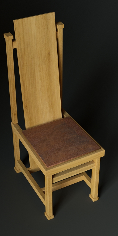
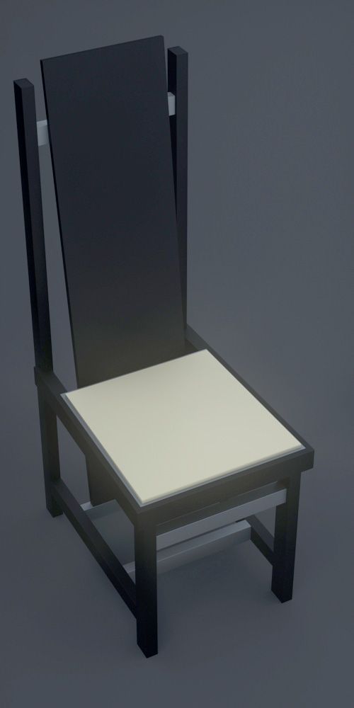
Massimo, thanks for the insight, as I am an aspiring renderer I wanted to see if I could create a similar image to yours. I hope you don't take it the wrong way. Then I took it a step farther and wanted to create a metallic version of the chair. It doesn't look as metallic as I was hoping but I like it either way. I used the arctic HDRi from that link you posted. Both rendered with Thea.
Troyhome, I agree with you, I didn't even model the chair and I've learned a few things.


-
RE: My model of the tallest brick church in the world
Cool, I'd like to see more overall shots like the fifth image down.
-
RE: Post Floof Rehabiltation
Neat concept, the problem I find with posted board like this is that it's hard to view it as intended, confusing thought I know but it's kind of like viewing a render on a computer then printing it, they have subtle differences but they are the same image. Anyways my constructive criticism would be that the overall composition could improve, the third board is definitely the best but the last one is kind of all over the place. The images are good they just look like they where thrown on the page in the last minute. The wall details on the third page could improve a bit, like the callouts and are they hand drawn? Also it seems like barbed wire would be a difficult material to use as a building material. You would need special gloves or something to handle it right? Anyhow neat concept. I hope I didn't sound to harsh but you where looking for comments....

-
RE: Apartment Interior
I think the effect is too strong in this one. The modeling looks really good and well done but the watercolor effect kind takes away from the detail/models.
-
RE: Church rendering
Cool, I like it. Maybe to much grass in the composition, you could probably crop some out.
-
RE: Dark day
Wow, Davidh, thanks for all the links, this will keep me busy for awhile. Cheers!
-
RE: Frank Wright Chair
Troyhome, thanks for posting the model, it looks great. Especially the render of the whole model

Massimo, the render is awesome and the posting the materials, wow! thank you! Give you give a little insight into your render? I'm learning thea and I'd love to be able to do similar furniture renders like this.
-
RE: Render this: Kitchen
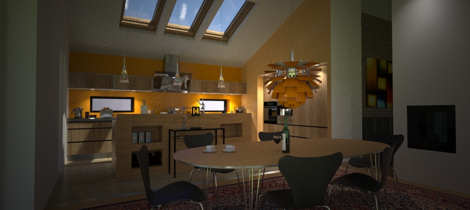
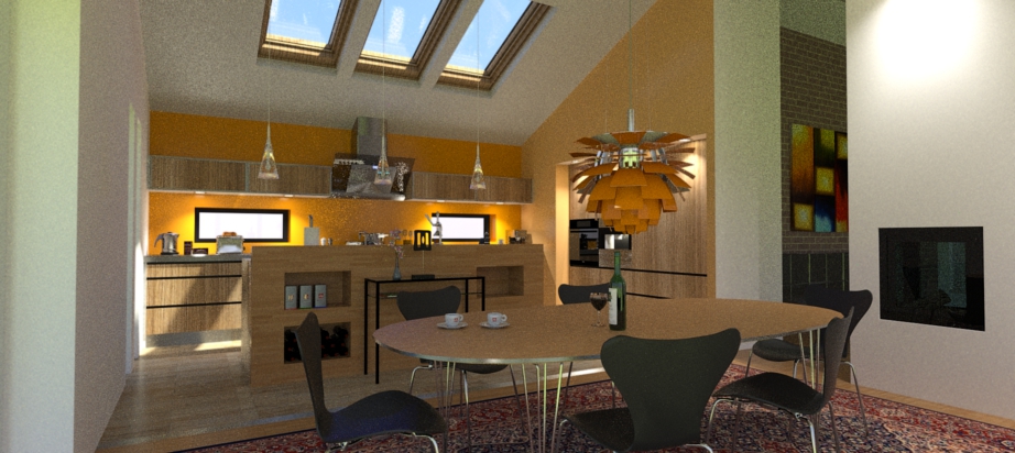
I 'm trying to throw my hat in the ring a little more often but I'm still learning. Rendered in Thea, added vignetting in the first image to create a bit darker atmosphere in the room, not sure if it worked though. Just sun for lighting, which is why there is nothing in the windows. I love the blue in the skylights especially with the reflections. Does anyone know how I would get the same blue in the lower windows. I assume it has something to do with the horizon/atmosphere settings but I don't know. I uses adobe kuler for selection of the paint on the walls and the lamp over the table. I like the colors but they match the wood texture too much I think. If you haven't heard of Kuler, check it out, I think it's great for any designer. http://kuler.adobe.com/


-
RE: A few textures with normal maps
Awesome, thank you! +1 on the avatar, made me smile.
-
RE: Dark day
I love the style in these renders, I vaguely remember in another post that you gave some insight into how you did it. If I'm wrong I'd love to hear how you did it, what's sketchup, what's not, the pp behind it. If you did already can you reply with a link? Thanks,
-
RE: Frank Wright Chair
Can you do a render of the whole chair? I'd like to see the whole thing.
-
RE: NPR Retro Style
I like it, and it would certainly fit into one of sears home catalogs from way back then. I might suggest moving the treeline closer, makes the yard look huge and unrealistically flat. Other than that I think its great. On a side note, I wish the production home builders of today would pick up some of the home catalogs of the past to learn how to design a home.