Granted, but now you have no textiles to cover your ass.
I wish I had my viewing privileges for this topic given back...
Granted, but now you have no textiles to cover your ass.
I wish I had my viewing privileges for this topic given back...
Granted, but now it will stay void.
I wish I didn't find this thread!
Very nice subject and renders. I love the camera angles. Really add up to the mood and avoid the classic 2p perspective thing. Great!
@valerostudio said:
That's all I am asking in this thread.
Yes, I know, but I think the naming of the thread is attracting rant.
I too want millions of polys but I don't want, with that, to loose everything else.
What I'm saying is that for me, the limitations it has, don't surplant it's potential. What I do with it is not less nor more than what I need.
Layout in the other hand... But this thread is aimed at archviz, which I also dwelve in and Layout is out of this.
Anyway, just wanted to state that sketchup is more than a specific user's needs.
I will talk about this case with someone...
Thea has viewport rendering which, for single monitors brings sketchup to life. Your plugin, as it is realtime, would be amazing with viewport rendering.
Well I guess most of us aren't happy with sketchup, yet I find it very useful and am happy with it, even with all the limitations it has.
Hi Didier, I've tried it and it's really good.
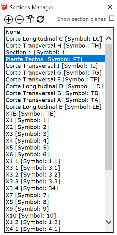
I made a mockup as what I was actually thinking was something like this:

This way we could see the list of all sections and easily navigate in the model (as long as section names are easy enough which, since 2018, can be controlled)
I then went ahead and added a few feature requests to the UI too:
1 - Double Click would replace the Apply Button;
2 - A single click would select a given section (select in the list and in viewport);
3 - CTRL/SHIFT would add/remove sections to the selection;
4 - Delete selected section(s) from list;
5 - And why not add a section while working with the list;
6 - Then duplicate seemed natural too as you could duplicate selected sections then select in the list and move around in the viewport.
I know this is asking too much, but who knows?...
Thanks!
EDIT: The plus, minus, duplicate and delete icons are a copy paste from skatter dialog which I believe is inspired in Sketchup's.
There's always several ways of looking at things.
As an architect I can use sketchup while I could never use blender or Max.
As a gerneralist modeler I can use sketchup while I could hardly use Revit or archicad.
As a render artist I can use Sketchup I could hardly use autocad.
Rhino can probably be used for all this stuff… That shuts me up but it's still less intuitive than Sketchup (for me)
What people seem to fail to see in this thread is that Skechup already wears big boy pants.
Sketchup is probably the most widely used 3d software on earth. There isn't a bigger boy.
So, we could reverse all this discourse and say: why aren't the other 3d modellers intuitive like sketchup?
Blender, 3DS max, Autocad, Revit, Archicad, Rhino…
They all fail much more than sketchup.
@samuel_t said:
[*]Metallic & Roughness maps are separated in Material Editor.
Good news indeed. Will try it again.
@didier bur said:
About hidden layers: if your sections are on a hidden layer, the plugin also works, but you will not see the sections planes appear in the viewport. Same goes for sections that are hidden entities (masked).
Hi Didier,
For me it's perfect then, I wouldn't need to see section planes at all, because the section would be active and that's enough for me.
However, if you're willing to improve the plugin, how would you feel about having it in a floating window instead of a dropdown menu?
I would definetelly use that a lot, having a section's list floating on the side, double clicking a section and it would then become active, even if invisible. In fact it would look like outliner without the model part of it. Having the outliner open all times doesn't work at all because it will slow down Sketchup or actually bog it down a lot of times when using plugins. Having an outliner dedicated exclusivelly to sections would be oh so great!
@pbacot said:
Excellent idea. I was surprised there was no way to do this in SU. (Why aren't section planes in "Outliner"?).
Thanks for sharing!
have you uses2018?
It's a very cool idea! Thanks for sharing. Does it use sections in hidden layers?
First of all, why would you want to do this?
If you're doing it professionally, Make shouldn't be your choice, but Pro.
Hi,
I did what you suggested. Erased the pbr plugin and folder from my appdata's plugins folder, restarted everything and installed, following all your suggestions.
Still no good with 1.2.5:
Sorry, it's not something you have made, it's just a standard Architectural style that seems to be widely used in some countries. It's so widely used and standard in fact, that it makes it possible for you to create a plugin like this. The plugin itself seems robust and really seems to be a huge achievement.