Cheers Kaas, appreciate the reply. Profile builder looks amazing! definitely need to check it out. Will make adding crown molding and cabinet profiles much much easier. I too model in a solid based workflow as it makes more sense in my head, and also easier to work with later down the road. Also good tips on using nested components; I find when I make my doors for example I just make the door all one component and do not break it down From the frame, door, knob, etc.
Posts
-
RE: General workflow tips for house design?
-
General workflow tips for house design?
Hey Everyone,
I find that when designing a house it takes me a very long time to even get the basic structure built(floor, walls, doors, etc.). I have been using sketchup for a while and consistently use shortcuts, hotkeys and whatnot, however I still feel like it is taking me way longer than it should. Now part of this could be because I am a perfectionist, and hate having strange dimensions. I for instance cannot just "place" a door frame somewhere on a wall, I always measure to keep things consistent.
I was for example working on laying down a floor plan for a smallish house, took me an hour just to get the floor and walls done. I started by mapping each room out, connecting them into one floor and grouping together. Then added in the walls by doing offsets on each room, deleting the inside lines from adjoining walls. Does that method sound efficient? Hard to explain without images but hopefully you get the idea.
I just tend to get frustrated because I have these great visions of what I want to do, and have the hardest time implementing them.
When doing a slanted roof with two separate angles, say perpendicular to each other, what is the best method for combining those into a single roof? Should they be draw separately, then combined with intersecting objects, and delete the spare lines/geometry?
If anyone has any tips or tricks they use on a regular basis that they want to share it would be appreciated. I love designing in my spare time and would love to start cranking out some neat homes.
Thanks to all who reply.
-
RE: Open plan residence, first floor.
I think its just how we perceive the picture with no reference objects to go off of. If you try and imagine a person standing next to the counter it seems to help. I think because it is a WIP that without anything in the space it seems to feel cramped in there surprisingly.
-
RE: Open plan residence, first floor.
What about a half wall with a breakfast bar to separate the kitchen from the living space? still keeps the open feel, while giving separation from the two spaces.
-
Nightly Musings (Will Update Regularly)
Hey guys just whipped up a couple models tonight. Simple furniture really but good practice nonetheless. I have a render going for one of them and I will post that in the morning when it finishes up. I modeled all of these from photos so if you hate the design, blame the original guy

Any comments, questions or suggestions are always welcome!

-
RE: Need help with workflow (Chair Modeling)
Hey Dave,
I really appreciate you taking the time to outline that for me, it makes a lot more sense now. When I get home I will give it a go and see what happens.
Thanks again!
-
RE: Need help with workflow (Chair Modeling)
Hey Dave,
Really nice video showing the benefits of the follow me tool. Its a tool I hardly use mainly because I have a hard time visualizing a profile first, and then have the computer finish the drawing for me.
After watching that video I see now how I could easily make the rails that troubled me before quite quickly by just making a series of basic lines and arcs. I will need to pick up that Weld plugin as well, very helpful!
-
RE: Need help with workflow (Chair Modeling)
Thanks for the help Dave! I was thinking maybe the Bezier spline tool would work, but it sucks not having sketchup in front of me to try it out.
I really feel like its something super simple that I am missing, either with groupings or just general workflow. I did eventually get it but had a lot of trouble making the stainless rails, as I needed to extrude from the original pieces to make the rails "fit" properly, which then caused an absolute mess of faces.
-
Need help with workflow (Chair Modeling)
Hey Guys,
This is going to sound super basic and I almost feel dumb for not finding a faster way on my own, but that's what a community is for. I was trying to model the chair in the link below and I was having a seriously hard time finding a quick and easy way of making all of those curves. My main issue was rounding the corners on the chair seat, and metal frame around the top, and foot rest area.
My first step was to make a square (for the foot rest), offset by my desired amount to make the rails, then use the arc tool to round the corners at the bottom edges. I eventually got it, but I kept running into a plethora of issues.
As for the chair seat itself I made a square followed by a few arcs for the contouring and used loft by spline to make the surface. I joint pushed pulled for thickness afterward. All of this took quite a long time, getting all the measurements correct. I feel like a model like this should not take more than an hour to get the basic shape done. I spent about 4 and ended up with nothing I was happy with.
I would post pictures of my workflow or maybe even a video but I am currently at work. If someone has any tips or plugins that might be helpful, please I am all ears.
-
Creating a UV map I can edit in photoshop
Hey everyone,
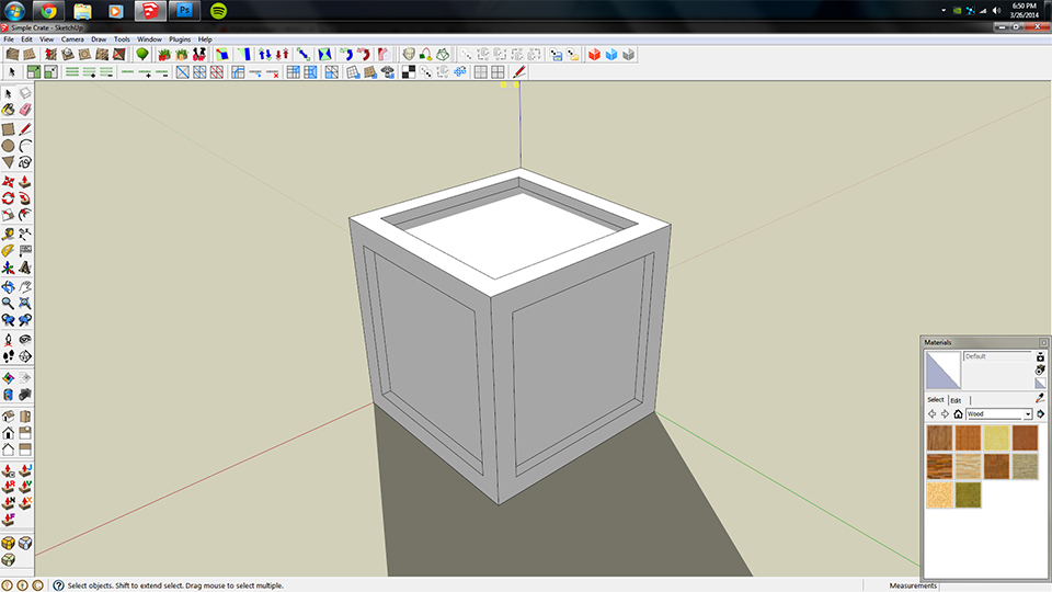
I am hoping I can get some guidance on how to go ahead an start UV mapping a simple wooden crate. I saw a tutorial on youtube where the individual was using maya and it seemed quite simple, a few clicks and he had an editable UV map in photoshop. I would like to do the same thing going from SU to photoshop, however I am quite lost on how to get there.
I have downloaded several plugins so far, UV Tools and Quadface, but I do not know how I can use such tools to get the result I am looking for.
Below is the box in question. I want to select all faces on top and unwrap them into a UV texture to edit in photoshop, any advise?
-
RE: Modern House (Need Ideas/Constructive Criticism)
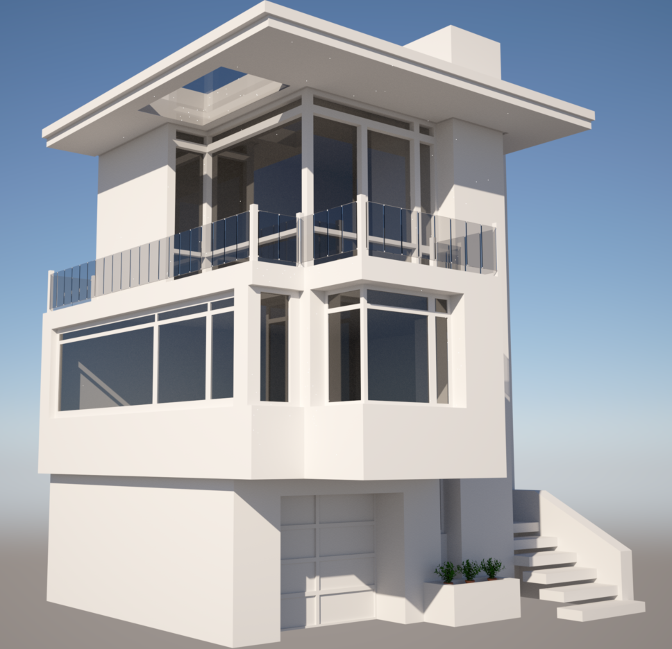
As promised here is the latest iteration of my project. I revised the 1st floor side window to conform with the "indented" style of the front face. I also made some revisions to the 2nd floor to give it a more open feel by extending the window on the left wall. In addition I took the suggestion of deleting the second flour pot in front of the garage.
Please excuse the fireflies in the render...
-
RE: Modern House (Need Ideas/Constructive Criticism)
Hi guys thanks for the feedback. This is really the first time I have taken a project seriously, I mostly make something from my head, hate it and delete it. Ill see what I can do about making the top floor a bit more consistent with the first floor. As for the skylight outside...yes thats there, thats what seemed to be in the picture I was following.
Should have something revised up tonight so check back then. Thanks again!
-
Modern House (Need Ideas/Constructive Criticism)
Hi everyone!
This has been my holiday project that I have been working on for the past few days on and off. Total working time so far is around 10 hours. I based the house off the link below, however I had to make a few modifications due to my skill or lack thereof. If this great community could give me some pointers or ideas on how to improve this project it would be greatly appreciated.
I would like to eventually place this in a nice HDRI environment, however I think it has a ways to go.
My main complaint is that the 2nd floor left wall looks a bit bare right now. Granted the picture I was working with does not show that side, so its really up to interpretation.
Overall I am happy with the way it came out, just needs a bit of tweaking, and that is what I am here for!
http://www.houzz.com/photos/97923/Bernal-Heights-Residence-modern-exterior-san-francisco
Roughly 1 hours work, laying the framework.
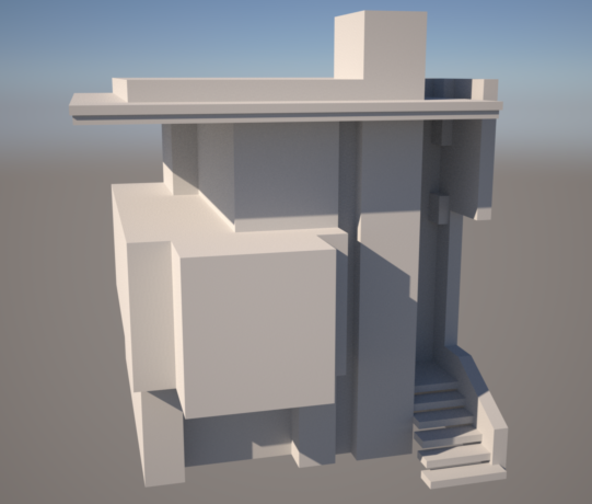
3-4 hours of work, finished most of the main design work.
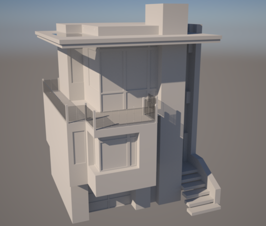
10 hours of work, lots of nit picking and fine tuning. Mostly wasted time with nighttime lighting that didn't work the way I wanted.
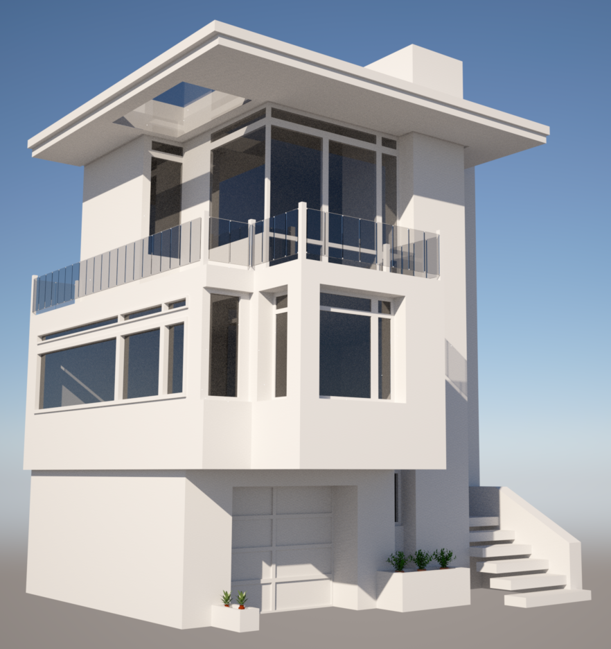
-
RE: Modern bathroom rendering, looking for feedback
I did not use exit portals because I was having an issue with them working properly, When I placed them over the windows it would block out the light completely instead of allowing it through. My process was as follows:
-Create a rectangle over the existing window (which is a component, the whole wall that is)
-Group said rectangle
-Right click, edit active mesh, tick exit portal.
-When I render it no light comes through.I followed the steps on this site for exit portals but maybe I am missing something, any insights?
-
RE: Modern bathroom rendering, looking for feedback
Ok so I adjusted the brightness and color in photoshop, looks a bit better than before. I will start to model some clutter on the counter along with some props to make it a bit more lively of a scene.
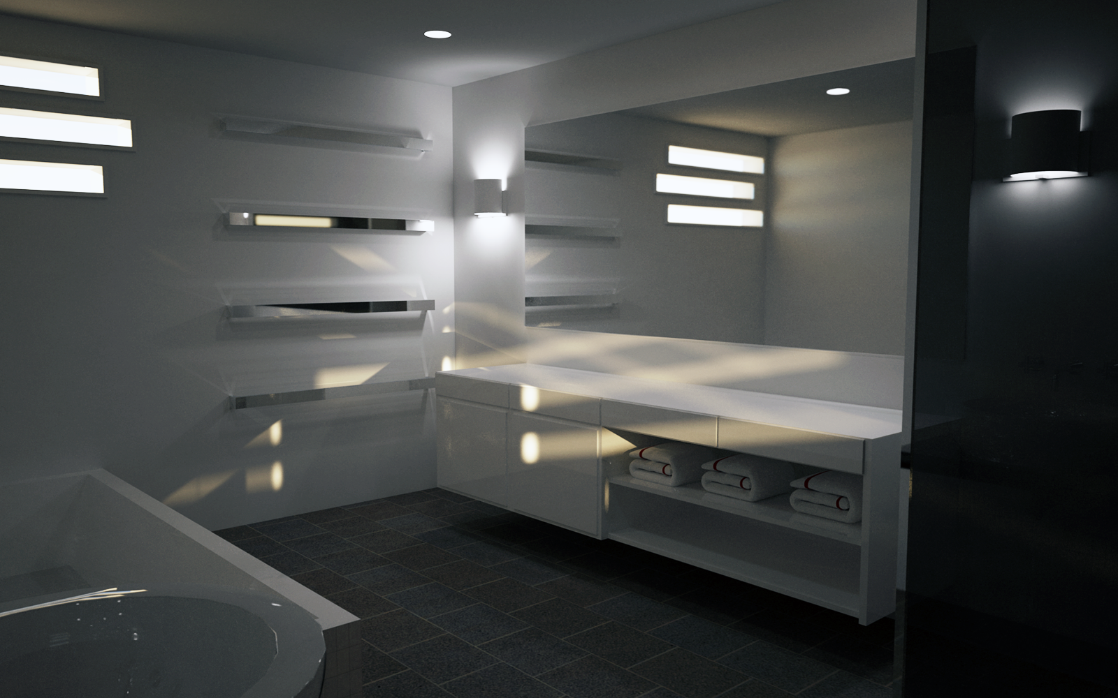
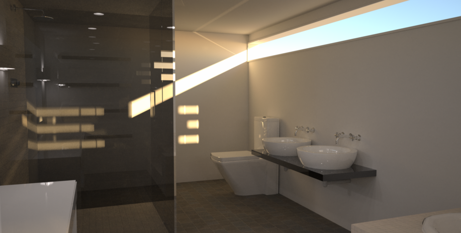
I have to agree that it does not look as sharp as it should for 14 hour render. I am pretty inexperienced when it comes to Indigo so perhaps its a setting that needs adjusting. Due to the complexity of the scene with all of the phong materials I went with Bi-Directional Path Tracing with MLT. I dont have a slouch of a computer either so im not sure where I went wrong.
-
RE: Modern bathroom rendering, looking for feedback
If i set the settings to reinhard it makes the scene way too bright and the lights become unnatural. Ill try to readjust it in photoshop.
-
Modern bathroom rendering, looking for feedback
Hey guys and gals,
I mostly come to the site just to read the forums and look at the great stuff other people have designed and for the first time I am posting something im actually pretty proud of. I got the inspiration to do this little project after finding a great site that provides thousands of reference pictures that I can work off. It also has an entire section for products too, pretty neat! I would post the link but im not sure if I am allowed, let me know and I will do so if able.
Scene Info:
Type - Modern Bathroom
Render Program - Indigo
Render Time - ~14 hours at 1920x1200 5x supersample
Materials Used - Aluminium for the mirror and metal surfaces. A white Phong material to imitate porcelain or lacquered finish on the cabinets.I designed everything pictured except the towels.
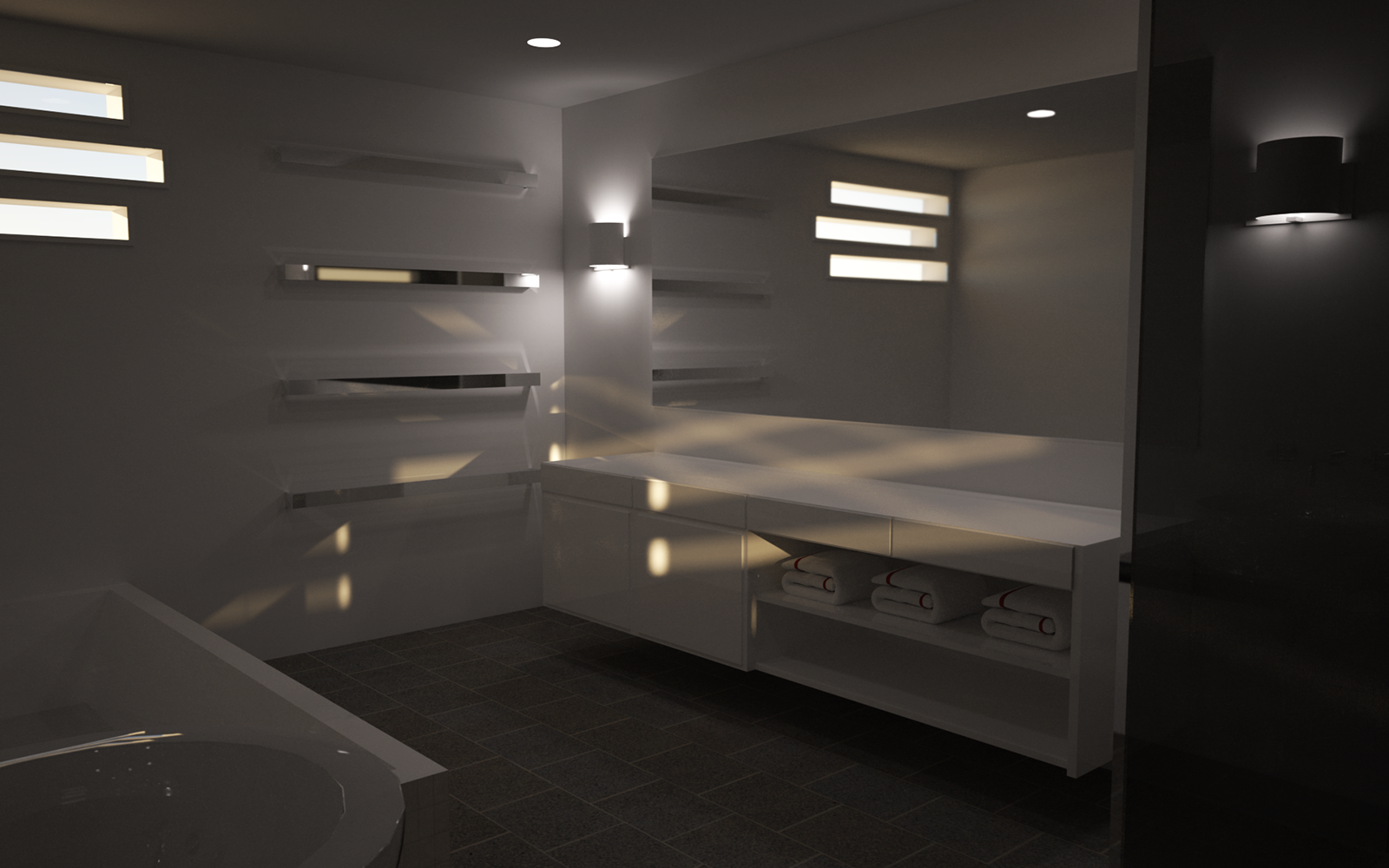
I am looking for feedback on this one here, I am still learning a lot about both sketchup and indigo renderer, but being a hobby not a job its not something I devote a ton of time to. Overall I am happy with the way it turned out, however a few things still bother me. One, I can never position the camera properly to really take in the whole scene. I think I can use section planes to do this, but I am not sure how. I did not use an IES Profile for the lights as I could not find one I liked. I also did not use exit portals for the windows. It could use a little texture work or an accent wall to break things up. Let me know what you think.
-
Absolutely lost when trying to make glass see through
I have searched high and low all over the internet for a tutorial on how to make a proper window with glass that doesn't get rendered black in Indigo. I read that doing it via components is easier, for me its not. I like to design ultra modern homes and I use a lot of extruded,intruded window and door frames. What I can get my head around is how to make a frame of lets say 5 inches thick and inside that a pane of glass that is .25 inches thick.
 This is my workflow when trying to do this:
         Create Wall with .10 thickness (feet)
         Draw rectangle
         Offset to .10 inside
         Pull frame out by .25
Window Frame
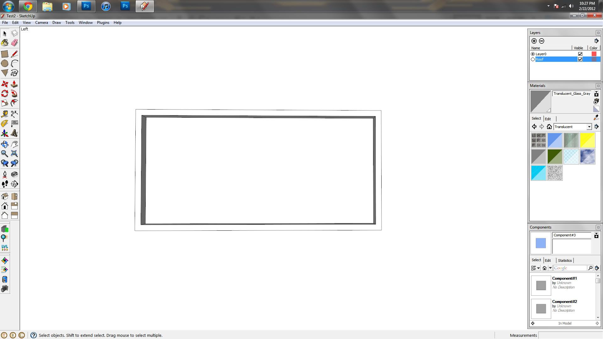
Frame with glass
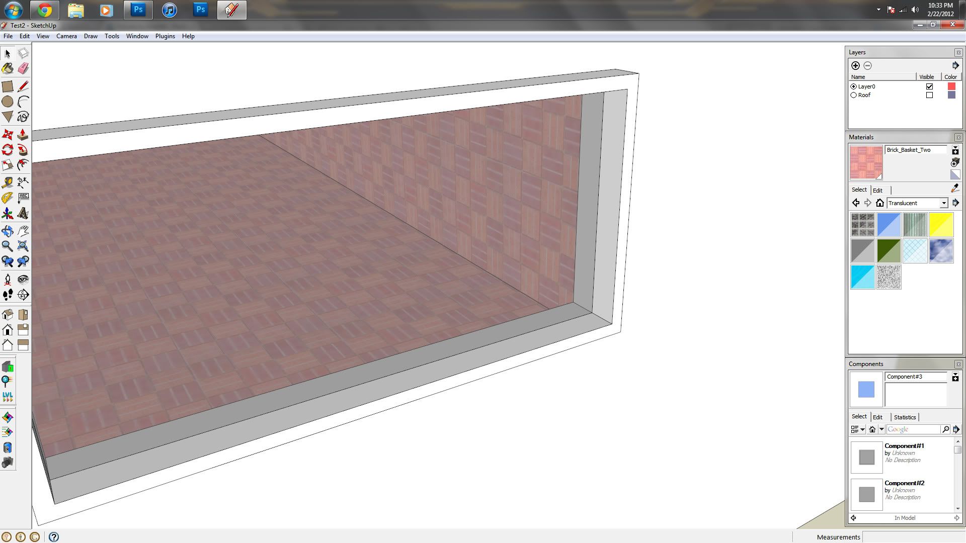
It looks fine here but as soon as it hits indigo it becomes black because as im sure you know there is a zero thickness on that glass. So with that said I have been as detailed as I could, please This is really the only thing thats holding me back right now, any help would not go unnoticed.
Thanks,
Irkie500