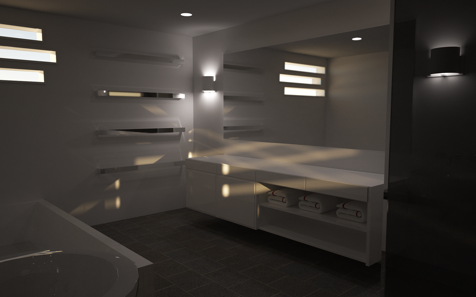
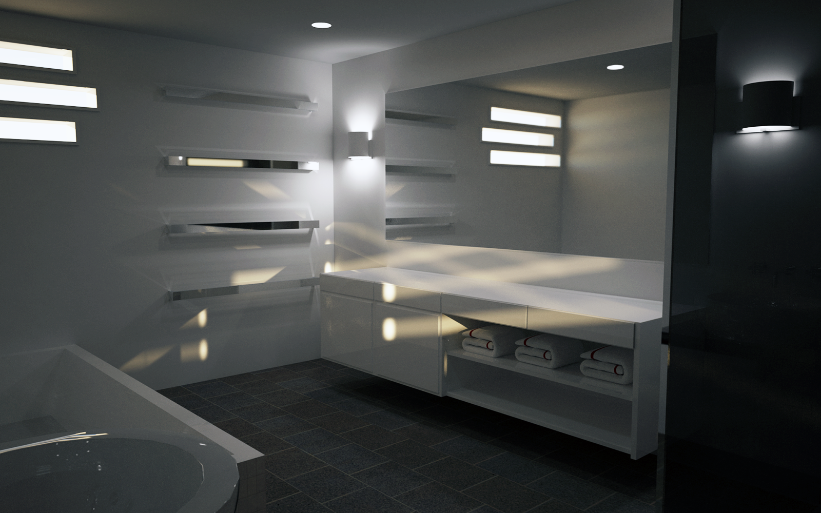
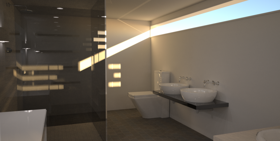
Modern bathroom rendering, looking for feedback
-
Hey guys and gals,
I mostly come to the site just to read the forums and look at the great stuff other people have designed and for the first time I am posting something im actually pretty proud of. I got the inspiration to do this little project after finding a great site that provides thousands of reference pictures that I can work off. It also has an entire section for products too, pretty neat! I would post the link but im not sure if I am allowed, let me know and I will do so if able.
Scene Info:
Type - Modern Bathroom
Render Program - Indigo
Render Time - ~14 hours at 1920x1200 5x supersample
Materials Used - Aluminium for the mirror and metal surfaces. A white Phong material to imitate porcelain or lacquered finish on the cabinets.I designed everything pictured except the towels.

I am looking for feedback on this one here, I am still learning a lot about both sketchup and indigo renderer, but being a hobby not a job its not something I devote a ton of time to. Overall I am happy with the way it turned out, however a few things still bother me. One, I can never position the camera properly to really take in the whole scene. I think I can use section planes to do this, but I am not sure how. I did not use an IES Profile for the lights as I could not find one I liked. I also did not use exit portals for the windows. It could use a little texture work or an accent wall to break things up. Let me know what you think.
-
Maybe it's the difference in my monitor, but it needs to be brighter.
-
If i set the settings to reinhard it makes the scene way too bright and the lights become unnatural. Ill try to readjust it in photoshop.
-
This rendering has a good potential to look realistic. Oh yes, its a bit dark. Try making the basin with more faces so it will be smoother. and finally try adding up some accessories cluttered on the counter. Its nice overall.. but 14 hours I think is a long time for a render of this quality.
-
Ok so I adjusted the brightness and color in photoshop, looks a bit better than before. I will start to model some clutter on the counter along with some props to make it a bit more lively of a scene.


I have to agree that it does not look as sharp as it should for 14 hour render. I am pretty inexperienced when it comes to Indigo so perhaps its a setting that needs adjusting. Due to the complexity of the scene with all of the phong materials I went with Bi-Directional Path Tracing with MLT. I dont have a slouch of a computer either so im not sure where I went wrong.
-
That looks better.

-
Did you use exit portals on your windows?
-
I did not use exit portals because I was having an issue with them working properly, When I placed them over the windows it would block out the light completely instead of allowing it through. My process was as follows:
-Create a rectangle over the existing window (which is a component, the whole wall that is)
-Group said rectangle
-Right click, edit active mesh, tick exit portal.
-When I render it no light comes through.I followed the steps on this site for exit portals but maybe I am missing something, any insights?
-
Some points to consider:
- All openings through which light can "escape" (directly to the background or environment) must be covered with exit portals.
- The exit portal normals must point inwards.
- Bi-directional path tracing mode must be used.
- Glass acceleration cannot be used.
Hello! It looks like you're interested in this conversation, but you don't have an account yet.
Getting fed up of having to scroll through the same posts each visit? When you register for an account, you'll always come back to exactly where you were before, and choose to be notified of new replies (either via email, or push notification). You'll also be able to save bookmarks and upvote posts to show your appreciation to other community members.
With your input, this post could be even better 💗
Register LoginAdvertisement


