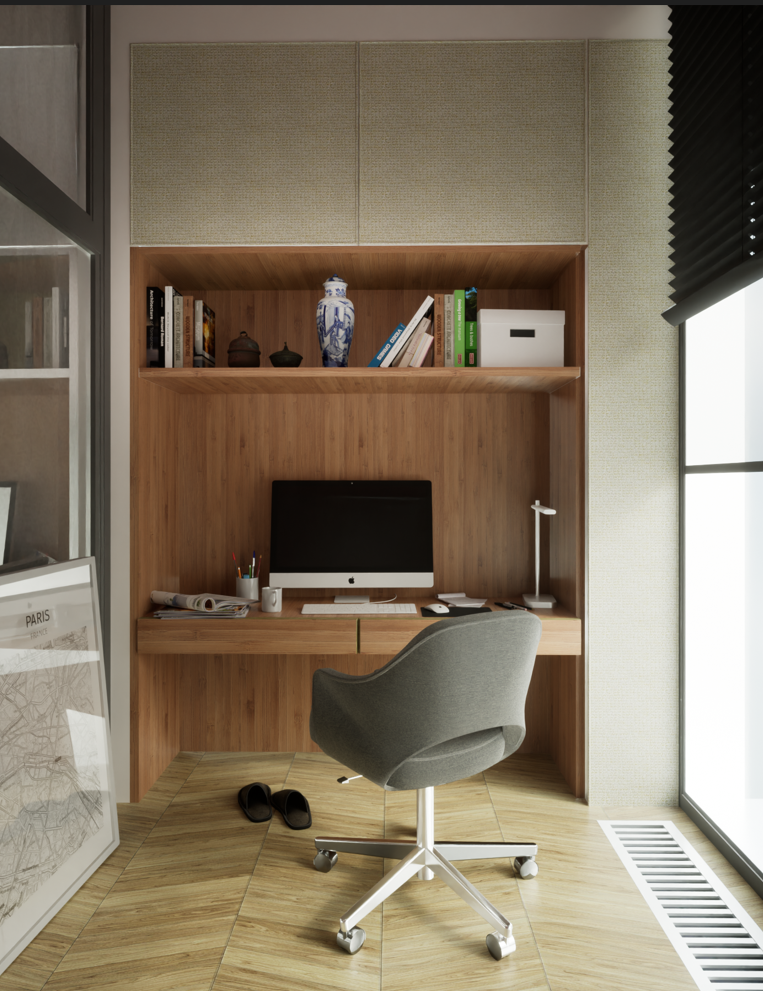
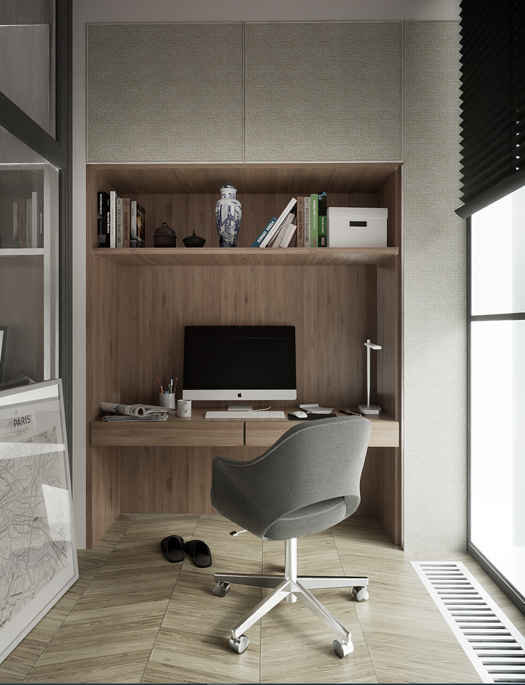
Twinmotion interior render
-
I gave TM a miss for a while as my graphics card was not up to the new version, I was very rusty. I decided to practice interior work as I dont need fog and decals which are now fixed in TM with path trace on. This render relied heavely on an image from Matt Interiors with some minor changes.
(Edited) I think I prefere the desaturated image


-
Really nice lighting and textures/materials. Top notch output.
My only observation is the noticeable texture tiling for the wood. Those 3 knots at eye level in particular.
-
Brilliant.

-
Thanks Rich and Mike. You have a great eye Rich and I would normally fix the tile on the wood material but I will be lazy as it is a timber vaneer and mirroring is common

-
Looks good, I made my minor criticisms elsewhere.
-
@box said:
Looks good, I made my minor criticisms elsewhere.
Yes I saw mate, and agree the optical illusion caused by the chevron flooring. I will change that. I will go with a linear floor. I was going for more normals effect but it backfired. TM is strange when a normals map is used is has a preset of 100% which is actually quite stupid as TM does not know the effect (Power) of the normals map. The preset should be 50% common sense
-
very nice one.
-
-
Wow!

-
I lean towards the more saturated image. More punchy vibe.
Newer one is nice too. I wonder what my opinion would've been if you posted the revision first?
Beauty is in the eye of the beerholder
-
@rich o brien said:
I lean towards the more saturated image. More punchy vibe.
Newer one is nice too. I wonder what my opinion would've been if you posted the revision first?
Beauty is in the eye of the beerholder
I go throuh a hard time fine tunning thats why I post as I cannot se the forrest for the trees at the end and get confused. Thats why I post

-
Very nice.... I was really torn between getting TM and lumion.
I prefer the saturated image as well

-
Both pictures are excellent!

-
here took somebody the same scene and rendered it in twinmotion:
Hello! It looks like you're interested in this conversation, but you don't have an account yet.
Getting fed up of having to scroll through the same posts each visit? When you register for an account, you'll always come back to exactly where you were before, and choose to be notified of new replies (either via email, or push notification). You'll also be able to save bookmarks and upvote posts to show your appreciation to other community members.
With your input, this post could be even better 💗
Register LoginAdvertisement


