Girls Best Friend - New Images
-
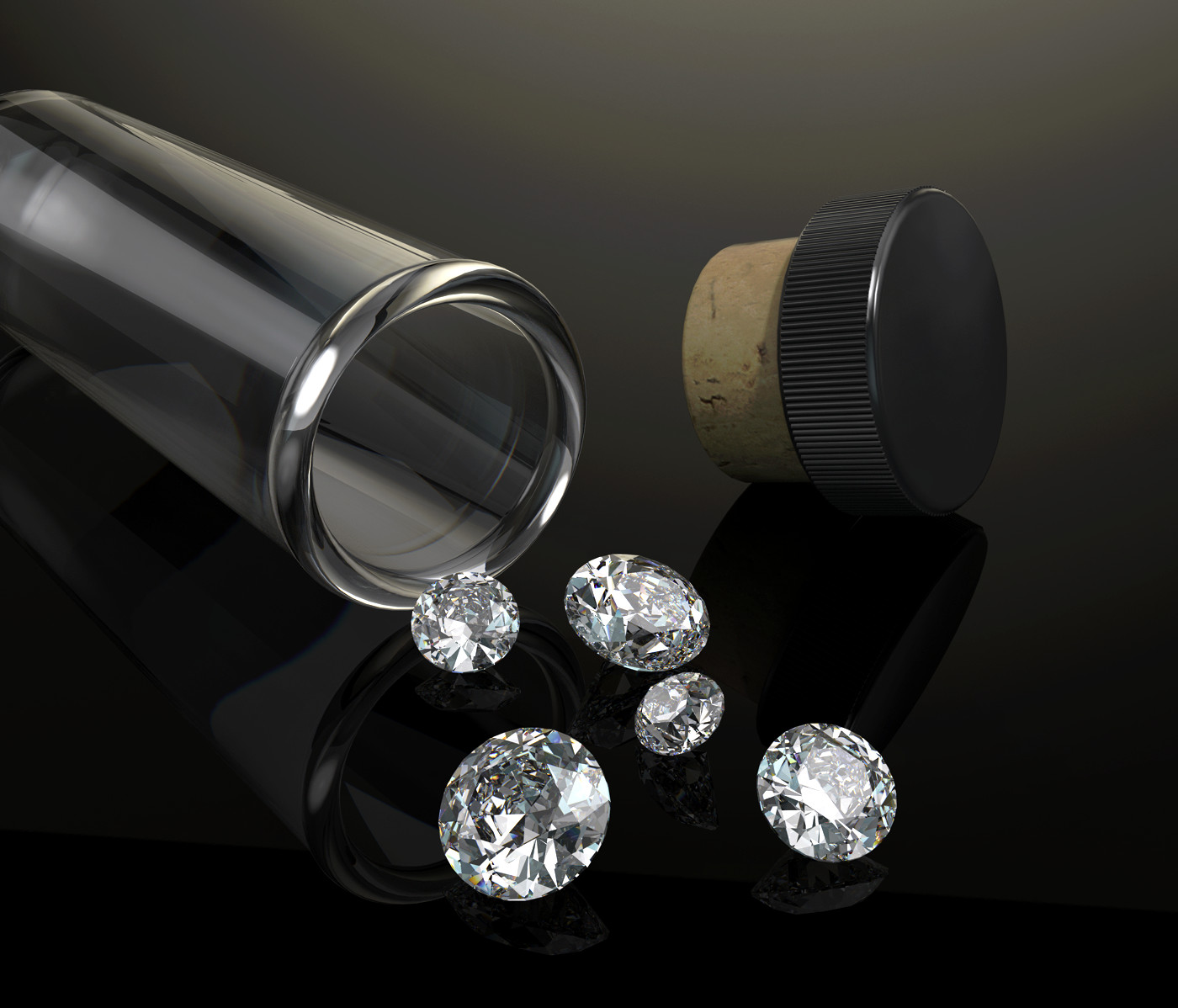
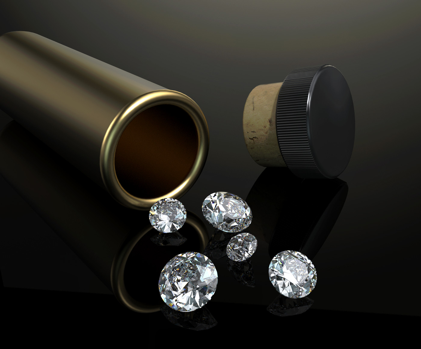
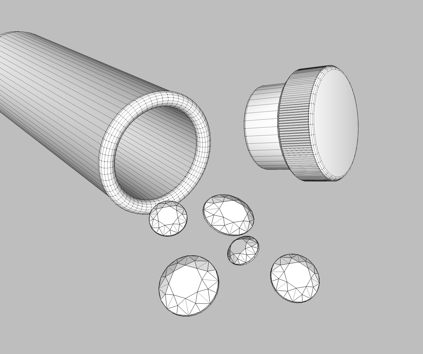
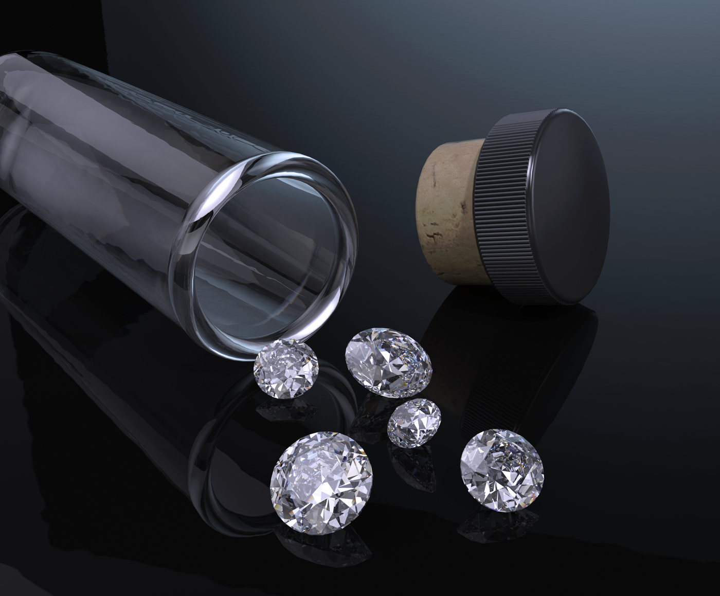
Well you know what they say....... Have played about with this off and on for awhile now. Think I finally got something decent. Remodeled the diamonds a couple of times. Finally found a drawing of how diamonds are actually faceted and tried to get the model as close to that as I could. Lit the render with a "studio" hdri. It took some messing about to not get weird reflections. Wasn't real sure what to expect. Think I like the "glass" tube a little better than the "brass" one. Enjoy.

-
"...Enjoy" - yes I do, very much


the little stones sparkle and reflect like real ones - and the detailing of the black cap is well done also! An impressive work & thanks for sharing -
Great, Agreed on the glass tube rather than the brass one.
-
Looks too artificial too me, but I can't tell exactly what's the reason. Maybe try to move that black away from absolute black, I think that's messing up the light. Also, some depth of field effect might be nice, since it's a small object. If you're really into experimenting, try some bump and dirt maps for the bottle and ground.
-
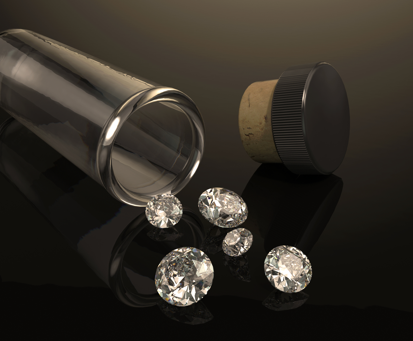
Really appreciate the comments and critiques. In that spirit posting two new images. Made some very minor adjustments to the bump maps of some of the textures. Biggest change was adding a noise map for the glass tube, strength of that map set very low. First image has the same hdri setup as the originals. Second image I rotated the hdri around 160 degrees . If any ones interested the hdri is out of the sketchUcation studio pack #001. It's a multi light setup. Experiments showed the diamonds render best under multiple lights. Forgot to mention all renders done in Twilight. Original images post pro in Gimp. Second set of images very minor post pro in Affinity ( just downloaded it last night ). Second set of images any better...... darned if I know.
-
Much clearer images, brilliant.
-
Thanks Mike.
-
Well done!
-
Thanks Bryan.
-
tuna1957 :
I like the way the diamonds are rendered. garystan -
Very nice to see. And the second set of images really are good. Bravo.
-


-
The final one is "picture perfect"

Hello! It looks like you're interested in this conversation, but you don't have an account yet.
Getting fed up of having to scroll through the same posts each visit? When you register for an account, you'll always come back to exactly where you were before, and choose to be notified of new replies (either via email, or push notification). You'll also be able to save bookmarks and upvote posts to show your appreciation to other community members.
With your input, this post could be even better 💗
Register LoginAdvertisement


