Learning to render with Twilight Hobby
-
A couple of things that might help.
Grab the HDRI studio pack from the store and use one of those as your light source without any sun. So in the environment tab set background to Hemispherical sky and browse for a background image to one of the HDRI you downloaded. Each one will give a different result.
Set the material of your background form to plastic satin or shiny.
This should give you a better lighting structure to play with the other elements.
The critical thing is to create something for the shiny metal to reflect, the Studio HDRs give you this.
You may want your backdrop form to be larger and even a bowl shape with a flat part in the center to sit things on. Different studio layouts give different results. What is outside the opening in your backdrop and where it is will affect how your reflections work.
Remember, The sun isn't great for product renders, you really need to create your own lighting and environment, that can include throwing in other geometry out of camera view to give you something to reflect. With a plain surround all you get is a flat reflection. Look at a flat white wall in a mirror and what do you see? -
Thanks for the feedback Box. I switched over to using the Light here is my first render.
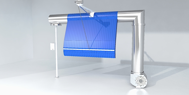
This is much closer to what I want. The reflection I was talking about before was being able to see the equipment reflected in the floor.
Lot more experimenting/learning needed but I feel like I am headed in a better direction.
-
Would you be willing to send me that SketchUp model? I'll try rendering it to see what I can get.
-
@dave r said:
Would you be willing to send me that SketchUp model? I'll try rendering it to see what I can get.
Here is the model..............
IP Stripper-inside.skp
Yes, I need to go read some more of the tutorials about applying lights.However, I had to try one more little wrinkle first..........
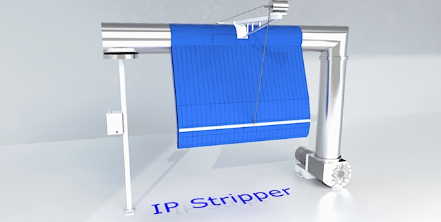
-
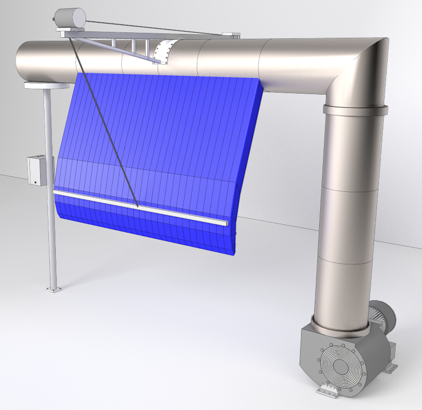
I didn't spend much time on this and I only set up a material for the large diameter pipes and the blue thing. It could be better but I just wanted to get a quick render out. What do you think?
-
Dave, I like this better. What renderer are you using? The sections above the blue blower are blue also. I like the color of the metal better as well. Maybe just a little more hint of silver but it has a better degree of shine than what I am coming up with.
-
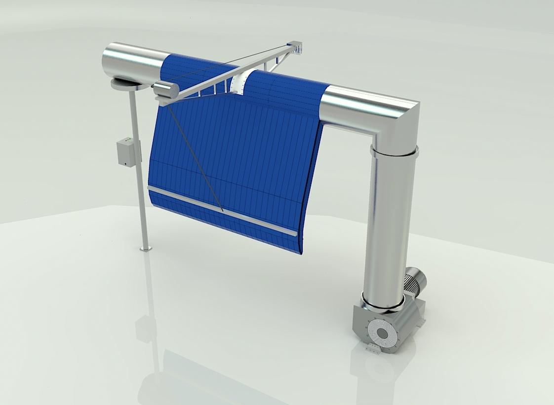
Here's a quick one.
I've changed no materials, so there is plenty of scope to play with those.
As I described above I used a flat bottom bowl as the background, turned off the sun, set it to hemispheric sky and added number one hdr from the sketchucation studio pack, reduced the brightness to 3, deleted your light and your box and rendered on easy medium for less than 2 minutes.
If you create a good environment you have good base to start editing your materials.
-
@ntxdave said:
Dave, I like this better. What renderer are you using?
This was done in Kerkythea.
@ntxdave said:
The sections above the blue blower are blue also.
Oops! Since that entire horizontal pipe is all connected geometry, I painted it all the same.
@ntxdave said:
I like the color of the metal better as well. Maybe just a little more hint of silver but it has a better degree of shine than what I am coming up with.
That metal is from a preset. I didn't bother to edit it but I could have made it look more polished. The background is the default front face color.
-
Sorry no Twillight presently under hands!

So Simlab
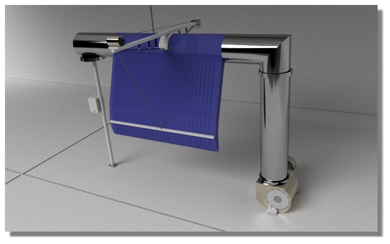
Then Fotor
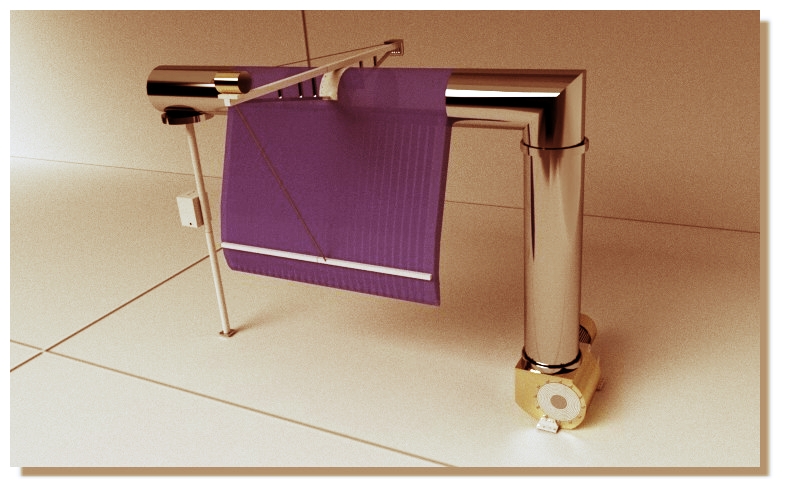
Then Fotosketcher + Fotor
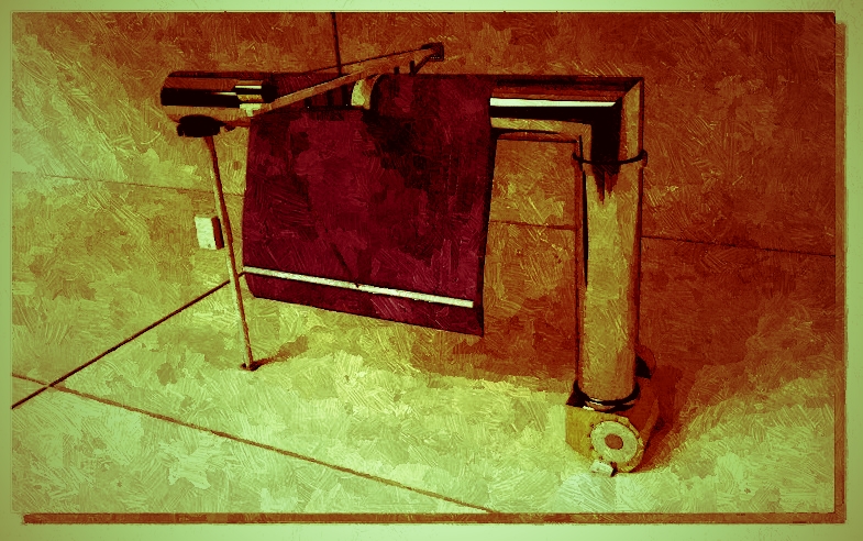
-
Nice to see a clear system of feedback and real progression here! Keep it up!
-
You guys are all making me feel bad. Why am I having so much trouble learning how to do this?
@Box, @Dave R, & @Pilou You are each showing me some really good results. I do not seem to be getting the hang of things. I am trying to learn one step at a time but seem to be going backwards. Box, in particular, I really like the reflection of the equipment in the floor. Pilou, your colors in your first render really stand out to me and I like the floor tile.
I have been using Twilight because it is free. I was trying to apply one of their lights but I have to admit something about the 3 click process is not going well for me. Do not fully understand where I am going wrong.
@box said:
Here's a quick one.
added number one hdr from the sketchucation studio packWhat is the sketchucation studion pack?
-
-
Dave,
Did you use a edge overlay in the render? Nice job. I think the metal as he says is nice, because the other metal looks too perfectly reflective to be realistic.
Peter
-
-
I appreciate the patience all of you are showing me. I do not understand why I am being so dense. Box, there is a download of things that can be used with Twilight on the Kerkeythea site. I used one of those in this latest renderings using the settings like you suggested. Even with my "box" background, it looks much better. I just need to keep reading and exploring/trying.
This one is much better (because of your information).
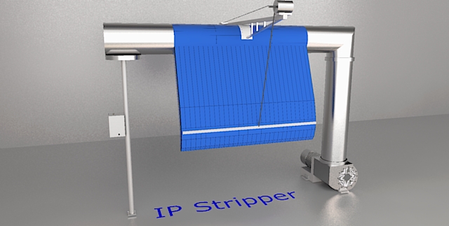
I did lighten up the blue cloth a little and will go back and lighten the wall a little.
This is just the medium setting @ 1:06. I am sure the high setting would make it even better. -
@ NDave : You will be surprised, I never made renderings, it's not my cup of thea, i just make translations of Render manuals or sites of render's engine, or UI!
Like these ones for TwillightRender, Visualizer, Podium, LightUp, SimLab etc... !
For the render above I just read what has said Box and voilà!

(the only difference is the apply of a standard Wall/Floor material)
So you can make the same in Twillight!All renders today make quasi all the same things, just difference is the ergonomy!
@unknownuser said:
I have been using Twilight because it is free.
Twillight is perfect!

@unknownuser said:
3 click process is not going well for me
You right if you are hobbyist prefer the "one Click"! Alas this one is pricey (see KeyShot)
-
@pbacot said:
Dave,
Did you use a edge overlay in the render? Nice job. I think the metal as he says is nice, because the other metal looks too perfectly reflective to be realistic.
Peter
Peter, yes. I did use an overlay. Actually, I pasted a Hidden Line exported onto a separate layer set to Multiply. I made the Hidden Line export at 4k or 5k wide and resized it down to the size of the rendered image so that the lines would be very thin. I also adjusted the opacity of that layer so the lines would be fairly light. All very quick and easy to do.
@ntxDave, I could have also made the floor reflective but as I said, I was just trying to make a quick example and didn't bother setting up all of the materials.
-
-
Ugh! I just missed a 'render this' challenge.

-
@solo said:
Ugh! I just missed a 'render this' challenge.

Welcome aboard but the real challenge is me learning how to use a rendering engine.

Hello! It looks like you're interested in this conversation, but you don't have an account yet.
Getting fed up of having to scroll through the same posts each visit? When you register for an account, you'll always come back to exactly where you were before, and choose to be notified of new replies (either via email, or push notification). You'll also be able to save bookmarks and upvote posts to show your appreciation to other community members.
With your input, this post could be even better 💗
Register LoginAdvertisement
