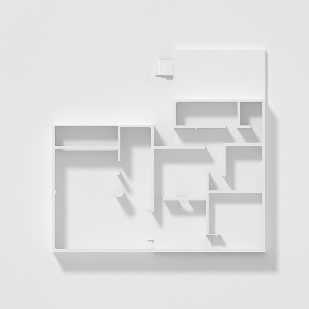
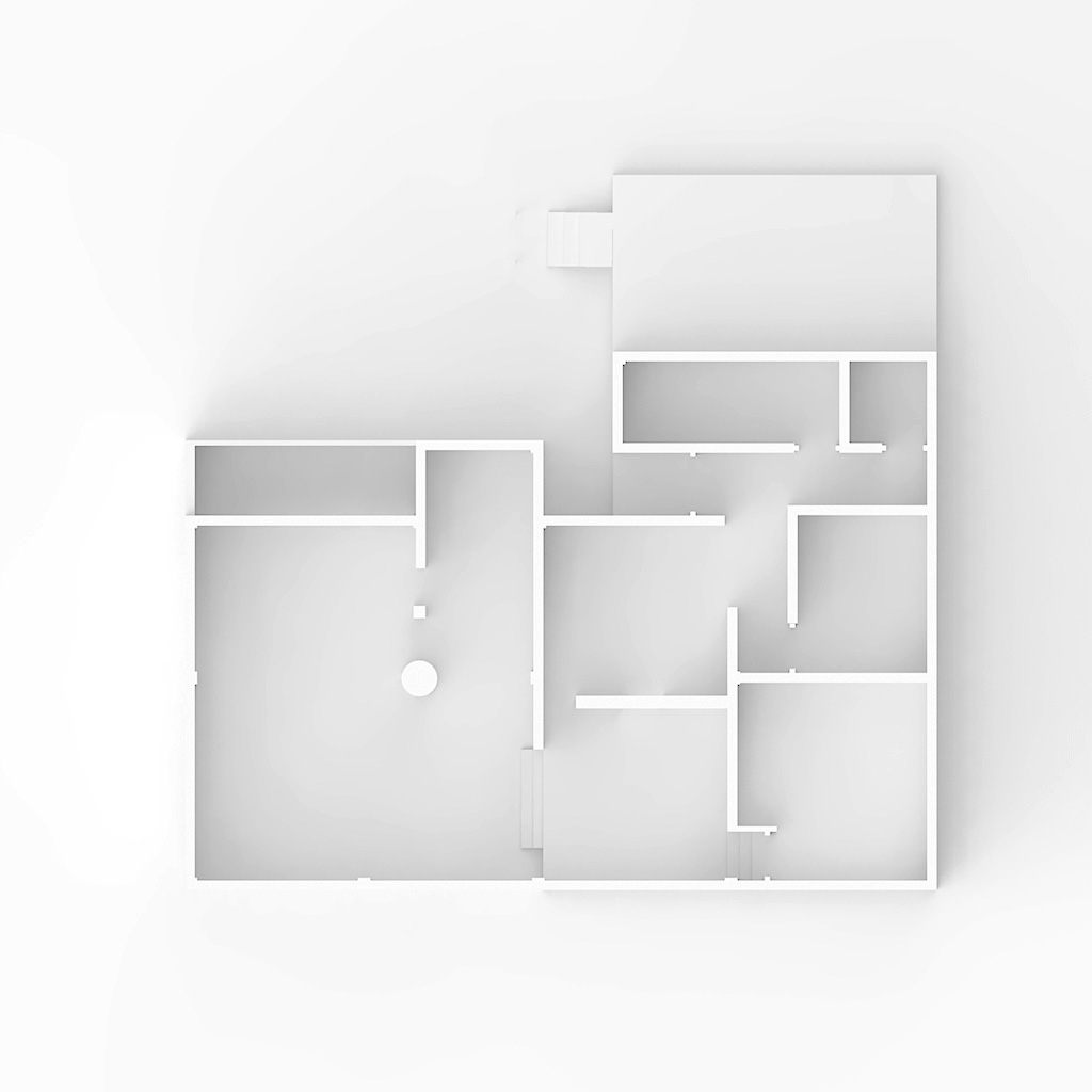
How did the great Alex Hogrefe do it ?
-
@unknownuser said:
The radius changes the position of the sun,
Odd, that should not happen. Would you mind to post the scene?
-
larger radius does not change the sun position. Large radius = softer shadows. Small radius = sharper shadows. You must have soft shadows checked to see the effect of changing the sun's radius.
I really love how this project is going, I find plan shadow studies very pleasing on the eye.
-
-
Ok, here is a try. Raw KT output.
Of course, as I said before, you can change the softness of the shadows by changing the radius of the sun.

scene_3.zip -
Legit amazing.
-
Could you pleas tell me how you managed to achieve that clear white look ?
& I see you have arranged the file, and added other elements.
-
Well I've posted the scene, have a look at it. The render is a raw output of that scene, so just pick a clay render preset (I think I've used the 22 if I remember well, but more or less any clay preset will work) and render it. I added nothing, just tuned sun's multiplier and radius.
-
Oh and, if i remember well, also reduced the gamma from 1.5 to 1.2. Anyway you have the scene to look at.
-
@massimo said:
Well I've posted the scene, have a look at it. The render is a raw output of that scene, so just pick a clay render preset (I think I've used the 22 if I remember well, but more or less any clay preset will work) and render it. I added nothing, just tuned sun's multiplier and radius.
Much appreciated, sir.
Have a nice day.
-
My pleasure.

-
Here is another quick try using a HDRI for lighting. Perhaps more similar to the reference image you posted. The "direction" of light is less clear and you have less control on it and shadows are really soft, but the overall effect is pretty effective I believe. Only a slight levels correction in post pro.

-
Yes, this looks even better and less sharp.
Especially if you are going to place furniture and other data on the plans.
Could I please know what HDRI you used on this ?
-
You can find it here. Scroll down the page, it's called "van Kleef 3". I have made a black&white version of it. Also when you use a HDRI in KT is better to switch off "linear lightflow". In KT go to settings-->advanced-->scenes-->"you scene name"-->default global settings-->right click on the green thumbnail.
You may need to boost the HDRI intensity. -
Thanks, but what does switching it off do ?
This is what I get :

-
Could you upload the last update you made please ?
-
@unknownuser said:
what does switching it off do ?
Basically it has to do with gamma setting of the HDRI: if HDRI has gamma correction set to 2.2 (most of them are that way) you should turn it off. If gamma is set to 1.0 the it has to be turned on. Just try to render with it turned on and off and see what happens.
@unknownuser said:
Could you upload the last update you made please ?
If you mean the scene with the HDRI then I can't because I deleted it. Anyway you have all the infos to reproduce it I guess.

-
Oh, I see.
Yepp, I'm still baffled about the sun jumping from its place when i change the radius tho.

-
I was also wondering, how yours looks more "Black & white" ?
-
Be sure you don't have any color for sun/sky/HDRI. Also if you use the HDRI be sure to disable the sun.
Hello! It looks like you're interested in this conversation, but you don't have an account yet.
Getting fed up of having to scroll through the same posts each visit? When you register for an account, you'll always come back to exactly where you were before, and choose to be notified of new replies (either via email, or push notification). You'll also be able to save bookmarks and upvote posts to show your appreciation to other community members.
With your input, this post could be even better 💗
Register LoginAdvertisement


