FONT- Need a quick favor (from windows user)
-
hola..
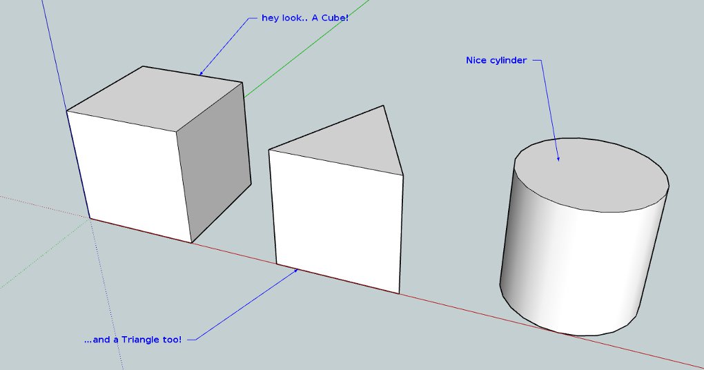
can someone on windows (maybe someone with and someone without the font 'Helvetica Neue' installed) open this and post a screenshot of it?
I'm having a weird problem with someone i sent a .skp too.. I imagine it may be related to the fact that i use a standard mac font in my template and this person doesn't have it on their system?
thanks!
fwiw, it looks like this on my computer:
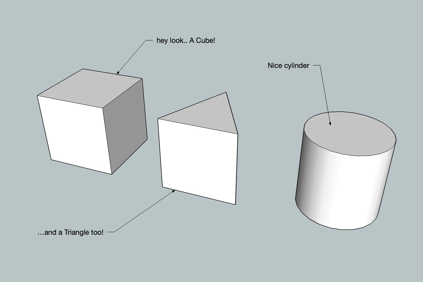
-
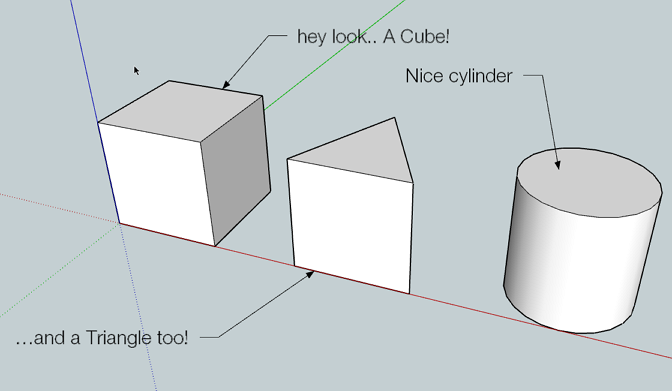
-
cool.. thanks..
yeah.. it looks like the problem might be something along the lines of windows showing the text much larger than on my computer.
(the A in 'A Cube' is over the triangle in yours where as on mine, the whole cube sentence didn't even make it to the triangle.. i'll start using a different font i guess.. i just never really liked the default sketchup font (tacoma i think)..what else is pretty standard on windows? (not calibri because i might end up having the same problem for mac users.. calibri isn't standard on mac..)
-
Arial
-
@rich o brien said:
Arial
that looks ok..
can you do the same thing again with this file? (just gotta make sure it's not my font size (24pt) that's causing the problems)
-
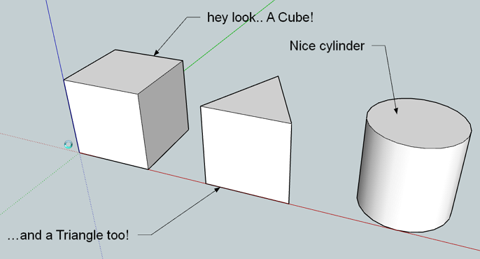
-
bummer.. looks like i have a bigger problem than just the font i choose..
maybe it's because i'm doing this on a high rez screen? (15" laptop @ 1680x1050)..
more tests are in order but i was hoping this would be a simple fix

thanks for the help rich
-
ugh..
this problem is going to start being more prevalent soon..
apple is rumored to come out with a 15" 2880x1800 very soon..
the display i have now will be middle of the road in a couple of years..
people will still have today's standard resolutions..
the text is being displayed as if it's a web browser (or something) with no regard to what's going on in the viewport..[EDIT] oh wait.. one more test please

this one has the font size set via 'height' instead of 'points' (5" in this case).. i wonder if that will get things under control?screenshot please

thanks
-
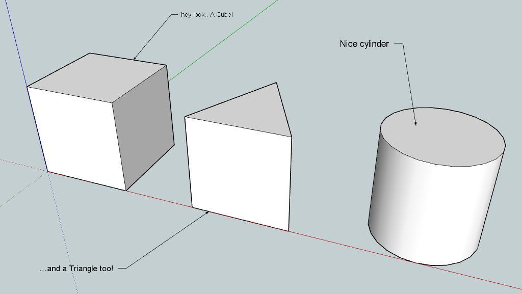
Jeff FYI
The pic is using TT font DejaVu Sans bold 12 pt.
24 pt ~ 32 px, 12 pt ~16 px
I 'm running 1680x1050 96 dpi
Your 5" about the same as your orginal post except not bold -
ok. thanks
so apparently, setting font size by 'height' will consider the sketchup viewport so using that setting instead should give a consistency across different monitors..
in contrast, your 12pt example more_or_less matches the one i posted at 24pt (which explains why many .skps i open with text has such tiny text.. i'm always wondering why people are using such small text in their .skps
 .. now i know)..
thanks again for the help

-
Roger
I will continue to look at this time permitting. We have the same monitor res. set but get different results which I don't understand
-
FYI
Your Helvetica Neue font is not one available either in the SU model info nor in my fonts showing in my control panel fonts. Guess is SU is using some type of default but what?? However when I change to fonts available in SU the same problem shows ( at 24 points) unless of course I change the size also?? -
@mac1 said:
Roger
I will continue to look at this time permitting. We have the same monitor res. set but get different results which I don't understand
we have the same amount of pixels but my overall screen size is smaller than yours (the individual pixels are smaller on my laptop than on most monitors).. my screen is 15.4" diagonal which means my pixels per inch is around 130 instead of your 96..
so text at 24pixels high on my screen appears smaller than on yours.Helvetica Neue is the default font used by most mac apps.. sketchup default text is tacoma but i changed it in my template to Helvetica Neue some time ago..
at first i thought that might be the problem but it's not.. i think if i share a .skp with you which contains a font which isn't on your system, your sketchup will just replace the font with something you do have (probably tacoma)..
i believe the problem i was experiencing (basically, the person i sent a .skp to couldn't understand my text because it was enlarging/overlapping itself and creating a big mess of text) has to do with difference in resolution and me setting the font size via points instead of height.
-
Thanks for the info. Learn something from you every day.
A word of caution. The 5" font is not adaptive with the model size. It stays the same even for a small model. Scale your 5" test down and see what happens. -
Hi Jeff
I think what you are experiencing may have to do with a bug I ran into recently. Apparently windows and mac versions of sketchup have different ways of measuring text height!
Simple test. Create a 3d object on the pc, using arial for example. Note the text height used. Save the file. Open that same file on a mac. Try and recreate the same text, using the previous parameters. Compare. ,!!! No matter what you try, they will not match.
Hello! It looks like you're interested in this conversation, but you don't have an account yet.
Getting fed up of having to scroll through the same posts each visit? When you register for an account, you'll always come back to exactly where you were before, and choose to be notified of new replies (either via email, or push notification). You'll also be able to save bookmarks and upvote posts to show your appreciation to other community members.
With your input, this post could be even better 💗
Register LoginAdvertisement


