Architectural models - untextured, unrendered
-
An even less polished attempt at a model of the existing structure. The railing really pretty much looks like that.
-
Great work. It reminds me of a job I was involved in a while back. Although this ended up as a monster file colored, textured and rendered, in the early stages we presented them as simple line drawings. I was always fond of it, maybe because of a background in hand rendering. I had several, but could only find this one.
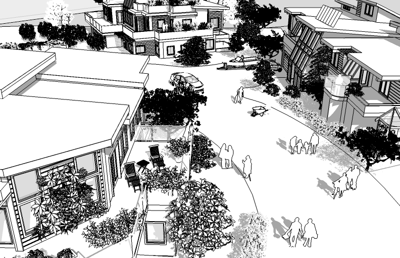
-
Nice to see other work that keeps it simple.
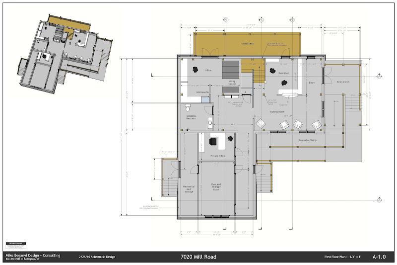
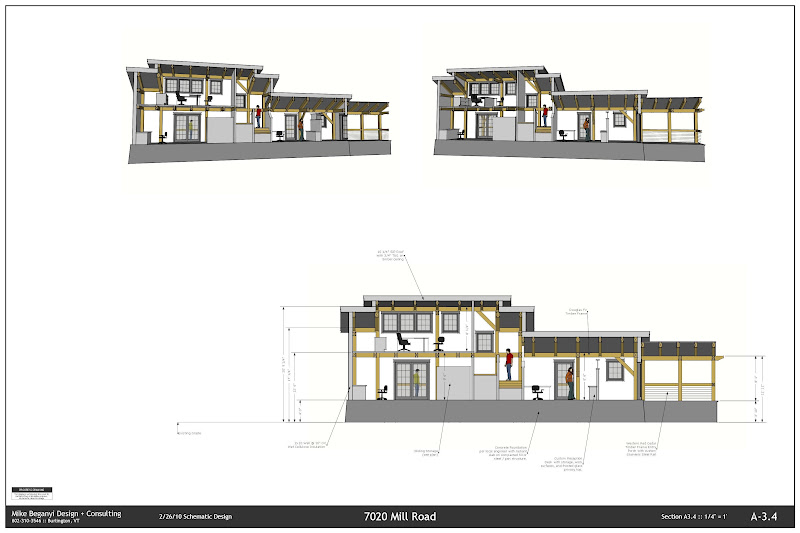
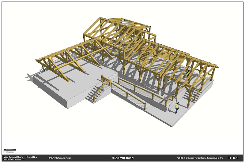
I posted these over in the LO discussion on construction documents: (size will hurt me here, these were 24x36" PDFs)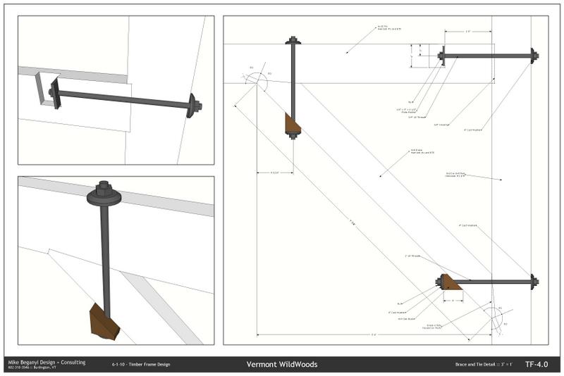
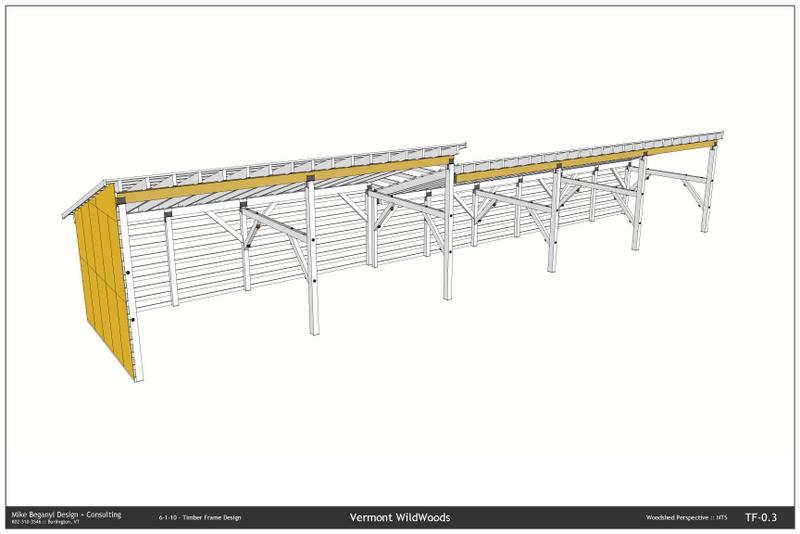
Another project:
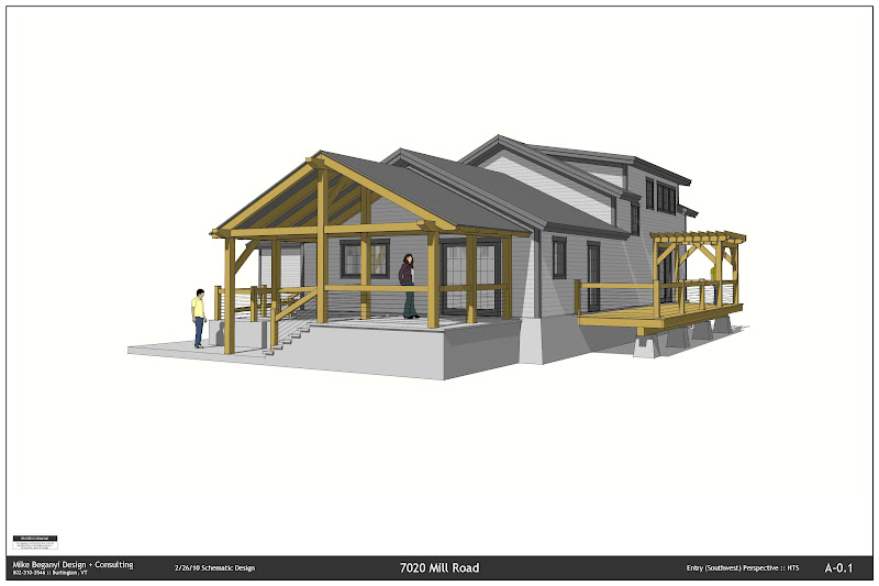
-
You guys have some great work. Love the play of the shadows and minimal textures.
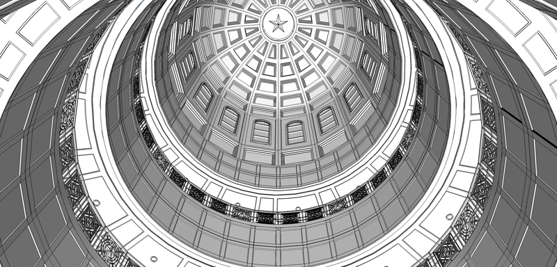
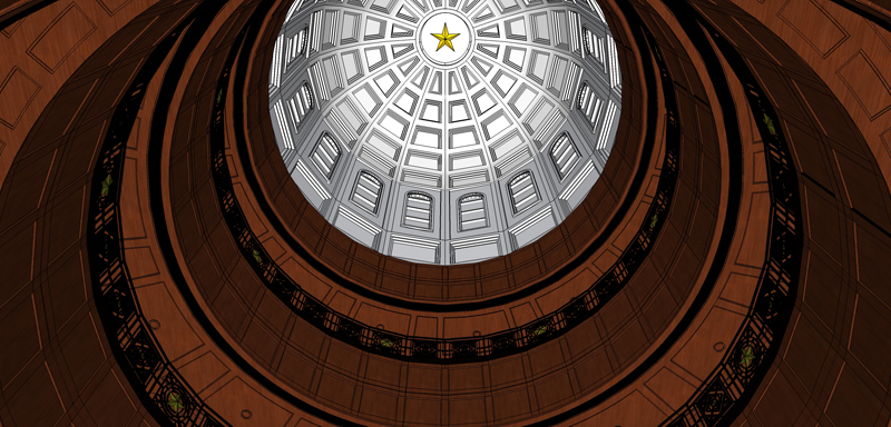
Here is a little dome I am working on for a Court House.
-
Wow, it's refreshing to see some native SU work. Excellent work. The simple style really works well on these very detailed models you are all showing.
-
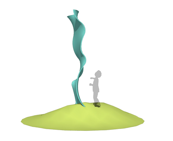
here's a couple of sculptures to mix it up a bit.
baz
-
great stuff!
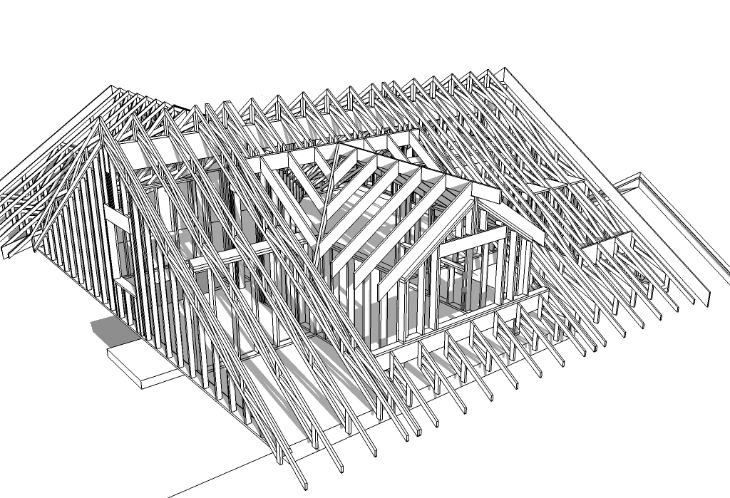
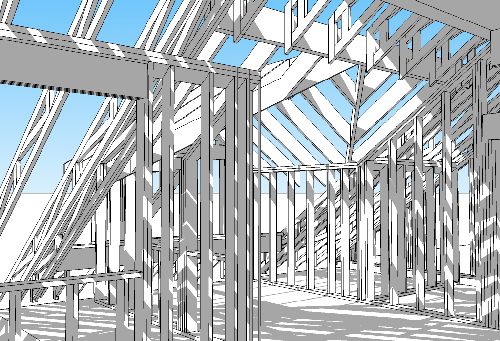
Here's one that I did a while back to solve some framing and truss issues.
-
A few quick shots of recent work (design by another firm):
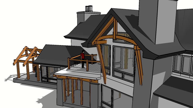
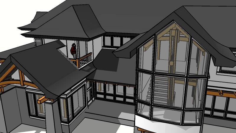
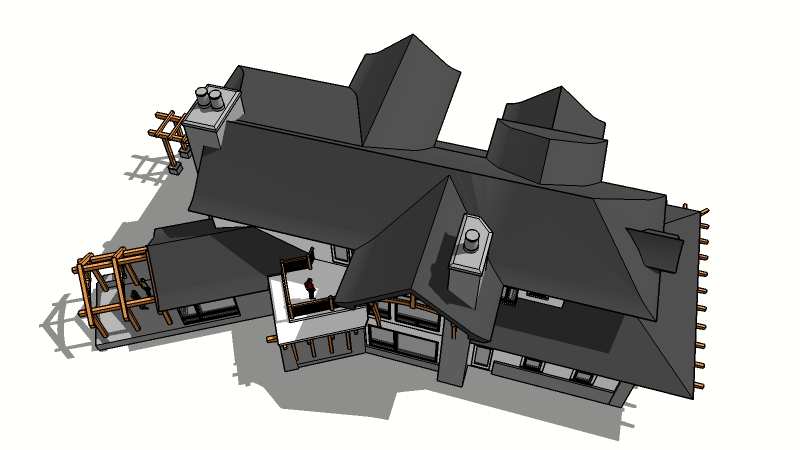
-
Looks great.
-
Carkeek renovation exterior - CURRENT - more or less
This is the same as was posted before, only larger. Is it too large, obnoxious, requiring scrolling? I did notice some glitches. The improved quality doesn't show until you play it.
[flash=1280,745:3rskvj8r]http://www.youtube.com/v/QE8L8jD6xuA&hl=en_US&fs=1?rel=0&hd=1"></param><param name="allowFullScreen" value="true"></param><param name="allowscriptaccess" value="always"></param><embed src="http://www.youtube.com/v/QE8L8jD6xuA&hl=en_US&fs=1?rel=0&hd=1" type="application/x-shockwave-flash" allowscriptaccess="always" allowfullscreen="true" width="1280" height="745"></embed></object>[/flash:3rskvj8r]
-
Thanks for your future response, ecofeco. I replaced the videos with the larger size.
-
Thanks much, Pilou and Hieru!!
Native SU scenes, with added patience and practice. (For instance, this was processed overnight, and I'm not doing it again any time soon even though parts are too dark to see what I'm trying to show.) Set everything to a minimum (delays, size, fps, no shadows, etc.) to do tests. There are good tutorials online. I am far from expert.
-
test embed - WIP - all my postings to this thread are of this same project
Carkeek renovation interior - CURRENT - more or less
[flash=1280,745:5o7ctb76]http://www.youtube.com/v/yX6vYGpw2kg&hl=en_US&fs=1?rel=0"></param><param name="allowFullScreen" value="true"></param><param name="allowscriptaccess" value="always"></param><embed src="http://www.youtube.com/v/yX6vYGpw2kg&hl=en_US&fs=1?rel=0" type="application/x-shockwave-flash" allowscriptaccess="always" allowfullscreen="true" width="1280" height="745"></embed></object>[/flash:5o7ctb76]
Direct link for smaller (formerly larger) display of same video
For those like me, learning this linkage stuff, the above EQUALS:
Direct link for smaller display:
http://www.youtube.com/watch?v=yX6vYGpw2kgAND IS:
'left bracket' url=http://www.youtube.com/watch?v=yX6vYGpw2kg]Direct link for larger display[/url 'right bracket'
Hello! It looks like you're interested in this conversation, but you don't have an account yet.
Getting fed up of having to scroll through the same posts each visit? When you register for an account, you'll always come back to exactly where you were before, and choose to be notified of new replies (either via email, or push notification). You'll also be able to save bookmarks and upvote posts to show your appreciation to other community members.
With your input, this post could be even better 💗
Register LoginAdvertisement


