Old Downtown
-
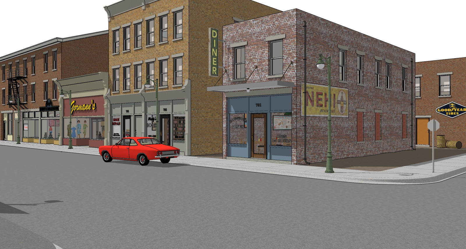
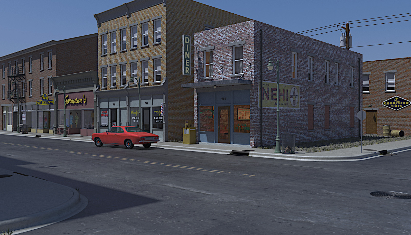
Have had the idea for this for quite some time. Finally trying to finish it ! Is my first serious attempt at using Match Photo for the buildings. Still have some of the small bits and pieces to get modeled. Intend this for a late night render experiment. Have to see how that goes.

-
Good start. Looking forward to see where you go with it.
-
Whoa. Match photo?
Whoa. Excellent modeling.

-
Thanks ntxdave. Thanks Bryan. Nothing real exciting about using match photo on my part. Just used it to get the approximate size of the buildings worked out , widow spacing and such. Reference photo wasn't high res enough to be real exact. Took a fair amount of adjusting after getting basic shapes.

-
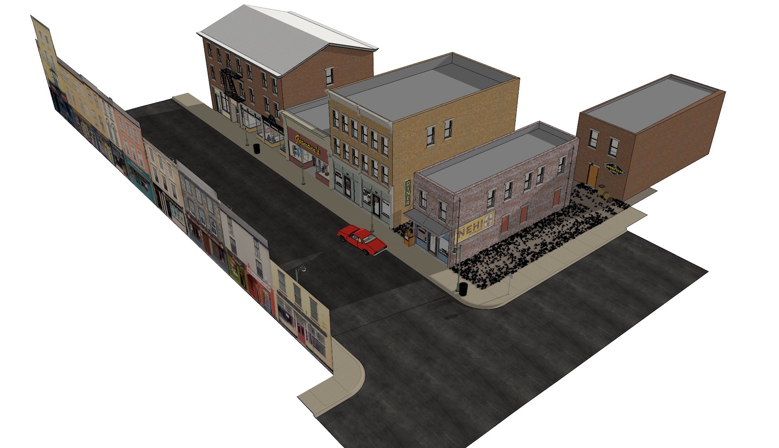
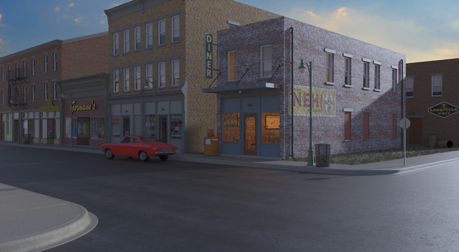
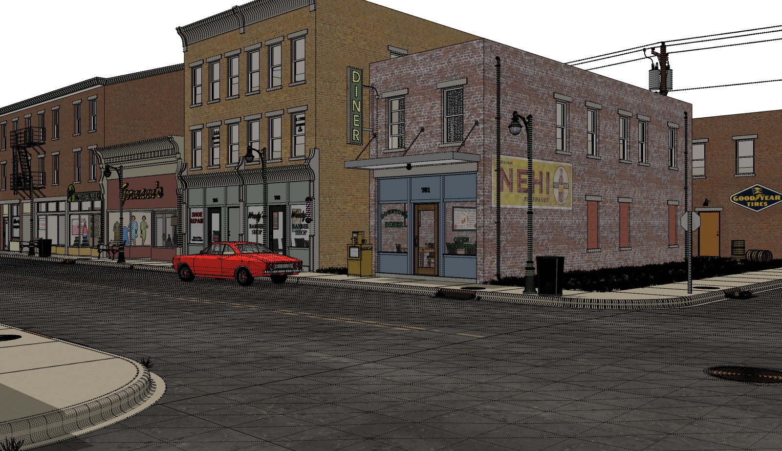
Think I have the modeling part done.... Starting on render testing. An early morning render test , mainly checking texture set ups. Also posting an overall view of how I've set up the model if that's of any interest.
-
OK, call me dumb. I do not understand the buildings (picture of buildings) across the street from the original buildings in the first image. However, I am looking forward to seeing where you are going. Looks like you have a great start.
-
ntxdave , no question is dumb it’s how we learn. The building cutout is to give reflections in the windows of the storefronts in the render view.
-
Aaaah, I missed that. Views it on my small iPad so did not see them.

-
Hi Tuna, Really nice start mate
 If you have the patients to finish it properly and are willing to take the time with details that is going to be an absolute cracking render

Just a thought....SU "fog' may assist with the atmosphere if done well
I have attathed some models/textures that may be worth considering using in your model. The intersecion might be gold if you can scale it to fit.
Also have a look at models by "Cronoz-artes" in 3D Warehouse, he is amazing with texturing. His street furniture would be perfect to use in your model....absolutely perfect
Hope this stuff helpsHave a look at: https://3dwarehouse.sketchup.com/user/daa5767f-cf34-4300-ae9a-361f5e702660/Cronoz-artes#contact. He is amazing
-
L i am , Thanks for your input it's always helpful. Appreciate you taking the time to post some models although I can't use them
 , I work in SU 2015 primarily but also have SU2018 installed...... Not real big on using models out of the warehouse , I try to muddle my way through the best I can building what I need if I don't have it in my "model library" already. Will admit though the car I'm using is a Formfont model purchased back when I was still getting paid for this kind of work. Also have some curtains in upstairs windows that are out of Solo's Curtain Pack in the SketchUcation store.
Have a pretty good visual in mind of where I want to go with this model, trying to recreate a montage of places I've been and seen in earlier years before stoplights on every corner and signs every five feet telling you what not to do....
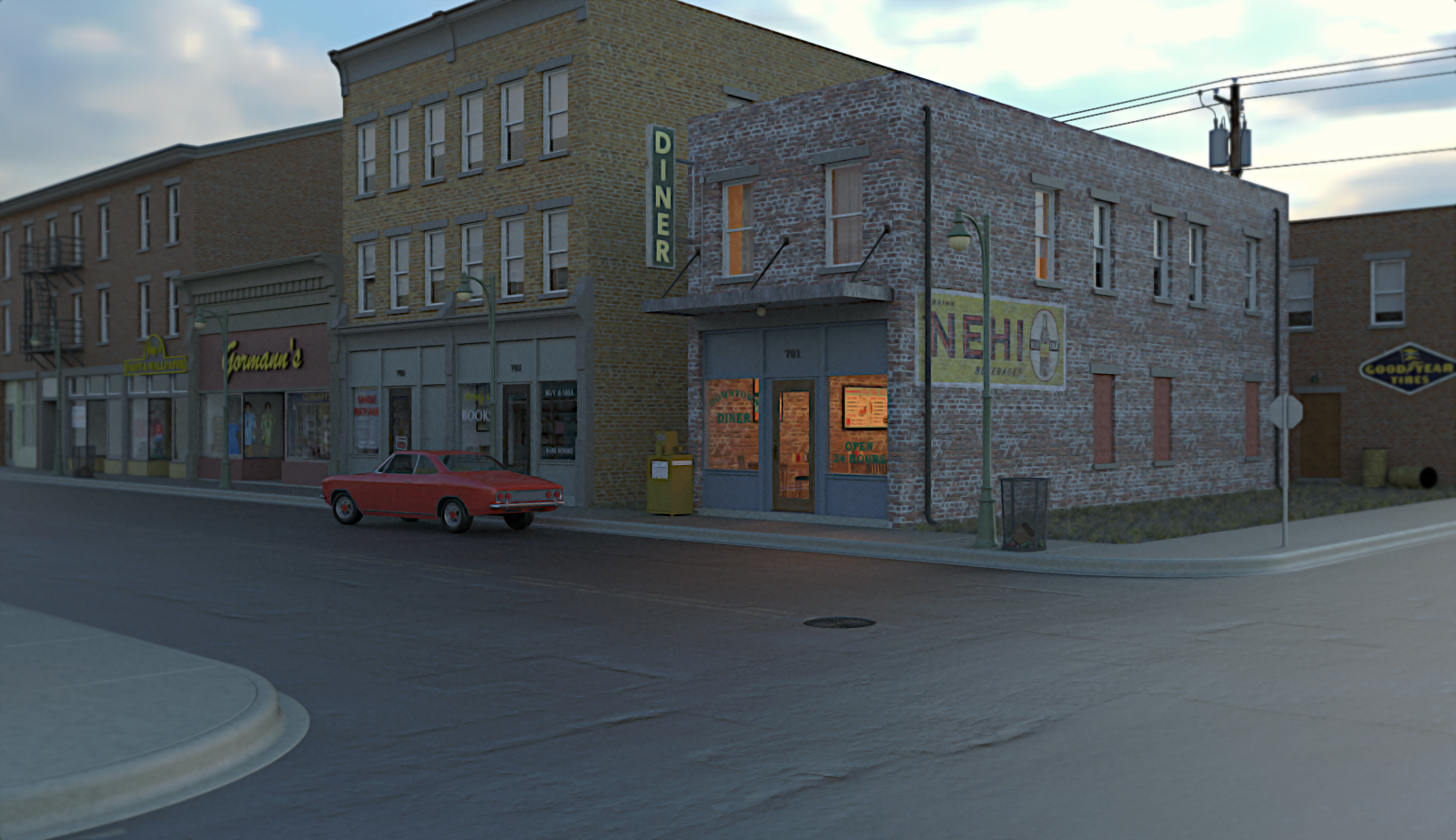
Guess I'll keep pecking away at it as time allows.... Posting another lo-res render test. Messing with textures and tried a sunrise HDRI I haven't used before.... Cheers all
 .
.
-
All good Tuna, Just in case you can use them I have attached models in SU 2015. Others may do so as well.covers and patches 2015.skpIntersection 2015.skp
-
Looking good. Real good. Keep on.

-
L i am , didn't really expect you to go to the trouble of reposting those models, many thanks for the effort. Thanks Bryan , still plugging along . Making little changes , tweaking on textures and bunches of quick test renders. I'll get there eventually

-
Very nice piece, looking forward to progressions.

-
Thanks Mike. Here's another test render..... been making small changes to the model itself and down to tweaking texture set ups in Twilight. Doing bunches of short test renders..... All in all it's progressing I think

-
-
Thanks ntxdave. Still tweaking on the model and textures. Getting a little carried away, models up over a million edges now
 Road surface giving me fits. What looks good in daytime render not so good when I test. It in nighttime light. Go figure. I’ll get it figured out eventually
-
Yep. Looking good!
-
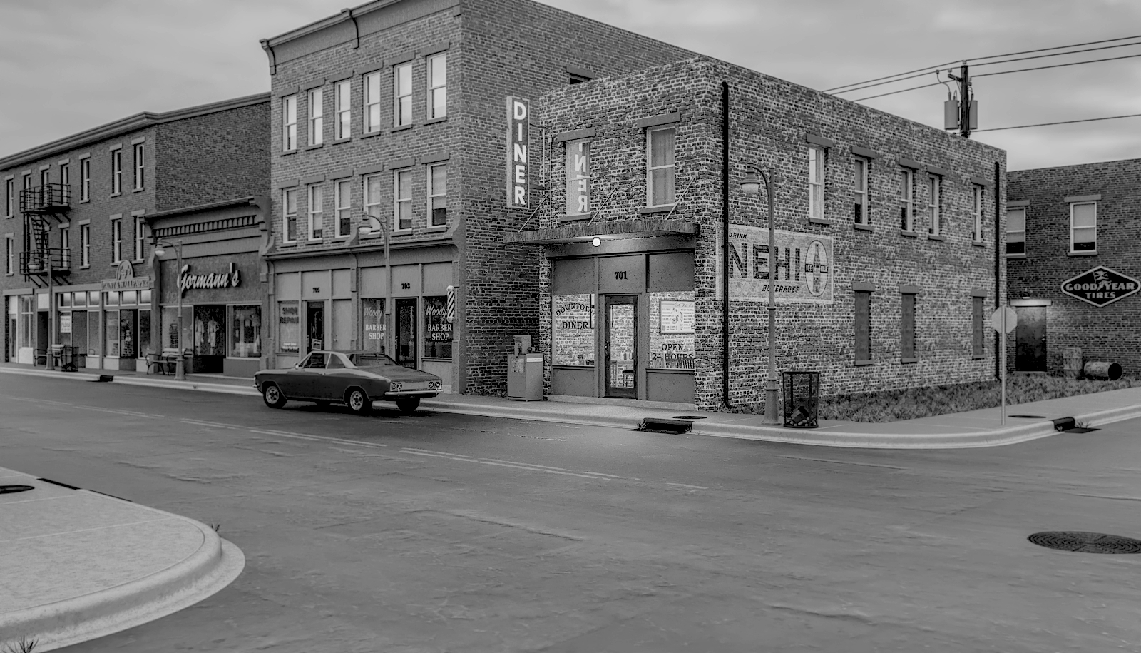
Thanks Bryan. Posting the latest version of the model as of today. Minor tweaks here and there ! I'm starting to obsess
over the details now....... . Also posting a test render that I took into Gimp and went black and white with it. Was kind of fun experiment that I've never tried before
-
In some ways I think I like the black and white one the best. Given the type, and apparent age of the buildings and car, it looks like an old photo of a small town (kind of like the town where I grew up) back in the 50’s.

Hello! It looks like you're interested in this conversation, but you don't have an account yet.
Getting fed up of having to scroll through the same posts each visit? When you register for an account, you'll always come back to exactly where you were before, and choose to be notified of new replies (either via email, or push notification). You'll also be able to save bookmarks and upvote posts to show your appreciation to other community members.
With your input, this post could be even better 💗
Register LoginAdvertisement


