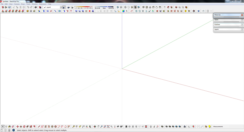
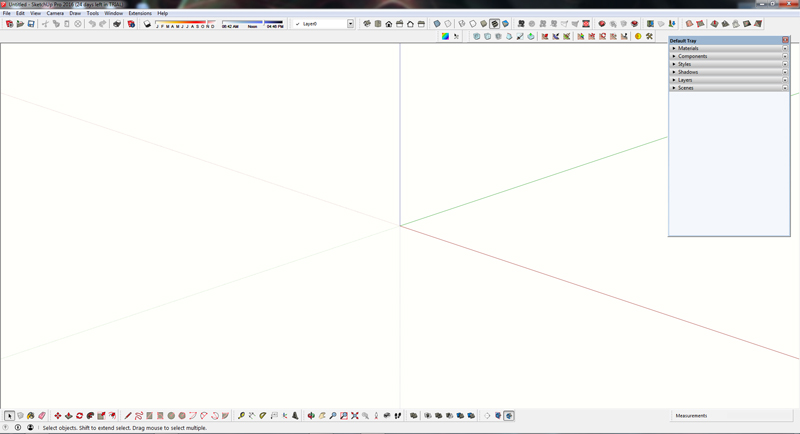
SketchUp 2016 is here....
-
@solo said:
[attachment=0:pxnbjdin]<!-- ia0 -->TOOLBAR.jpg<!-- ia0 -->[/attachment:pxnbjdin]
edit lines to components is actually called S4u-to components
Thanks Pete,
I'll now check these out.
-
@clayton49 said:
I'll now check these out.
Just to make clear: some of them are commercial plugins ($) and Skatter isn't yet published (but will be commercial too).
-
Anyone else noticed that when using a tool from any toolbar other than those native to SU, it is no longer highlighted in the toolbar? This even includes the extension toolbars that come with it, like Sandbox Tools and Dynamic Components. Not a big deal, but a little puzzling indeed.
-
@pherim said:
Anyone else noticed that when using a tool from any toolbar other than those native to SU, it is no longer highlighted in the toolbar?
Had never noticed it... It's true!

-
To all,
SketchUP/Layout improvements for the recent 2016 release as listed below may not please everyone I’m sure. However any improvement to software we use has to be welcomed, especially when it seems SU HQ release updates each year.
SKETCHUP
Trimble Connect
Reload Components with 3D Warehouse models
Generate Report 2.0
Enhanced inferencing and tool improvements
Customizable Utility Trays on Windows
Refreshed Textures
Support for High DPI Graphics
Extensions Loading Policy
Welcome Dialog Refresh
Knowledge Center Update
Support for El Capitan and Windows 10LAYTOUT
LayOut cloud references
Small dimensions
LayOut layers
Optimized PDF Export from LayOut
Documentation ImprovementsFor me, the main ones are: Enhanced inferencing, Small dimensions, LayOut layers & Optimized PDF Export from LayOut.
One item I thought was way overdue for improvement is the SU layer dialogue. So I’ll just have to WHISH-LIST this one for SU 2017. In the meantime I’ll keep on using the superior layers dialogue EXTENSION called Layers Panel by Jiminy-Billy-Bob. It does some of the stuff I note below a good Layers dialogue should do in my opinion.
Layer Folders for specific layer names.
Move to layer by selection.
Layer on/off by selection.
Layer as active by selection.
Layer active only by selection.
Layers all on.
User to dictate layers order, not alphabetically, i.e. an move up/down arrow button with lock order.I also wondered what direction SU HQ were taking in terms of future development, I even muted it may even start looking at some form of basic parametric building elements for certain disciplines in the construction industry. Obviously I was getting way ahead of myself as I see their website now firmly stamps third party developers for this with add-on EXTENSIONS. Being an Architectural Consultant in the UK, any parametric software tools for Designing Buildings for Planning & Building Regulation Approvals for Construction would be key for me. EXTENSIONS may provide this, but I would favour these to be in-house as EXTENSIONS sometimes aren’t initially compatible with new SU releases or may even fall by the wayside.
From what I understand, FORM-Z & RHINO+VISUALARQ have taken this “in-house” direction & thus may be a consideration for people in the construction industry looking for a similar product as SU.
Over & out,
Clayton.
%(#BF0000)[I posted the above on the SU-FORUM, it might be an idea for all expecting more..

 from SU-2016 to cut+paste their comments to this forum as well, just a thought......
  ]
] -
"- You can still revive the old way if you make a tray per inspector and use a short cut to call it as you probably did before. You can also use that shortcut to toggle it on and off wich is great!"
Not sure what you mean,What I don't like with the new tray is the space it takes up on my screen, even when its rolled up I need to adjust the tray to take up less screen space. in SKU2015 and prior I didn't have to do this.


-
@philw said:
"- You can still revive the old way if you make a tray per inspector and use a short cut to call it as you probably did before. You can also use that shortcut to toggle it on and off wich is great!"
Not sure what you mean,What I don't like with the new tray is the space it takes up on my screen, even when its rolled up I need to adjust the tray to take up less screen space. in SKU2015 and prior I didn't have to do this.
For more screen "yardage" double click the trays to fix to right hand side of screen, then you can pin-it or un-pin-it, the latter it slides back to right hand side of screen & pops out when you ghost the mouse pointer over the tab....

-
I've noticed how inferencing has got better. Not just the new parallel/perpendicular feature. Especially noticeable when using the rotate tool - it snaps to edges now - before it only snapped to points in most situations. Inferencing in general feels much more successful. It's a big productivity plus for me, more valuable than any new feature.
-
The perpendicular inference is great but you still can't inference to the world axes from within a component (which has a different axes orientation).

-
well .. .Im a tad underwhelmed. I think I will hold out for 2017 where I am sure ALL the major wish items will be finally included.
Frankly. . I have been wishing for one feature since version 5 and it doesn't seem to get any traction at all. I don't know if I know how to describe it very well or what. . but the one thing I would love sketch up to is to Hide visibility of nested components when you ware working on them. If I have window C and I have multiple C's in that component to able to hide all but the next C up in the tree for clarity sake would be awesome. right now with "hide rest of Model" it's an all or nothing thing.
-
If you're holding out for 'All the major wish items" to be included, you might change the timeline to 2027.

-
Clayton49
Still like the old way better as it did not take up screen space and it just worked.
its not just SKU, it other programs as well. They keep fixing whats not broken and not fixing what needs to be fixed. -
@philw said:
Clayton49
Still like the old way better as it did not take up screen space and it just worked.
its not just SKU, it other programs as well. They keep fixing whats not broken and not fixing what needs to be fixed.+1
-
@david_h said:
well .. .Im a tad underwhelmed. I think I will hold out for 2017 where I am sure ALL the major wish items will be finally included.
Frankly. . I have been wishing for one feature since version 5 and it doesn't seem to get any traction at all. I don't know if I know how to describe it very well or what. . but the one thing I would love sketch up to is to Hide visibility of nested components when you ware working on them. If I have window C and I have multiple C's in that component to able to hide all but the next C up in the tree for clarity sake would be awesome. right now with "hide rest of Model" it's an all or nothing thing.
Odd wishes. Why only 3, not 4?
If it so crucial you could copy 3 instances of the component you are tweaking to the empty file on the next display and tweak there more discreetly. And paste it back when its OK. -
@rv1974 said:
@david_h said:
well .. .Im a tad underwhelmed. I think I will hold out for 2017 where I am sure ALL the major wish items will be finally included.
Frankly. . I have been wishing for one feature since version 5 and it doesn't seem to get any traction at all. I don't know if I know how to describe it very well or what. . but the one thing I would love sketch up to is to Hide visibility of nested components when you ware working on them. If I have window C and I have multiple C's in that component to able to hide all but the next C up in the tree for clarity sake would be awesome. right now with "hide rest of Model" it's an all or nothing thing.
Odd wishes. Why only 3, not 4?
If it so crucial you could copy 3 instances of the component you are tweaking to the empty file on the next display and tweak there more discreetly. And paste it back when its OK.Is TREE (like branched hierarchy), not 3 !!
 ))
)) 
-
Odd wishes. Why only 3, not 4?
If it so crucial you could copy 3 instances of the component you are tweaking to the empty file on the next display and tweak there more discreetly. And paste it back when its OK.well . .. of course I have been doing that as a workaround,but it seems to me to be a thing that would be a nice feature. but since I seem to be the only one clamoring for this. .
-
Just wonder what that means, david.
-
i dunno...i'll just shuddup and wait in my corner for 2017 or 18. . .19. .
-
I mean, I don't follow the wish item.
-
I think what is confusing in david_h's request is the meaning of "next C up in the tree". I suppose "tree" means a structure with components nested inside components that are nested inside other components? Then the phrase might mean the instance of C nested in the component that contains the one currently open for edit? Alternatively it could mean sibling C's nested in the same component or all except those nested in the same component. So, the issue isn't with whether it is a good request but with understanding what it means!
Hello! It looks like you're interested in this conversation, but you don't have an account yet.
Getting fed up of having to scroll through the same posts each visit? When you register for an account, you'll always come back to exactly where you were before, and choose to be notified of new replies (either via email, or push notification). You'll also be able to save bookmarks and upvote posts to show your appreciation to other community members.
With your input, this post could be even better 💗
Register LoginAdvertisement


