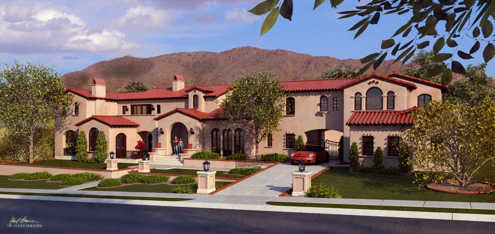
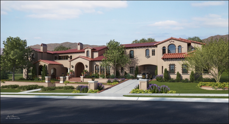
A more traditional look!
-
Nice render, a bit too clean for my taste though . I tried to change it a bit (in better I hope) by adjusting the color balance and adding a dirt map over the entire building and alleys . I hope you don't mind too much !

-
the main issue it's too CG..
you need better textures (arroway for example); additionally you should take a look at what Richdirt plugin does. -

-
@rv1974
What's "Richdirt"? -

enRichPro - enRich your renderings in a second
RichDirt free trial - for 3ds Max 2011 - 2025 with V-Ray and Scanline.
(www.enrichpro.com)
-
Thanks, Rich. Neat tool, but I only use Thea for rendering.
-
Karl,
I always hate commenting on something I'm not even close to being able to do myself, but what I've seen in your render, and others, is the use of a real sky mixed in with the other non-photo real elements. Any way to make the sky detail consistent with the rest of the render? Thoughts?
Anyway, I think it looks great otherwise.
-
@rich o brien said:

enRichPro - enRich your renderings in a second
RichDirt free trial - for 3ds Max 2011 - 2025 with V-Ray and Scanline.
(www.enrichpro.com)
There doesn't appear to be an SU version...?
-
Its been a while

-
Looks much better...

What render app. have you been using...?Side note...
Where are you from...?
Karl Larsen sounds very Danish, but the building doesn't look Scandinavian at all... -
@bob james said:
Thanks, Rich. Neat tool, but I only use Thea for rendering.
With proper texturing, you can achieve similar results using Thea Render...

This is also achievable using procedurals... -
Much better! I noticed you changed the lighting direction, among other things.
That seems to have made a big difference.
Hello! It looks like you're interested in this conversation, but you don't have an account yet.
Getting fed up of having to scroll through the same posts each visit? When you register for an account, you'll always come back to exactly where you were before, and choose to be notified of new replies (either via email, or push notification). You'll also be able to save bookmarks and upvote posts to show your appreciation to other community members.
With your input, this post could be even better 💗
Register LoginAdvertisement


