Questions raised by Nick Sonder's videos
-
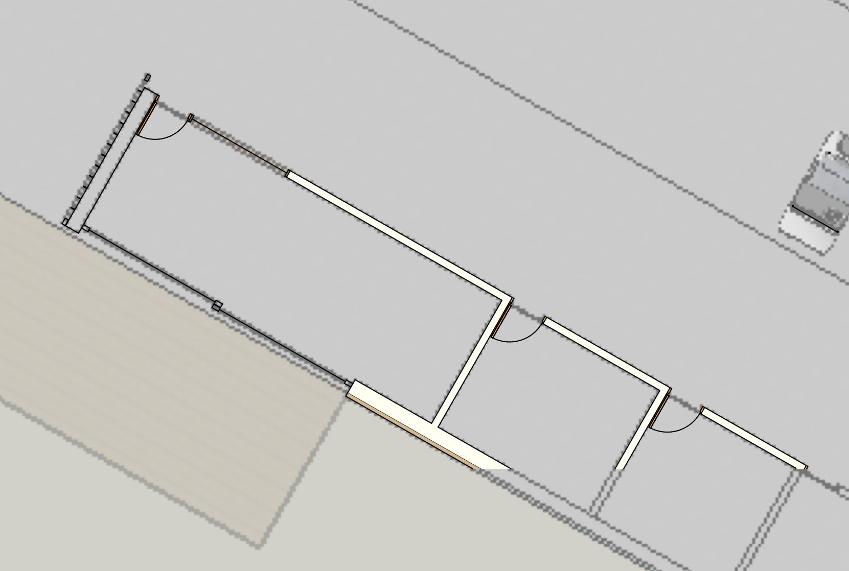
in trying to put Nick's tips to work I tried to reproduce his workflow. one of the things that caught my attention was his suggestion that we keep all the scenes in raster mode except for the linework layer which should be vectorized. I did that but soon ran into a problem: the plan under the linework looks very pixelated. even changing the style to hybrid it still looks bad. yes, I checked render resolution but setting it to high did not help either. any thoughts on this problem?
-
In plan he creates a section-cut with edges and faces which he moves up above the main model on its own layer [one per floor-level]. This is viewported on its own and overlaid [locked] with the main plan, and set to vector-mode - it hides the 'real' walls below. He dimensions that. Other things 'in plan' are relatively unimportant [i.e. 'for info only']... and these appear as raster/pixelated mode...
-
@tig said:
In plan he creates a section-cut with edges and faces which he moves up above the main model on its own layer [one per floor-level]. This is viewported on its own and overlaid [locked] with the main plan, and set to vector-mode - it hides the 'real' walls below. He dimensions that. Other things 'in plan' are relatively unimportant [i.e. 'for info only']... and these appear as raster/pixelated mode...
hi TIG,
I understand the workflow and what he does to get those results but in Nick's videos the model in raster mode that appears below his vectorized plan is not blurred as in the image I posted above.
besides, I tried with another model and did not get the same bad (blurred) outcome. thus I conclude either I did something wrong in that case or my model has some problem.
-
Since those are screen shots, is your edit mode set to low? LO exports really high quality PDF even when set to Low, so the final products resolution is much higher than the screen. Also, what monitor and video card are you using? The Raster image will have pixelation for sure, but with the final print, it is not easily noticed unless you press your face to the page.
-
@unknownuser said:
Since those are screen shots, is your edit mode set to low? LO exports really high quality PDF even when set to Low, so the final products resolution is much higher than the screen. Also, what monitor and video card are you using? The Raster image will have pixelation for sure, but with the final print, it is not easily noticed unless you press your face to the page.
yes, indeed. after watching your videos again I realized that what is seen on the screen is not what will be printed at the end. I exported a pdf from the file whose picture I posted here and the result was very good.
what still puzzles me is that different models get different results when sent to Layout. in general I do not see any pixelation in plans in the raster mode, even at the low setting. this was the first time.
thanks for your help.
-
The pixelation is, of course less noticeable in plans oriented square to view. Interesting (to know-nothings like me) this in alignment to the "port" and not the Layout page. That is, a line that is square to the view when exported from SU will not look jagged in LO raster, even when you rotate the whole the reference in LO.
-
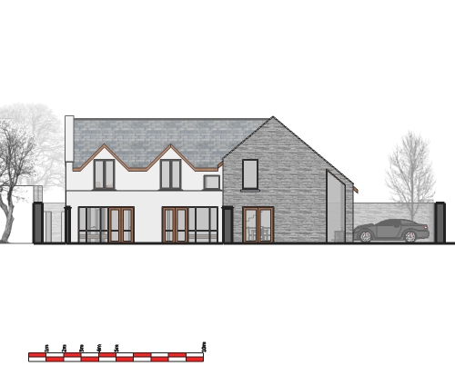
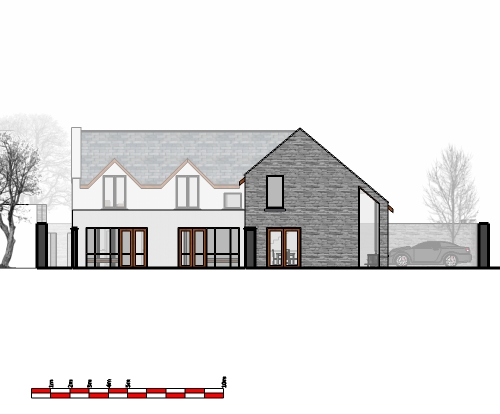
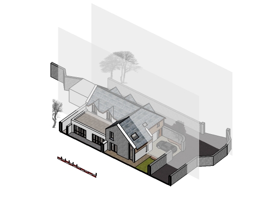
When I first saw Nicks video (original one), I gave the fog a go, but could never get it right, and dropped it. For a project I'm currently working on, I drew up a face set to white with opacity at 60% to act as a vignette. I then gave the fog a go, and got it working. So just throwing these as a comparison.
I like the results of both, but fog is a lot quicker to set up.
Not exactly a layout post, but thought this was the best place to put it. Anyone else have any tips or methods for vignetting?
-
@porch_unplugged said:
When I first saw Nicks video (original one), I gave the fog a go, but could never get it right, and dropped it. For a project I'm currently working on, I drew up a face set to white with opacity at 60% to act as a vignette. I then gave the fog a go, and got it working. So just throwing these as a comparison.
I like the results of both, but fog is a lot quicker to set up.
Not exactly a layout post, but thought this was the best place to put it. Anyone else have any tips or methods for vignetting?
thats a nice technique~!
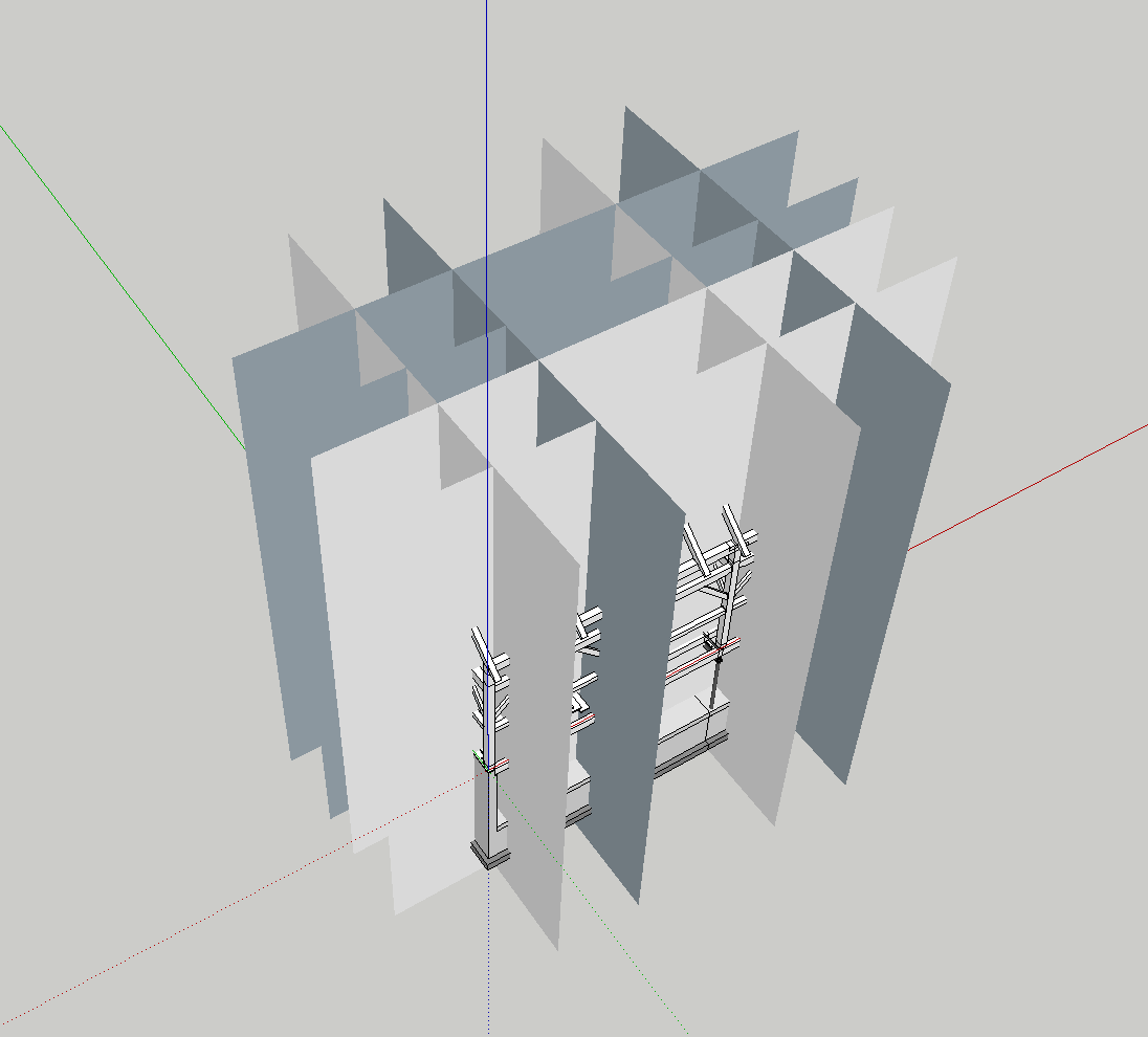
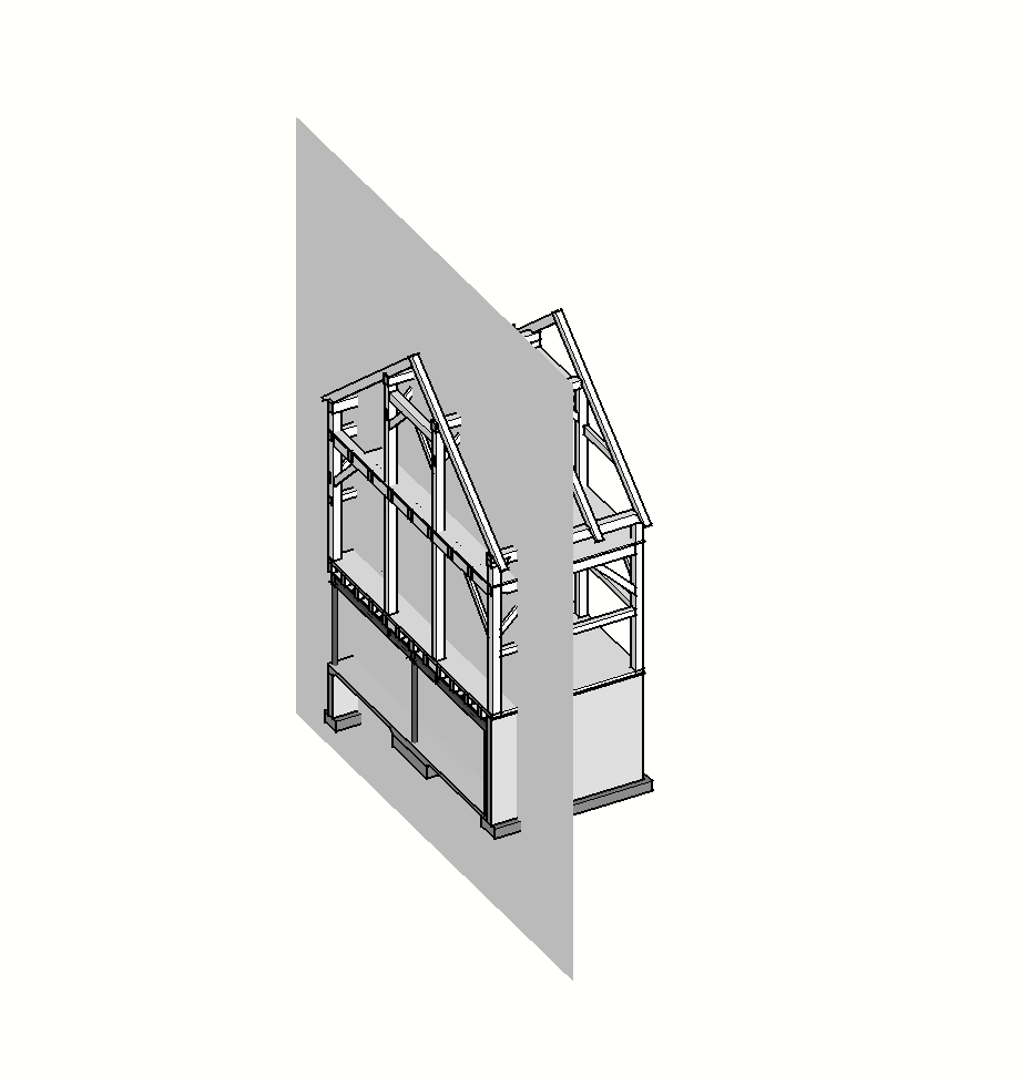
i use a similar technique for shop drawings / structural work where i need to isolate the framing, and i don't want to 'see into' the structure.changing the opacity is a nice trick... although i imagine it only works in 'hybrid' or 'raster'.
-
Edson, thanks for kicking this thread off. I see that we have Nick here to advise also TIG to keep us on the 'straight and narrow'

I'd like to suggest that some kind of a simple house model is agreed / worked on so that we can all try out the various processes and compare notes. It might make life easier all around.
What do you all think?
-
@bmike said:
thats a nice technique~!
i use a similar technique for shop drawings / structural work where i need to isolate the framing, and i don't want to 'see into' the structure.damn, i thought i was coming up with an original idea, it must have been implanted in my subconscious from watching one of your videos
 .
.@bmike said:
changing the opacity is a nice trick... although i imagine it only works in 'hybrid' or 'raster'.
I'm not using Layout, importing jpegs into CAD (hense the scale bar) and setting up my sheets that way.
-
@mike lucey said:
Edson, thanks for kicking this thread off. I see that we have Nick here to advise also TIG to keep us on the 'straight and narrow'

I'd like to suggest that some kind of a simple house model is agreed / worked on so that we can all try out the various processes and compare notes. It might make life easier all around.
What do you all think?
I think Nick should just upload all his drawings! and we take what we need.

-
I doubt Nick would do that and I would not expect such. I also think that a simpler building would work for folks new to the process in LayOut.
-
@mike lucey said:
I doubt Nick would do that and I would not expect such. I also think that a simpler building would work for folks new to the process in LayOut.
No, of course not. He has been very generous to Google/Trimble in opening up his projects and procedures.
I think Nick has pretty much demonstrated his working process, and I've read Paul Lee's construction documents publication and I've taken bits from both, and added my own bits to form my own processes and procedures. Like I've said before, I'm not using Layout at the minute, so the processes are a little different for me.
In gearing up my sketchup use recently, I've found it a little difficult to organise my drawings and drawing titles (probably as much to do with the outdated system we use in our office as with a new software/file use). Basically in CAD I would do a single 2D drawing per CAD file which was properly filed. But with different scenes and exports, I'm having to form new ways of filing, drawing numbering & issue sheets etc. So I was thinking of doing a few posts on how I've dealt with it. Fierce boring stuff altogether, but something I think is very important, certainly in my line of work where a strong record of drawings, specifications etc. issued, needs to be kept.
So, when I get a bit of time, I'll do something out.
-
Brian, you have put your finger on a problem area when it comes to LayOut. Even Nick might admit that the way drawings have to be filed is a little haphazard at best.
I look forward to you reading about your process and won't find it boring in the slightest. I also imagine the folks at Trimble SketchUp will be taking note. If LayOut is being put forward as a serious Con Doc production tool this area, filing, will have to be standardized I feel.
-
With regards to files, I organize mine the same way I did with acad. I have a main SU folder that has the base SU files and a folder named LAYOUT. I keep all drawing types as separate files in Layou, such as, site plans, floor plans, sections, etc. works very easy in keeping things organized.
-
@mike lucey said:
Brian, you have put your finger on a problem area when it comes to LayOut. Even Nick might admit that the way drawings have to be filed is a little haphazard at best.
I look forward to you reading about your process and won't find it boring in the slightest. I also imagine the folks at Trimble SketchUp will be taking note. If LayOut is being put forward as a serious Con Doc production tool this area, filing, will have to be standardized I feel.
i've come up with this method:
sketchup file is named 'clientname-clientname(optional).skp
so 'tfg-bridge.skp'as i develop the model, i do a 'save a copy... and add the date, or occassionally some descriptive text.
i'll often also have models that strip down to details, so things would be 'clientname-clientname-joinery.skp'
so 'tfg-bridge.skp' and tag-bridge-joinery.skp' and tfg-bridge-steel.skp'.i follow the same 'save a copy as...' date formatting as above.
this way, i try to keep the file without dates as my working file, and the other files used as backups or places to get back to specific changes, etc.
keeping the most recent file name basic and the same means i can find it easily, and my layout drawing is always referencing the same file(s).
i do the same with my layout files, but generally just have 1 working file, and save as versions with dates.
i occassionally break up larger projects into 2-3 layout files, to save rendering time. -
Mike, I also keep dated "versions". The way I keep track is "Project Name"_1. When a change occurs it goes to "Project Name"_2. This way the most recent version is easily accessed and referenced easily. Most projects usually go to version 4 or 5, although I had one that went to 22! That was a little painful, but this method made it work easily.
On the deliverables which are typically .jpeg and .pdf files, I have separate folders for those. In the JPEG folder and PDF folders are sub folders that are named by date such as "130107" (2013, January 7th). Using this format is really nice as explorer keeps them in order and back up is a breeze.
-
Of interest, though, is how the SU and LO files relate, are broken down for a typical project, and named, keeping the linkage simple. Nick wrote about that a little before. One problem is keeping names short enough because sometimes a search field or listing will not show the full names.
I keep a "Temporary Folder" too. This is for test runs and misc. workflow files and keeps my project folders clear. It hasn't been cleared out for a long time, but I only put something in there that is a copy or expendable.
-
Good suggestions there.
I've posted another thread with my procedures. Quite similar to Nicks by the looks of it.
-
Nick, if you're out there... I was just watching your videos again, and something stuck in my mind. You seem to be spending a lot of time doing out your linework for export to Layout, any reason why you don't use 'Section cut face'? thought it would have been ideal for your work process.
Hello! It looks like you're interested in this conversation, but you don't have an account yet.
Getting fed up of having to scroll through the same posts each visit? When you register for an account, you'll always come back to exactly where you were before, and choose to be notified of new replies (either via email, or push notification). You'll also be able to save bookmarks and upvote posts to show your appreciation to other community members.
With your input, this post could be even better 💗
Register LoginAdvertisement


