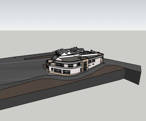
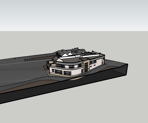
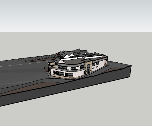
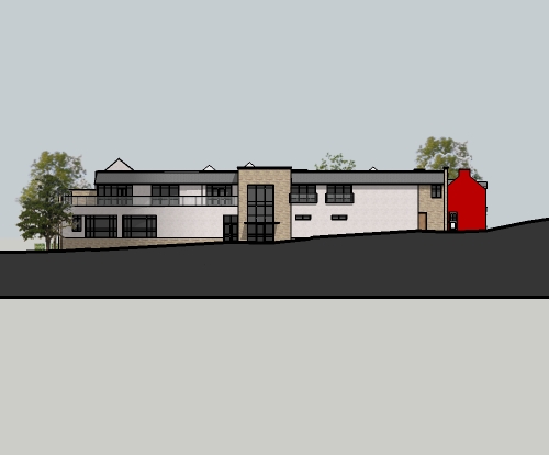
How to create a Mask in Layout
-
here you go Dave.
i kept my section cut face dark as i reckoned it looked good, especially with a light text for the drawing description placed in the dark area of the plinth (did this in autocad, not using Layout anymore, just exporting jpegs from sketchup and importing into cad, and scaling up as appropriate).
the bottom of the plinth can be moved down so you don't see the second heavy line, but i'm just clipping it with a viewport in cad.


-
Ah, yes. I see.
Why aren't you using LayOut?
-
@dave r said:
Ah, yes. I see.
Why aren't you using LayOut?
i've been using sketchup (free) casually for years, but really ramping up my use this year. I saw Nick Sonders video, and decided to give Layout and pro a chance. Did a full project in it to get a feel for it, but found a few things a bit annoying, slowness mostly, getting proper dimensions on 2D views, and a few other things. So i just left the trial run out, and haven't purchased the pro version (money is a bit tight for me at the minute
 ).
).so since i was doing a lot in sketchup i needed someway to properly title drawings, so just decided to import jpegs into cad and use viewports like a normal cad drawing.
-
I see.
About 90% of the work I do in LayOut involves dimensions, lots of dimensions, and I don't have any trouble getting accurate dimensions. Maybe it's just me.
-
@dave r said:
I see.
About 90% of the work I do in LayOut involves dimensions, lots of dimensions, and I don't have any trouble getting accurate dimensions. Maybe it's just me.
I started getting this ~ symbol in some dimensions as well as there being problems getting vertical dimensions from 2D elevations, where it was picking up different points in the 3rd dimension. i'm just so used to autocad dimensioning (setting up styles etc.) that it's second nature to me. only thing that annoys me is i can't snap to a point with the jpegs.
but sure if layout works for you, keep going.

-
The ~ just indicates that your dimensions don't fall on increments set by the Precision.
Ah, well. To each his own.
-
@porch_unplugged said:
@dave r said:
I see.
About 90% of the work I do in LayOut involves dimensions, lots of dimensions, and I don't have any trouble getting accurate dimensions. Maybe it's just me.
I started getting this ~ symbol in some dimensions as well as there being problems getting vertical dimensions from 2D elevations, where it was picking up different points in the 3rd dimension. i'm just so used to autocad dimensioning (setting up styles etc.) that it's second nature to me. only thing that annoys me is i can't snap to a point with the jpegs.
but sure if layout works for you, keep going.

so how are you getting accurate dimensions in autocad by dimensioning jpgs?
like dave said, to each his own, but i get accurate dimensions...


-
Mike, those are beautiful.

-
@bmike said:
so how are you getting accurate dimensions in autocad by dimensioning jpgs?
like dave said, to each his own, but i get accurate dimensions...
maybe it's just me then.
At the minute(and i've only really started the thought process really) I'm importing the jpegs with a scale bar and just scaling up to 1:1 in cad. like i said, i can't snap to the end points for dimensions, so for the minute i'm scaling off the sketchup model, and offsetting construction lines in cad to snap to. not ideal i know, and i think i'll probably have to revert to using dimensions in sketchup so they export with the jpegs. this is my first project doing it this way (sketchup to cad), so i'm making it up as i go along. still only in sketch design, so ultra accurate dimensions aren't required yet.
-
That just sounds like a lot of work to me. If it works for you, great. If I had to work that way I think I'd quit and do something else.

-
@dave r said:
That just sounds like a lot of work to me. If it works for you, great. If I had to work that way I think I'd quit and do something else.

It's not too bad, drawing out a clipping mask in layout sounds like a lot more work to me. Doesn't look like I'll be getting Pro and layout any time soon, so it'll have to do.

-
@porch_unplugged said:
@dave r said:
That just sounds like a lot of work to me. If it works for you, great. If I had to work that way I think I'd quit and do something else.

It's not too bad, drawing out a clipping mask in layout sounds like a lot more work to me. Doesn't look like I'll be getting Pro and layout any time soon, so it'll have to do.

have a look at my layout overview.
even if you don't go pro - there are lots of ways to setup your sketchup to streamline your workflow. -
@pbacot said:
Brian: Have you tried a dwg export or vector pdf to CAD? I think there a plugins for the dwg or dxf if you don't have pro.
thought never crossed my mind, i'll look into it, thanks Peter.
@bmike said:
have a look at my layout overview.
even if you don't go pro - there are lots of ways to setup your sketchup to streamline your workflow.I'm sure I've watched it already, but just waiting for it load again now (rubbish internet connection) Thanks Mike

-
Brian: Have you tried a dwg export or vector pdf to CAD? I think there's a plugins for the dwg or dxf if you don't have pro.
-
How about this? What do you do when you have elements on an elevation that are not orthogonal with the view plane as in walls that are at an angle and receding away from the viewer?
-
What do you mean, "what do you do?" What would you do? Could you post an example?
-
You could us Fog in SKP scene-tab or a Style with depth-cues - to show them feinter.
You could use a SectionPlane in the SKP scene-tab to hide everything towards the back of the model.
You could make a large white grouped vertical face on a special layer that's only on in that scene-tab, locate it to obscure the back of the model.
Or a shaped mask face overlaid in LayOut to hide them, or even made edgeless and translucent to show what's behind feinter.There are many ways to achieve different effects - you choose or invent one that does what you want...

-
Thanks tig. Very helpful.
-
Penumbra,
In common elevations, one should be able to see background elements of the building. Here is a masterful use of fog by Sonder, in SU and LO:
.http://sketchucation.com/forums/viewtopic.php?f=12&t=15911&p=374990#p374467
Peter
-
Thanks Peter, i find fog difficult to control but once is setup right, looks great.
Hello! It looks like you're interested in this conversation, but you don't have an account yet.
Getting fed up of having to scroll through the same posts each visit? When you register for an account, you'll always come back to exactly where you were before, and choose to be notified of new replies (either via email, or push notification). You'll also be able to save bookmarks and upvote posts to show your appreciation to other community members.
With your input, this post could be even better 💗
Register LoginAdvertisement


