Best way of modeling a column capital ...
-
Hello chaps,
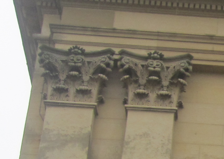
I'm currently modelling a large stately home, as there's going to be a ton of geometry and my laptop is rubbish, I want to make sure I'm modeling things in the best possible way. Also, my modelling of these organicy shapes leaves a lot to be desired, so, before I make a total hash of it and throw the laptop through the window, I'm hoping someone can advise on the best way to model the capital in the photograph? Would it be Artisan? Or is this overkill?
Huge thanks.

-
That will kill SU. But good challenge. Though they are plentiful on Archive3D. I'd use a texture in place if possible. Properly projected or mapped on lo-poly version would look great.
-
Thanks Rich, the thought of a photo-texture never even entered my head.

I don't intend doing any close ups of the columns so this should be great, just need some jiggerypokery in PS first then.
Thanks again.
-
You could bastadize this....

http://www.archive3d.net/?a=download&id=e8ccefe6
That'd be cheating though

-
-
I've yet to find a halfway decent corinthian capital in any 3D repository. If you find one let me know. I like the suggestion to do a photo-textured low-poly version.
-
Rich is right; use a texture. I have modelled a corinthian column in geometry, but even the low poly version was nearly 4000 faces. If you've got a lot of them, that's not good news.
The capital below, however, is image based and only has 423 faces...just enough to provide decent looking corners.
Obviously it requires a column, but that's not going to amount to much.
Sorry I can't share, as it's commercial...but it at least shows what can be done with ultra low poly and a map.
-
Just for info because it's make with ZBrush

But the construction can maybe be help you on your project!
By Nicolas
-
of course! I should have checked formfonts!
The columns there look pretty nice Alan!for example:
http://www.formfonts.com/viewModel.php?id=4699&config=3&action=&sub_action=&type=&active= -
Hi all,
Thanks so much for the input. I definitely think a texture is the way forward, will post up the finished article in the WIP thread when it's done.
Thanks again.
Lee
-
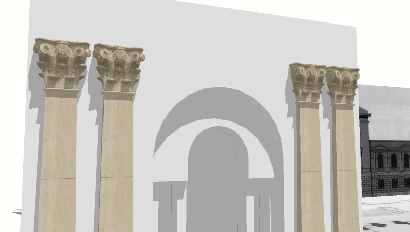
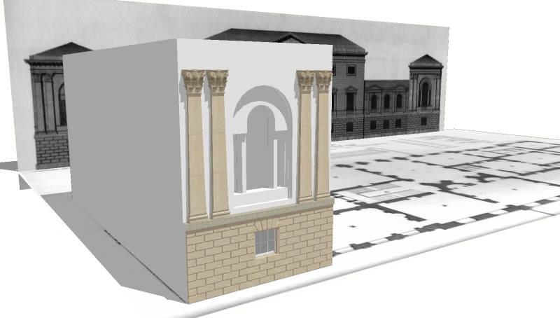
Came up with this. Get's found out with a close up but doesn't look too bad from further away.
Thanks again for all your help.


-
That's more than sufficient IMO. Pilou's solution is obviously an overkill unless you are examining it from a couple of centimetres (but still an overkill as far as invested time is concerned - ZBrush or not, you only spend days on a capital like that if you want to show of with that detail only).
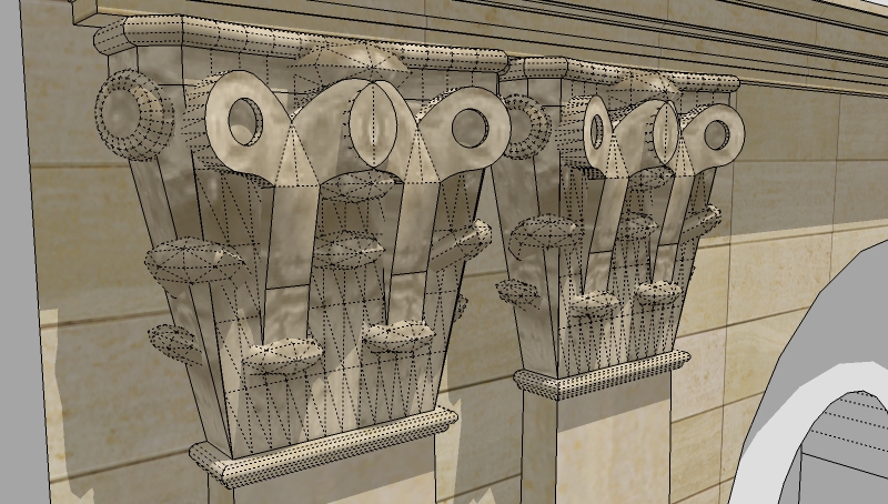
Can you show a real close-up so we can see where the "cheat" with textures begin?
-
Here it is. Think the geometry could be reduced a bit more but going to run with this at the moment anyway.

-
 Thanks.
Indeed, as you are there to represent geometry much with textures, there could be some place of further reduction but still better than modelling every part.
Hello! It looks like you're interested in this conversation, but you don't have an account yet.
Getting fed up of having to scroll through the same posts each visit? When you register for an account, you'll always come back to exactly where you were before, and choose to be notified of new replies (either via email, or push notification). You'll also be able to save bookmarks and upvote posts to show your appreciation to other community members.
With your input, this post could be even better 💗
Register LoginAdvertisement


