[Plugin] CleanUp
-
Thanks, makes sense.
-
-
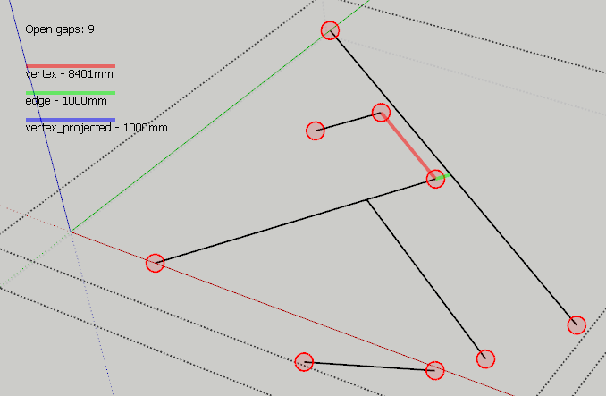
May I humbly request a close-open functionality (with custom search radius defined by user)? Just similar to closeopens.rb
by Todd Burch. -
@rv1974 said:
May I humbly request a close-open functionality (with custom search radius defined by user)? Just similar to closeopens.rb
by Todd Burch.Funny you should mention that. I began on a small utility today:

-
You are unhealthy unstoppable
 But don't make it a separate tool. Insert it in the cleanup. Those rubies pullulate like cockroaches
-
@rv1974 said:
But don't make it a separate tool. Insert it in the cleanup. Those rubies pullulate like cockroaches

I was planning on adding it to Edge Tools. One completely automatic, one where on can inspect, like solid inspector.
Could add the automatic version to CleanUp3.
-
-
@plot-paris said:
@thomthom said:
Could add the automatic version to CleanUp3.
oh, will that be in the near future?
CleanUp 3 and Edge Tools 2 will be out next week. ( And the feature of closing small caps will be in Edge Tools. )
-
-
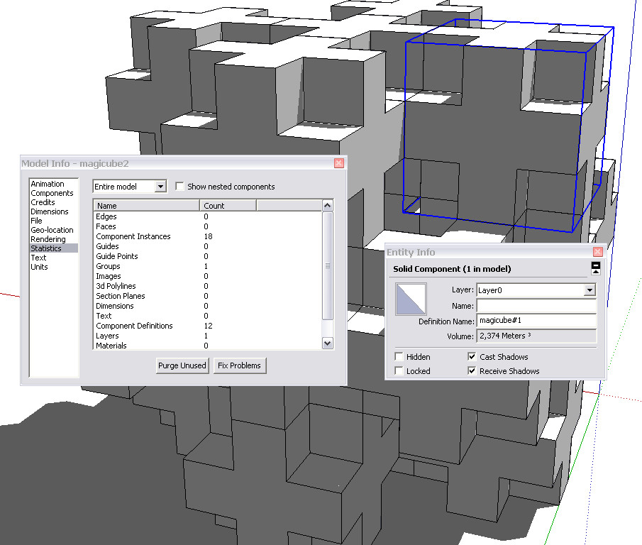
There's nothing to clean up there. There's not a single line that is not part of the components (which are all perfectly solid so cannot be any stray geometry in them).
If you want to get rid of the separating edges/faces, you need to explode the whole thing first and run another plugin:
http://forums.sketchucation.com/viewtopic.php?f=180&t=12668&p=92295#p92295(Nice model, by the way!)


-
Or you could just use the "outer shell" command from the solid tools in Sketchup 8.
Best,
Jason. -
@zenhipster said:
............ Inside a lot of extra polygons.
If you are trying to remove the polygons "out of view", this app will not do that. -
@jason_maranto said:
Or you could just use the "outer shell" command from the solid tools in Sketchup 8.

-
Well, had a closer look. Neither solution will work properly as the pieces are not aligned correctly (there are extremely small but gaps)
-
Not sure if it's the proper thread for this tip, but here goes.
@unknownuser said:
Wow, it looks promising. One suggestion, though: you could use big buttons instead of radio buttons and check-boxes. Such elements need more precision to click them (because they are small) and when using such plugin several times it can come more handy.
This was a request about v3 in another thread, that is very easily solvable by just using some proper HTML and keeping the radio buttons / checkboxes too.
Just make use of the <label> tag like this:
<label for="idname">Descriptive text here; <input type="radio" name="whatever" id="idname" /></label>and that should keep everyone happy

-
That it uses already, and thatæs what the initial v3 will be using.

-
That's great then, you should advertise it as "click the text and the checkbox is magically selected"
Keep it up mate :] -
@arty2 said:
That's great then, you should advertise it as "click the text and the checkbox is magically selected"
Keep it up mate :]I'll be doing a video presentation.
Another issue with the UI is displaying extra information. At the moment I use tooltips for each element, but I want to provide a better interface for this as well. But now I just need to get this first version out, otherwise it'll never be done.
(Btw, you're a webdesigner? Scripter/programmer? Doing any SketchUp plugins?)
Cheers!
-
Version 3
- New UI
- More cleaning
Remember to update TT_Lib2
-
Thanks Thom
Hello! It looks like you're interested in this conversation, but you don't have an account yet.
Getting fed up of having to scroll through the same posts each visit? When you register for an account, you'll always come back to exactly where you were before, and choose to be notified of new replies (either via email, or push notification). You'll also be able to save bookmarks and upvote posts to show your appreciation to other community members.
With your input, this post could be even better 💗
Register LoginAdvertisement


