sketchucation logo sketchucation
    • Login
    ℹ️ Licensed Extensions | FredoBatch, ElevationProfile, FredoSketch, LayOps, MatSim and Pic2Shape will require license from Sept 1st More Info

    Urban mixed use project
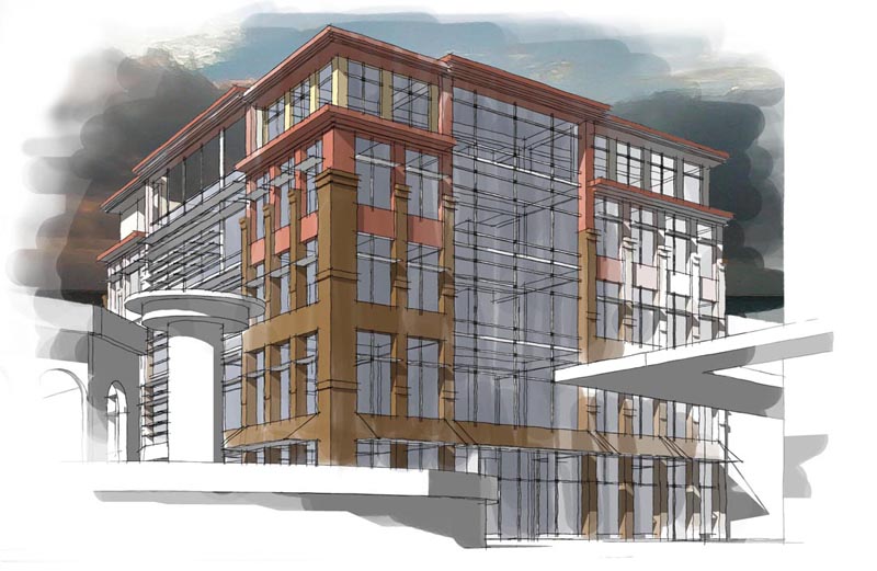
    Scheduled Pinned Locked Moved Gallery
    18 Posts 9 Posters 2.1k Views 9 Watching
    Loading More Posts
    • Oldest to Newest
    • Newest to Oldest
    • Most Votes
    Reply
    • Reply as topic
    Log in to reply
    This topic has been deleted. Only users with topic management privileges can see it.
    • R Offline
      remus
      last edited by

      Really good, i really like the presentation style. Couple of crits: that big tubular thing kind of obscures a lot of the building, a different camera angle might be better. A bit more colour on the outer edges would be good as well, at the moment you dont really notice the left and right hand sides of the building because of the colour fade out.

      Really good start though, are you going to post anymore?

      http://remusrendering.wordpress.com/

      1 Reply Last reply Reply Quote 0
      • P Offline
        pbozarth
        last edited by

        Yeah, I'm going to keep developing it with entourage and refining my technique and what-not, I will post them as I get them done

        1 Reply Last reply Reply Quote 0
        • boofredlayB Offline
          boofredlay
          last edited by

          Great first post, welcome.
          You have a good handle on this style.

          http://www.coroflot.com/boofredlay

          1 Reply Last reply Reply Quote 0
          • Mike LuceyM Offline
            Mike Lucey
            last edited by

            Hi pbozarth and welcome. You have the DT mastered quite well.
            I like the treatment your have adopted here. My only suggestion
            is that you might consider using a solid margin on the left
            also (but fade the sky) and have that rectangle shoot beyond
            the margin as you have done on the right margin.

            Mike

            Support us so we can support you! Upgrade to Premium Membership!

            1 Reply Last reply Reply Quote 0
            • P Offline
              pbozarth
              last edited by

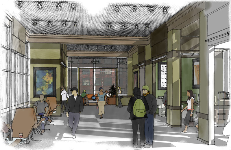
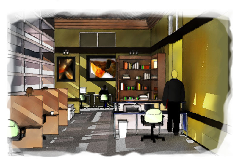
              Here is one of the main interior spaces:
              I feel like it looks better at a higher res, where the individual lines are more visible and the colors are less dominant


              interior perspective round 2.jpg

              1 Reply Last reply Reply Quote 0
              • R Offline
                remus
                last edited by

                Thats really good, i reckon youve hit the nail on the head with that.

                http://remusrendering.wordpress.com/

                1 Reply Last reply Reply Quote 0
                • P Offline
                  pbozarth
                  last edited by

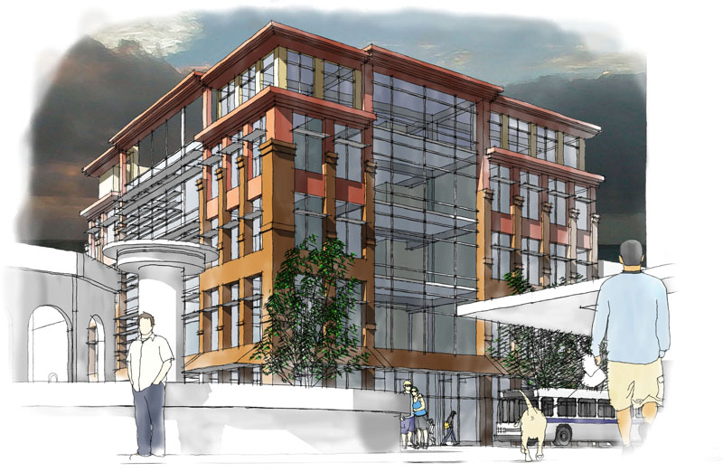
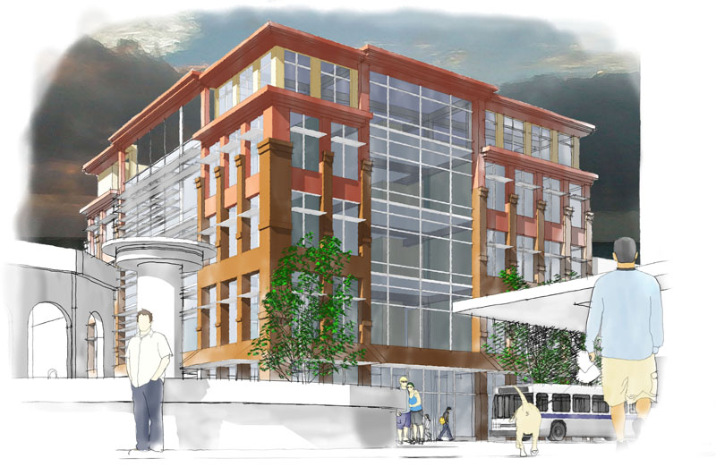
                  A revised version of my original exterior perspective


                  ext persp 2 w lines.jpg

                  1 Reply Last reply Reply Quote 0
                  • P Offline
                    pbozarth
                    last edited by

                    This version has some of the lines turned off, which gives it an interesting sort of watercolor effect


                    ext persp 2 no lines.jpg

                    1 Reply Last reply Reply Quote 0
                    • B Offline
                      bytor
                      last edited by

                      pbozarth,

                      I like the version with lines more. The people in the foreground help - but loose the guy with the dog dootie bag and his companion - bad perspective 😲 makes them distracting to the image.

                      Bytor

                      Find the Cost of Freedom.....

                      1 Reply Last reply Reply Quote 0
                      • FrederikF Offline
                        Frederik
                        last edited by

                        These are really NICE, pbozarth..!! πŸ‘
                        Can't decide which one I like best - they all look great...! πŸ˜‰

                        Cheers
                        Kim Frederik

                        1 Reply Last reply Reply Quote 0
                        • P Offline
                          PKast
                          last edited by

                          These are really fine. You have really got a grasp of the "Dennis Technique". Ditto about losing the dog ass in the foreground.

                          Best,

                          1 Reply Last reply Reply Quote 0
                          • P Offline
                            pbozarth
                            last edited by

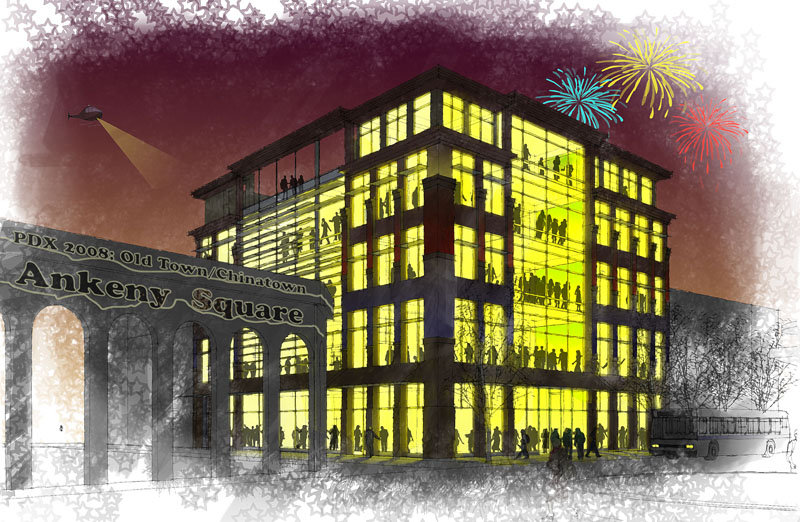
                            My first try at a night shot...

                            1 Reply Last reply Reply Quote 0
                            • P Offline
                              pbozarth
                              last edited by

                              slightly different, I toned down the interior people and the signs in the foreground.


                              signs and people faded.jpg

                              1 Reply Last reply Reply Quote 0
                              • P Offline
                                pbozarth
                                last edited by

                                I took an interior perspective from this project, and layered some sketchup views over the same view quickly rendered in kerkythea to impart some quality of the true lighting in the room. It is certainly not a photoreal effect, but its definitely a different look than the other dennis technique stuff I have been doing...


                                kerk render 1.jpg

                                1 Reply Last reply Reply Quote 0
                                • P Offline
                                  pbozarth
                                  last edited by

                                  ps what do you think of the floor, I applied a gray fill layer to the floor and film grained it in photoshop. I was going for a carpeted look. What do you think of the texture, and the level of shadow that is visible?

                                  1 Reply Last reply Reply Quote 0
                                  • plot-parisP Offline
                                    plot-paris
                                    last edited by

                                    I definitely like the combination of render and SketchUp - gives a handdrawn style (except for some pixeled lines at the right wall) while providing realistic lighting. πŸ‘

                                    the uneven floor texture is convincingly like a carpet. to me it seems a bit glossy though.

                                    1 Reply Last reply Reply Quote 0
                                    • J Offline
                                      jcaintn
                                      last edited by

                                      Loved them all up to the last one with the fireworks...

                                      Keep up the good work.

                                      john abernathy, aia, leed ap

                                      http://www.daad-group.com

                                      1 Reply Last reply Reply Quote 0
                                      • 1 / 1
                                      • First post
                                        Last post
                                      Buy SketchPlus
                                      Buy SUbD
                                      Buy WrapR
                                      Buy eBook
                                      Buy Modelur
                                      Buy Vertex Tools
                                      Buy SketchCuisine
                                      Buy FormFonts

                                      Advertisement