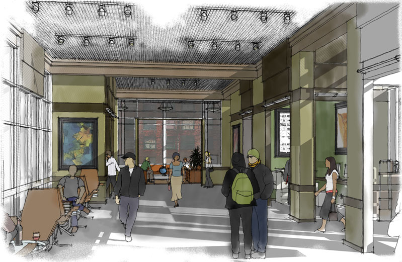
ps what do you think of the floor, I applied a gray fill layer to the floor and film grained it in photoshop. I was going for a carpeted look. What do you think of the texture, and the level of shadow that is visible?
Latest posts made by pbozarth
-
RE: Urban mixed use project
-
RE: Urban mixed use project
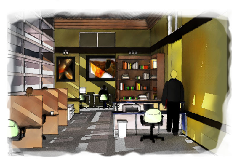
I took an interior perspective from this project, and layered some sketchup views over the same view quickly rendered in kerkythea to impart some quality of the true lighting in the room. It is certainly not a photoreal effect, but its definitely a different look than the other dennis technique stuff I have been doing...
-
RE: New project
I really like the way you did your semi-floor plans, with the roof taken off, and I like to do plans that way. What frustrates me is the way the shadows can't be realistic. It would be really prime if there was a way to have the shadows act as if the roof was still on, or in other cases, as if a section cut had not been performed. Anybody know of a way to do this, some sort of plugin or something?
-
RE: Urban mixed use project
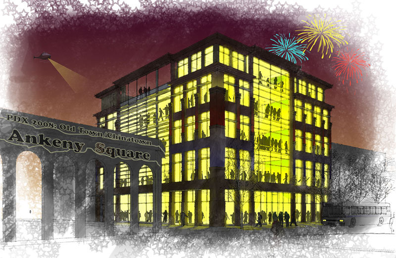
slightly different, I toned down the interior people and the signs in the foreground.
-
RE: Tack House to Restaurant!
I definitely like the trees, are they sketchup entourage or did you make them in photoshop? I feel like the edges in your drawing are a little jaggedy, if you export the colors with the lines turned off and use that as a raster image, and then export the lines as vectors like eps or dwg, you can place the vectors over the raster image, and get nice crisp lines that will never get jaggedy.
-
RE: My life...
I think it was pretty sweet in the earlier posts, where the walls have a bit more texture.
-
RE: Urban mixed use project
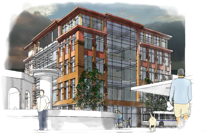
This version has some of the lines turned off, which gives it an interesting sort of watercolor effect
-
RE: Urban mixed use project
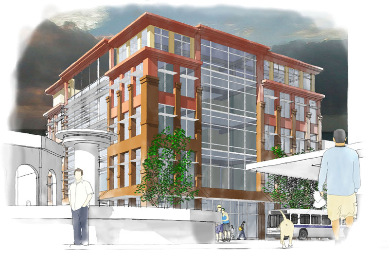
A revised version of my original exterior perspective
-
RE: Urban mixed use project
Here is one of the main interior spaces:
I feel like it looks better at a higher res, where the individual lines are more visible and the colors are less dominant
