[Restaurant Renders]
-
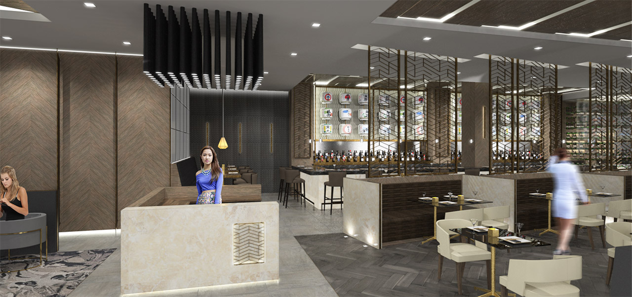
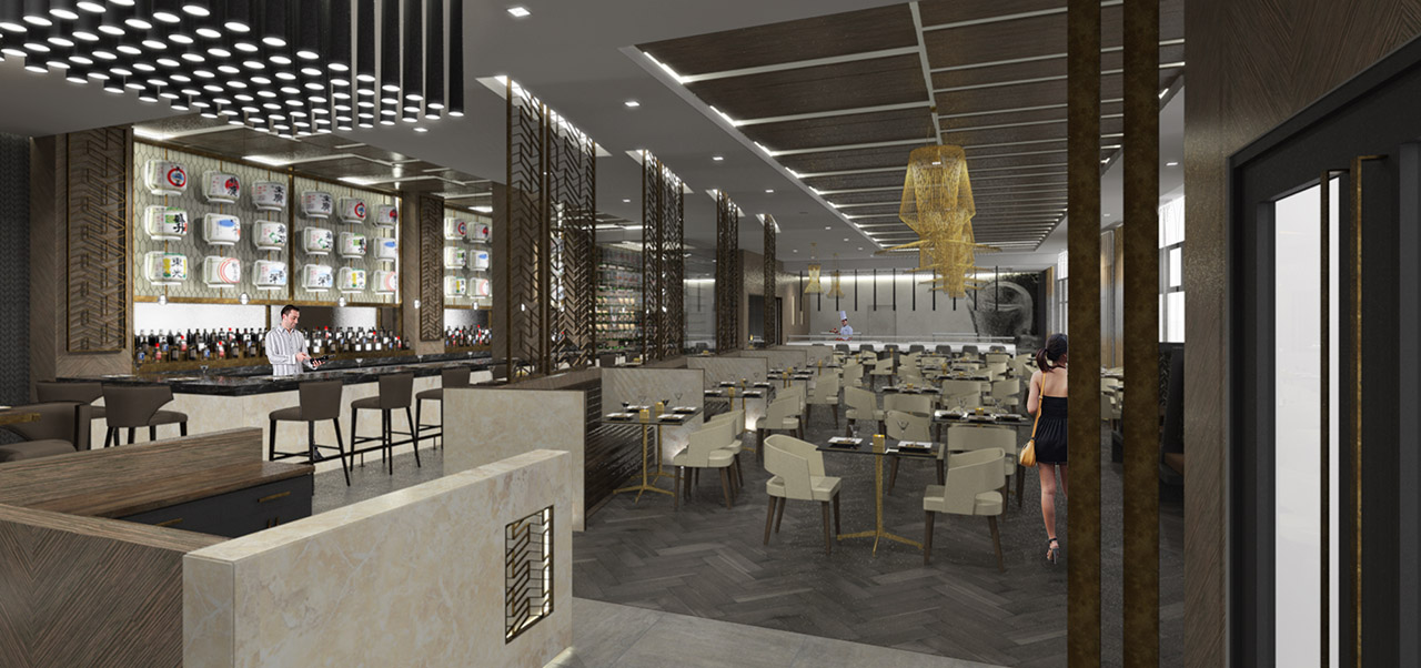
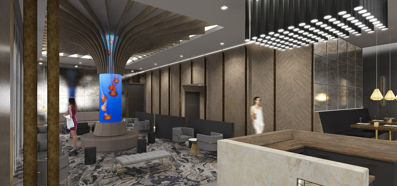
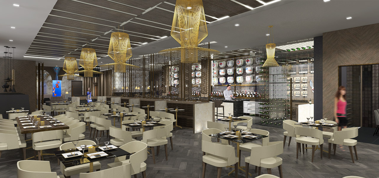
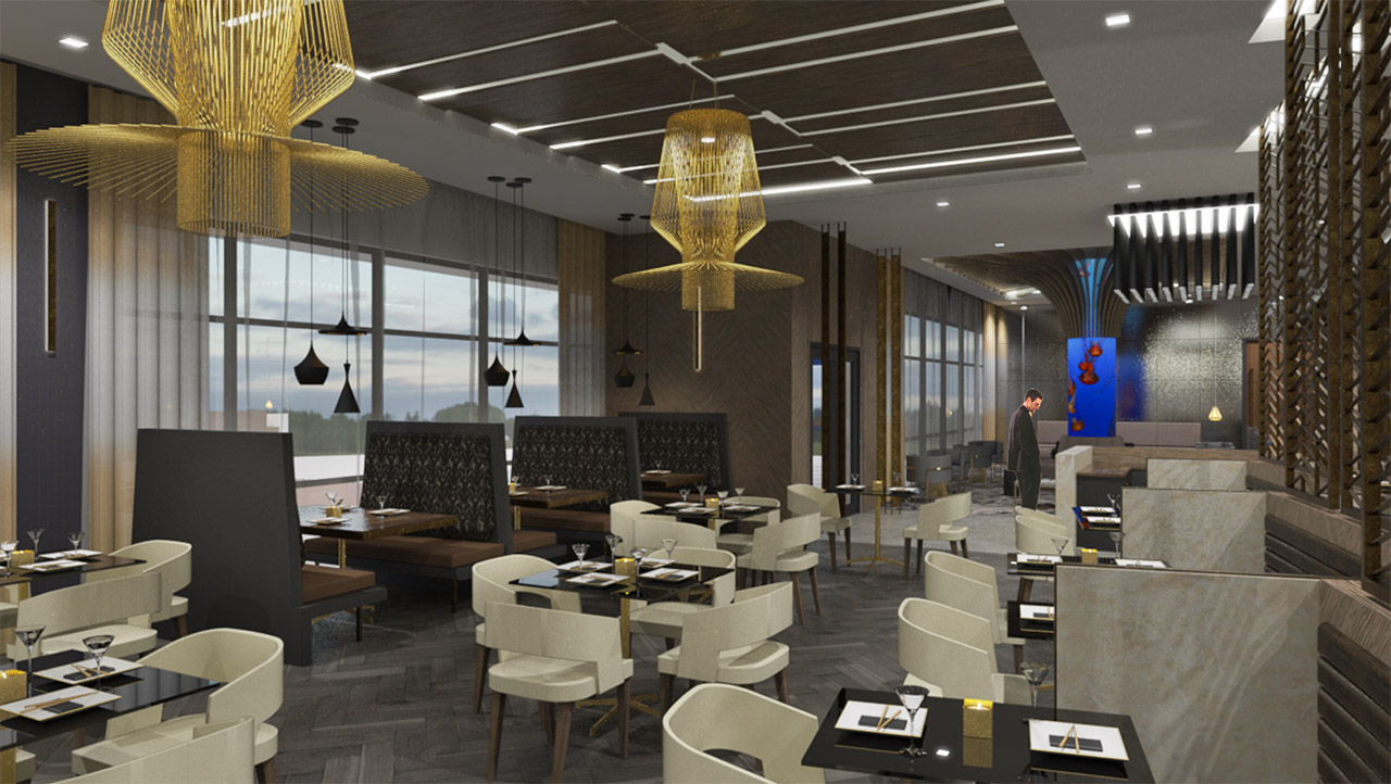
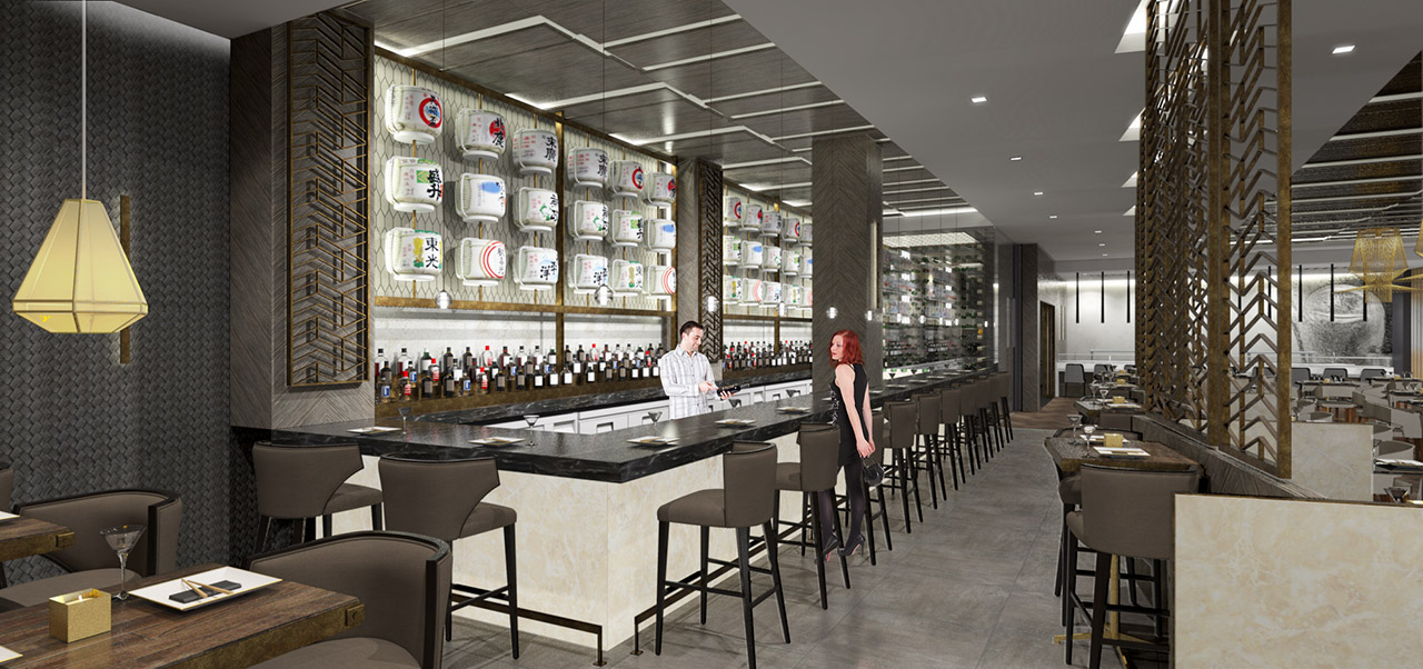
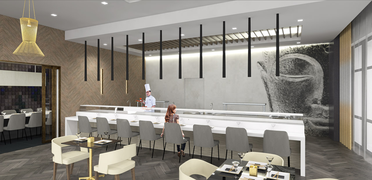
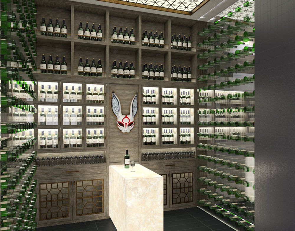
Here are some images of a restaurant we wrapped up the design on last week. SketchUp/Thea Render/Pshop
-
nice renderings. I would darken the people and do less saturation to match them better to the rest.
I like the Sake Bottles.
-
Very nice mate! It's a huge restaurant wow! I would suggest that fish tank, although a feature, is jumping out a little too much!
-
Nice renders. I agree with Richard about the fish tank ( not sure that's what it is ? ) .If it had some transparency it would look a lot better. One other thing, I find the people that have some "blur" to them a little distracting to the images. I won't knock the general design other than it's not really my style, but your renders show the place very well.
Hello! It looks like you're interested in this conversation, but you don't have an account yet.
Getting fed up of having to scroll through the same posts each visit? When you register for an account, you'll always come back to exactly where you were before, and choose to be notified of new replies (either via email, or push notification). You'll also be able to save bookmarks and upvote posts to show your appreciation to other community members.
With your input, this post could be even better 💗
Register LoginAdvertisement


