@davidh said:
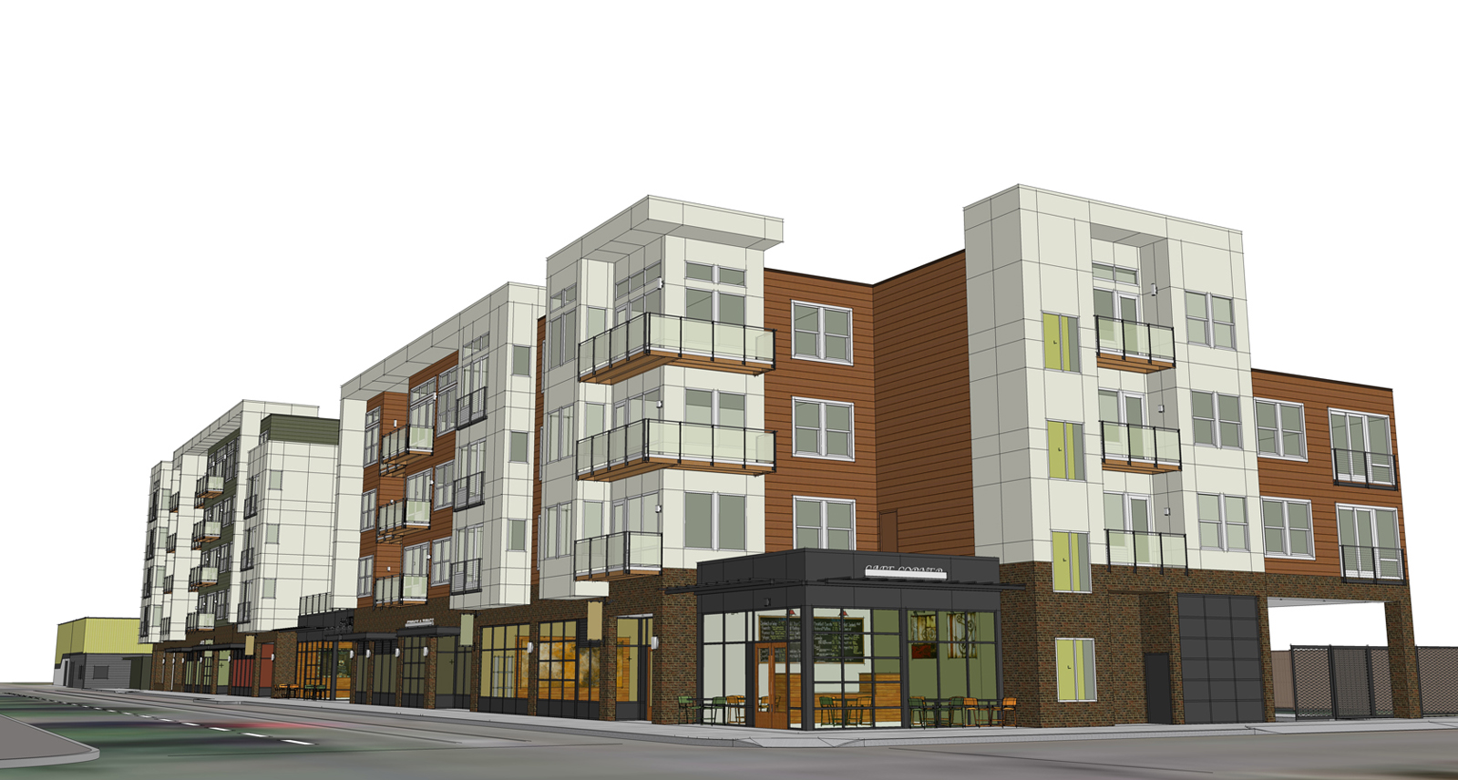
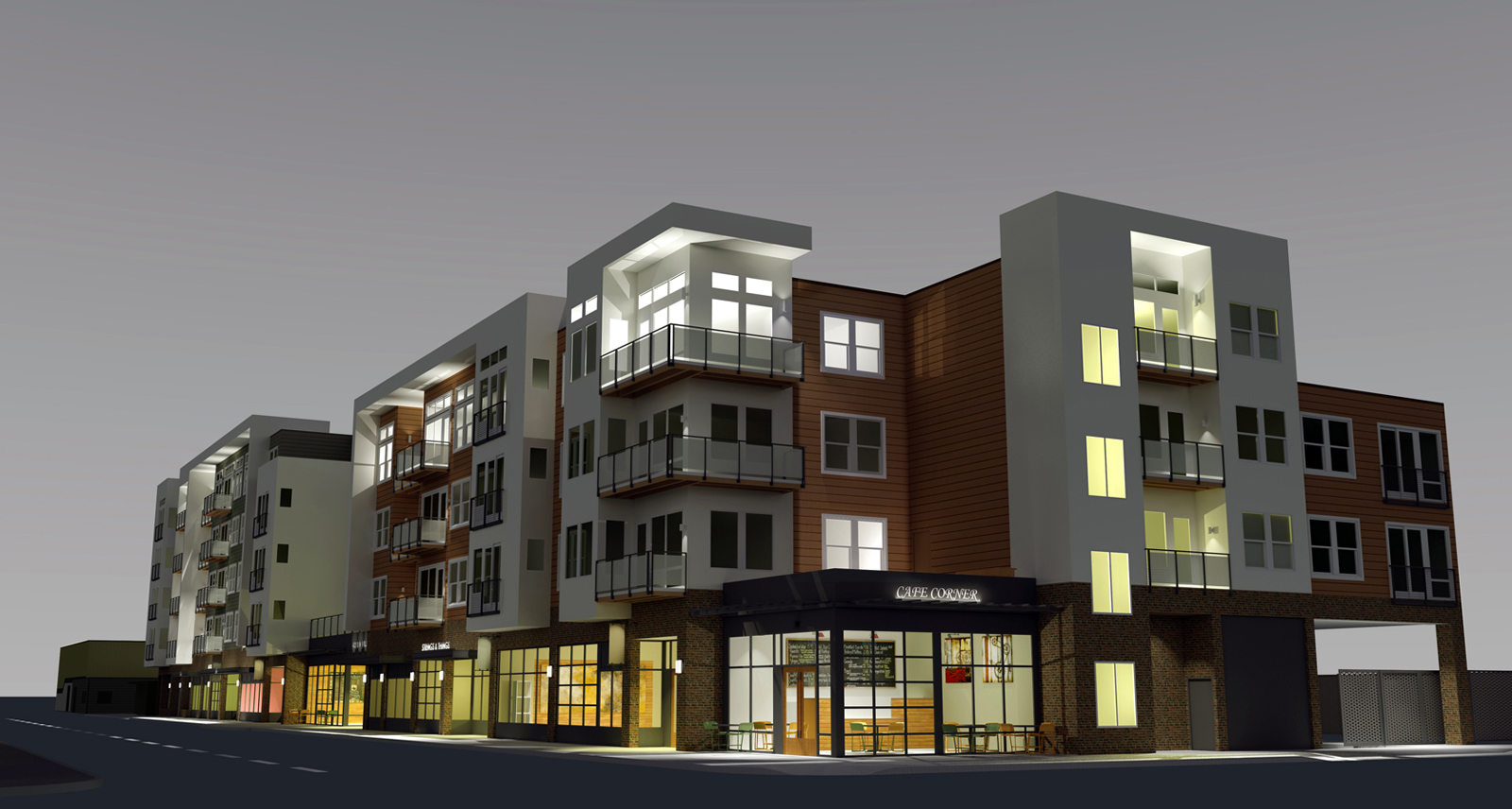
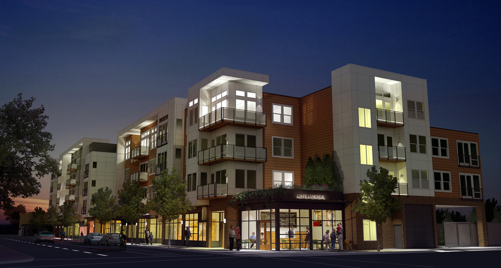
I think what you really need here is some shadowing.It can help break up large areas of colour into different tones of the same colour.For instance,some foreground shadows on the road cast from trees behind the camera.This will also result in the foreground being darker than the middle ground where you want people to focus(in this case on the building) Remember shadows are not simply ‘black’. Use darker tones of the colors in the objects, or dark complementary colours.
I would also add some texture to some of the materials,maybe a bump map or even some paving slabs to the pavement.This will also help break up areas of continuous colour.
Finally,and this is just my preference, I would increase contrast and saturation in order to get the image to stand out.Dont be afraid of having dark areas in the image,thats the only way for the light areas to really work
here is a tutorial I did last year on post processing
http://forums.sketchucation.com/viewtopic.php?f=18&t=31369
Thanks for your suggestions David. I have been following your inspiring work here.
