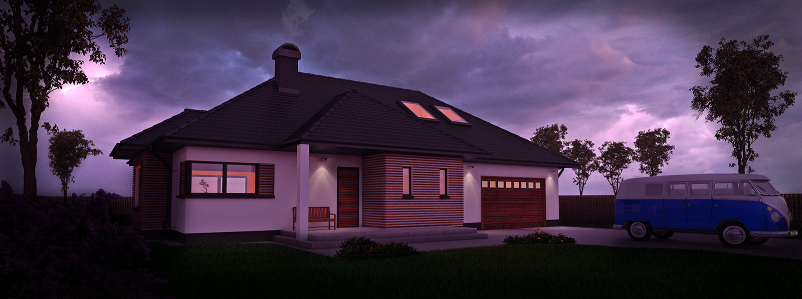
House model done in SU, VW from a warehouse (deleted doubled windows, added new materials and did few other fixes). 3D tress and plants downloaded from someone but can't remember from who, 3D SU grass no texture just colour. Rendered with vray 2.0 and post production work done in PS. CC is always welcome.
Latest posts made by cmoreink
-
A house somewhere in Eastern Europe
-
RE: [Plugin] QuadFaceTools
How do you import an .obj file?
It crashes every time I try ---> file, import, select .obj file "oops, an error occurred " a message displays (box) askes me if I want to send a report.
The tool bar displays ok
Any idea why? -
Are you a writer or a modeler/builder/designer?
It's simple.
17 years age adobe has added an option of having a dark UI and if you liked a light UI you still had that option. 3D max went to a dark side as well, maya did it too and many other modeling softwares and they did it a decade ago. But SU is stock in light ages.
I found a post from 2012 requesting to have an option of dark UI. We have 2017 and still we have to look at this painful bright UI colour.
Yesterday I requested to have an option of switching between light and dark UI.
Please and I am asking all SUers around the world to request to have an option of adding and switching between light and dark UI.
Please protect your eyes and support dark UI. -
RE: Change SketchUp UI from painful light to awesome dark
Well to me this is the most important issue because when I work in SU it's what I'm looking at non-stop. Ok Pixero please click on the link https://www.youtube.com/watch?v=-0C-PzfJjJ8 it's that simple and when you set up your own workspace and UI and you open next time that's how it's gonna look so you don't have to worry about being dark. I mean come on man, why would you even think that this dark UI would be a main feature? Like I said "let's have this as an option" for others and me so others and I can work and not getting our eyes tired.
-
RE: Change SketchUp UI from painful light to awesome dark
I meant no disrespect to you Pixero but for the sake of the preferences let's have an option of switching between dark and light UI and that way everyone will be happy.
-
RE: Change SketchUp UI from painful light to awesome dark
re: Pixero
You do not have to like it, but I and many others do like it so let's have this option.
"Even in Photoshop I always adjust the dark default UI to something lighter as it is much less straining to the eyes" really?????????? so let me ask you this, if you have a dark UI with light area of work and/or a light UI with dark area of work, where do you think your eyes will concentrate more and be less tired? and one more thing, you just said you "always adjust" so once again why not have this option in SU where many of us can adjust UI just like you do in PS?
"Who wants to look at negative text all day?" I thought that SU was a modeling 3D softaware and not a writing (word) software. Yes Pixero, when I write and over 95% of people on this planet prefer black (font) on white (background) but SU is not a writing software is a 3D modeling software.
"It should be close to invisible and let the user focus on his work." well Pixero once again, where do you think your eyes will go when you have a light UI (toolbars) with dark area of work or a dark UI (toolbars) with lighter area of work??????? But you have already answered this question, light area with dark UI so you can consetrate on work and not on tools.
And the title supposed to be catchy "awesome" and I guess it caught your attention. -
RE: Change SketchUp UI from painful light to awesome dark
Do you guys remember PS 7? The UI used to be light grey and the next version which was PS 8.0 or CS 1.0 was this dark graphite and you were able to change UI from light to dark.
I believe that you would have to change few lines of code since we are talking about only a colour of UI and as far as toolbars extensions go it would probably be overwritten by SU at least that's how I would desing a SU since I'm an engineer but I know some people do not look that far into the future.
Simple as this https://www.youtube.com/watch?v=-0C-PzfJjJ8 -
RE: Change SketchUp UI from painful light to awesome dark
Yes Dave, that's one way which I tried but it's not what I'm after. I know this needs to be done from inside by people who work on sketchup and I'm just wondering why it has not been done yet.
Anyways yesterday I found what I was looking for and I didn't bookmark so I'm looking again and once I find it I will post the link.This guy/girl had the whole UI and tools in graphite colour and it was amazing. So my request is for sketchup programmers/builders to change this. -
RE: Change SketchUp UI from painful light to awesome dark
With all due respect, I wrote "to change UI" and not background or face colour.
Same idea as PS or 3D MAX and etc, so it's easier on eyes. -
Change SketchUp UI from painful light to awesome dark
Or maybe it's been already done and someone can point me in the right direction.
Thanks