...how did you manage to do that? I haven't read anything about an exporter.
But doesn't it say "Max" with af 3Ds Max logo in the exporter window???
Posts
-
RE: Corona for Sketchup
-
RE: Toolbar icons position bug
It's messed up again - I think it reverts after every restart.
There is a box on the splash screen specifically for turning it off. Still this is not the main issue though. I'm SO freakin tired of having to set up my toolbars everytime. I hope it's some kind of issue with Microsoft Security Essentials or my Nvidia control panel and not sketchup. But I still haven' figured it out.It doesn't even remember my custom shortcuts, so it's almost like my user profile is deleted or something...
-
RE: Toolbar icons position bug
skethup 8 free on windows 7 64 bit. Profile updated
-
RE: Toolbar icons position bug
I backed up my plugins, uninstalled and reinstalled sketchup. So far so good - it's working now.
-
RE: Toolbar icons position bug
I also have problems with my toolbar icons. I save my setup, but after restarting sketchup it's all messed up again...
I also get the welcome to sketchup screen every time, eventhough i make sure to remove th "always show on startup" mark...
Running Windows 7 64-bit, with MSSE
-
RE: Podium V2 interior
...you're on to something here! Very cool indeed.
Did you compare the results with LEM's outside openings VS. just a white SU background? -
RE: Bathroom
...I for one like the overexposed winter shot look, and think this is a very good start, toward making a great render.
Don't forget to tell what and how you did it - that always encourages people to share tips & tricks to improve... -
RE: Podium V2 interior
Do the resulting renders from a white LEM, just outside the door, and a white sketchup background differ?
-
RE: Bang-for-the-buck laptop?
...you could take a look at the sony vaio e-series. It got me drooling a bit

But maybe that's just because I'm limited to a budget I can actually save up for before I retire as an old man!
If you customize it on the sony page you could end up with around a 1100 USD configuration that would probably fly well with sketchup and other graphical resource hogsThere's a review that seems to be legit right here:
http://www.notebookcheck.net/Review-Sony-Vaio-VPC-EB1S1E-BJ-Notebook.27201.0.html -
RE: New Brochure blending NPR / PR
I think youre floor plans are pretty damn close, Richard! Personally I would tone down the linework for your indication of tiled floors. At the moment they are similar to your furniture, and that seems a bit odd, when the kitchen tables vanishes into floor tiles.
Hmm.. Yes, they are a bit sketchy, but to me it still seems like it is something nearly finished, being converted into something sketchy.
I don't know if you agree, but a sketch can show a lot of thing a neat and pretty render can't.
It can show an immediate idea, impression, motivation and feeling, byt the way lines are drawn, ended, repeated and so on. I know I'm jabbering a bit here, but these things can be very tricky to simulate through a computer.BUT, and here's the kicker. I've seen you making some pretty good attempts at this before, Richard! I clearly remember your pavillion images from pushpullbar, and your fake scale model look, created entirely in photoshop. Have you tried any of those methods? Or, have you tried doodling a bit by hand? I've read quite a bit about what you're into, but don't know if you're into that

I guess my point is. You can show your client that they are a part of the process, as well as giving them a glance at how you transform a concept/idea into your stunning renders. (I realise that in this case it's actually not like that, but I guess the clients don't need to know that)
-
RE: New Brochure blending NPR / PR
Hey Richard. As I've made it clear before, you know I'm a fan of your work. Your quality is always top notch, wether it is layout task, furniture design, plan solutions or buildings.
However, eventhoug I like the general layout of the folder you showing us, I'm not liking the "NPR images" on the left. I'm guessing that the blend of NPR and some of your beautiful renders, are supposed to show some sort of ability to master the process from concept to finished project? I might be wrong, but that's how I read it.
Now, I would prefer two other ways. Both ways keep the nice and clean general layout and subtle use of colours:
**1)**Go a "step back" with you your NPR images. Show the project at an earlier stage i.e. sketches/doodles, 3d linework/wireframe or even some of the very nice "fake scale model" images you once made with photoshop! To me the current images seem like they're at the step just before rendering. (3D model with a relatively high level of detail) If and if that's the case, I would prefer another one of your stunning renders.
**2)**I know it was your intention to mix the NPR and PR look from the get go. But you could also skip the NPR. I'm yet to see a bad render from you, and a folder like this would look amazing if it was packed with more of them. (I know this is also a time/money issue)
just my 2 cents, Richard
-
RE: Play around with this test scene
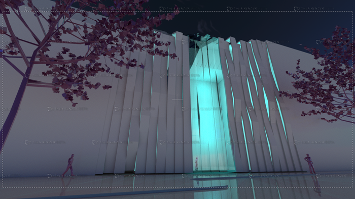
It could also be a possibility to make the bands vertical instead. It's surely a different layout, but equally interesting.
It would probably be easier to implement windows and let the right amount of light in...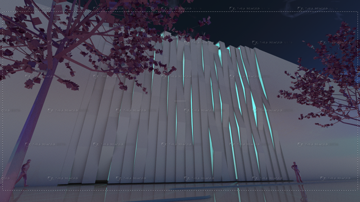
-
RE: Play around with this test scene
Thanks for giving it a spil, HvanEssen.
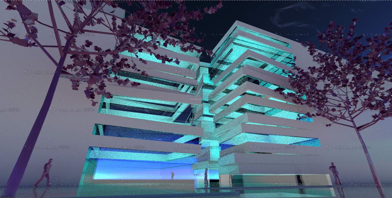
I was headed somewhat in the same direction in regards to making whole "bands" transparent.
This is a quick image of the idea at the moment. With and without transparent bands.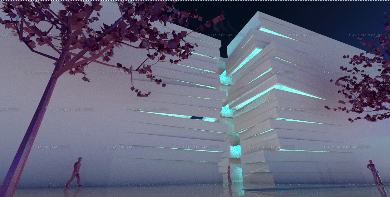
-
Play around with this test scene
Hello to everybody
I'm doing an infill project and at the moment I'm testing a kinda crazy idea, that might have something.
It's still a very abstract idea, and it will surely give me a few headaches, whem I'm trying to convert it into something usefulWindows, good lighting and views will be difficult to implement, without losing some of the conceptual strength. It's a kinda mixed-use project (for lack of a better term) consisting of 3 apartments, and workplaces for creative entrepeneurs.
I'm working on some ideas of how to let in daylight and still keep some of the expression of the preview image I posted. Then I thought of you guys and how maybe you would have some good ideas, and perhaps I could pick your brain about them?
So I included this little test model and thea scene, so some of you could play around with it if you want to.
I'm not trying to pull a "please fix my project" stunt here. I was just playing with the idea in thea render, and thought I could use some inspiration.
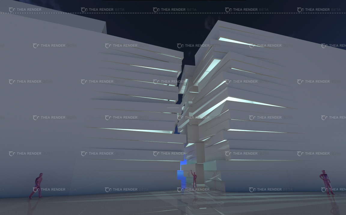
-
RE: Just playing
very clear explanation, majid - thanks!
So from the sketchuppers viewpoint it's a free subdivide & smooth on steroids with a free 3D app on top. Interesting!

How many smoothing iterations did you do on the glass from your renders? I wonder what would create the smallest file size - the wings#3 process you described or the subdivide & smooth plugin? -
RE: Just playing
top notch as always, majid!
@unknownuser said:
combination of sketchup+wings3d is excellent
Interesting you're integrating wings3D in your workflow.
Would you care to drop a few lines about how you do that? -
RE: Best office suite free the rest of 2009
...it's cool gaius, I kinda got it

I have actually used both open office and softmaker. I prefer the latter, mainly because of the reasons I described in my second post. But people normally have very independent preferences when it comes to software. Features, performance, GUI and so on. So it's probably easier to try it out for yourselves.
-
RE: Best office suite free the rest of 2009
@unknownuser said:
the difference is, it costs 79 € and there is a 30-days trial and Open Office is free.
I dont't think you took the time to read either the title of the thread or the initial post.
-
RE: Best office suite free the rest of 2009
I dont't think you read either the title of the tread or the initial post.
-
RE: Best office suite free the rest of 2009
In my experience it is MUCH faster, and it might just be me, but I find that important when choosing software.
It reads and writes excel and word files better. I didn't really have any problems with writer when I was using open office, but there were several problems when opening excel files in calc.
The interface is revolutionary, but it is minimalistic and highly customizable - I dig that.
But I can't say that you will like it better than open office - that's up to you guys to find out. All I'm saying is, that I think it is really good and now it won't cost you anything to try it.
You can read the feature list at link in the first post or here, if you want to compare the two:
textmaker: http://softmaker.com/english/ofctm_en.htm
planmaker: http://softmaker.com/english/ofcpm_en.htm
presentations: http://softmaker.com/english/ofcpr_en.htmI'm sure there are reviews out there that would favor open office, I just didn't bother to search any further
comparison review #1:
http://www.infoworld.com/d/applications/better-office-alternative-softmaker-office-bests-openofficeorg-445comparison review #2:
http://www.linuxworld.com/reviews/2009/063009-the-better-office-alternative-softmaker.htmlcomparison review #3:
http://ostatic.org/blog/tiny-softmakers-office-suite-beats-openoffice-in-reviews-what-givesAgain, I'm not selling anything here, I just thought you guys might like to know. And knowing what Richard can do with word, this is practically a free fully-packed writing, cad and graphics suite!
