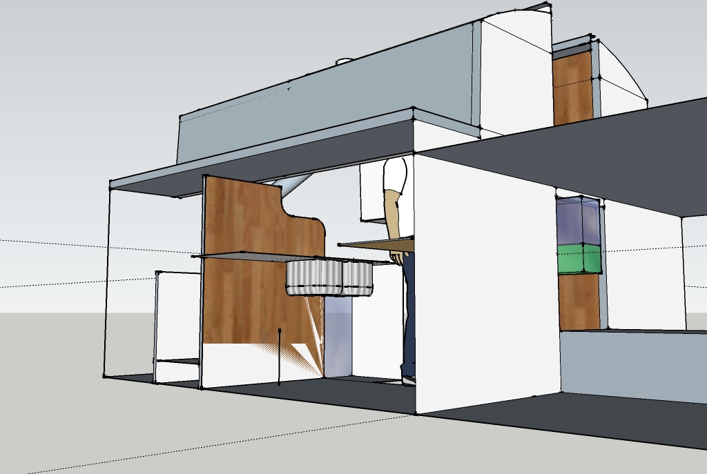
@unknownuser said:
that's z-fighting
you have two faces on top of each other.. you'll have to delete one of the faces if possible. (or get them off of the same plane via some design change)
[edit].. it would probably help if you upload the skp.. two reasons -- one, people could find the problem more easily and two, they could show you how to fix/prevent it more easily
aha. I don't know how duplication happened exactly, but it doesn't surprise me all that much. I'm working "in tight spaces" and having difficulty controlling the over-eager inferencing feature 
As a newbie to CAD I'm discovering all kinds of technique issues. My approach -- which may have been stupid -- was as follows: first, draw a handful of necessary components for my interior sketch (such as a wood stove, double sink, and propane cooktop with dimensions taken from real life). Then I worked intuitively from larger to smaller structure, taking the outside dimensions of the cabin followed by the inside dimensions, roughing in bulkheads (walls) and doorways. Then I tried to draw the interior joinery (countertops and so on) and place the prefabricated components. Here's where it started to get tricky, as I was working inside the structure with weird sightlines and too many vectors to which SU kept trying to snap lines. It got harder and harder to see what I was doing as the visual field got crowded.
I can hide surfaces, of course; but sometimes I need to be able to see some structure for alignment and orientation, yet it's in the way wrt mouse-picking. I had moments of hair-tearing frustration with objects popping around into different perspective lines on the tiniest mouse movements  or objects refusing to move on the axis I was trying to relocate them on, but arbitrarily (it seemed to me) insisting on a different axis. any tips on "how to work effectively inside a Sketchup architectural space?
I'll attach the skp file in case anyone wants to comment. I am sure Enlightened Masters like Gaieus will find it hideously amateurish and sloppy  but in this case it really is a sketch, with approximate dimensions for a reality check. I'm not planning to take a cut-list off it! just to get a feel for what's possible... nevertheless I'd be interested to learn how to do things smarter and easier, and especially how to reduce the mess, orphan surfaces, weird little gaps, etc.
The most difficult Sketchup activities, imho, are selection and relocation. Constructing shapes is dead easy (brilliant interface and metaphor imho), and measuring is delightfully intuitive with Tape Measure. Construction lines are dandy -- except for the darned x or + signs at each end, which are hard to select and erase (my models usually end up dotted with orphan +'s like fruit flies). The fancy special effects (plugins) are like a big box of candy  all tasty and so easy to use.
But the really challenging task is the basic one of properly selecting and repositioning elements; sometimes I feel like I'm fooling with a Rubik's Cube, trying to find just the right POV and order of operations to slide a piece into its correct place. Even with X-ray option and surface hiding, it can be tricky. One of the disconcerting things to this n00b is the way that surfaces and shapes become melded with the larger model as they snap to its edges or surfaces; several times I've wanted to resize a "plane" such as a wall, only to find the whole model distorting because the plane is now glued to the rest of the model along one or more edges. I sometimes wish there were a way to divorce a selected chunk of geometry from the model, fool with it, and then glue it back on.... but there are other ways to accomplish such modifications and I'm learning them slowly 
(.8 MB file attached)
Rough sketch of new galley layout

 i meant plugins folder of course..
