A short test.
-
About four inches, probably.
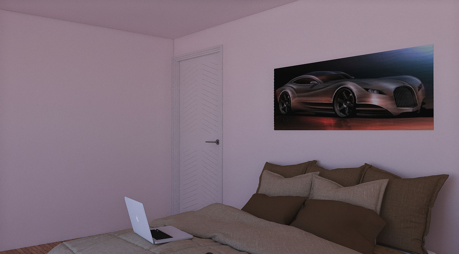
No seriously, I was thinking of 3d wall hangings for render scenes, a picture with elevation etc.
This piece is adapted from a wall panel with an image draped over it.
Elevation change is about one inch over the whole unit but probably needs to be exaggerated some more.
Wotcha fink folks?
Listening to Fleetwood Mac's latest album, "Say you will". They still have it imho.

-
It's looks like a picture on a wall and a good render.
Is there something else I'm missing?
-
No worries Bryan, I had a weird sense of humour going last night.
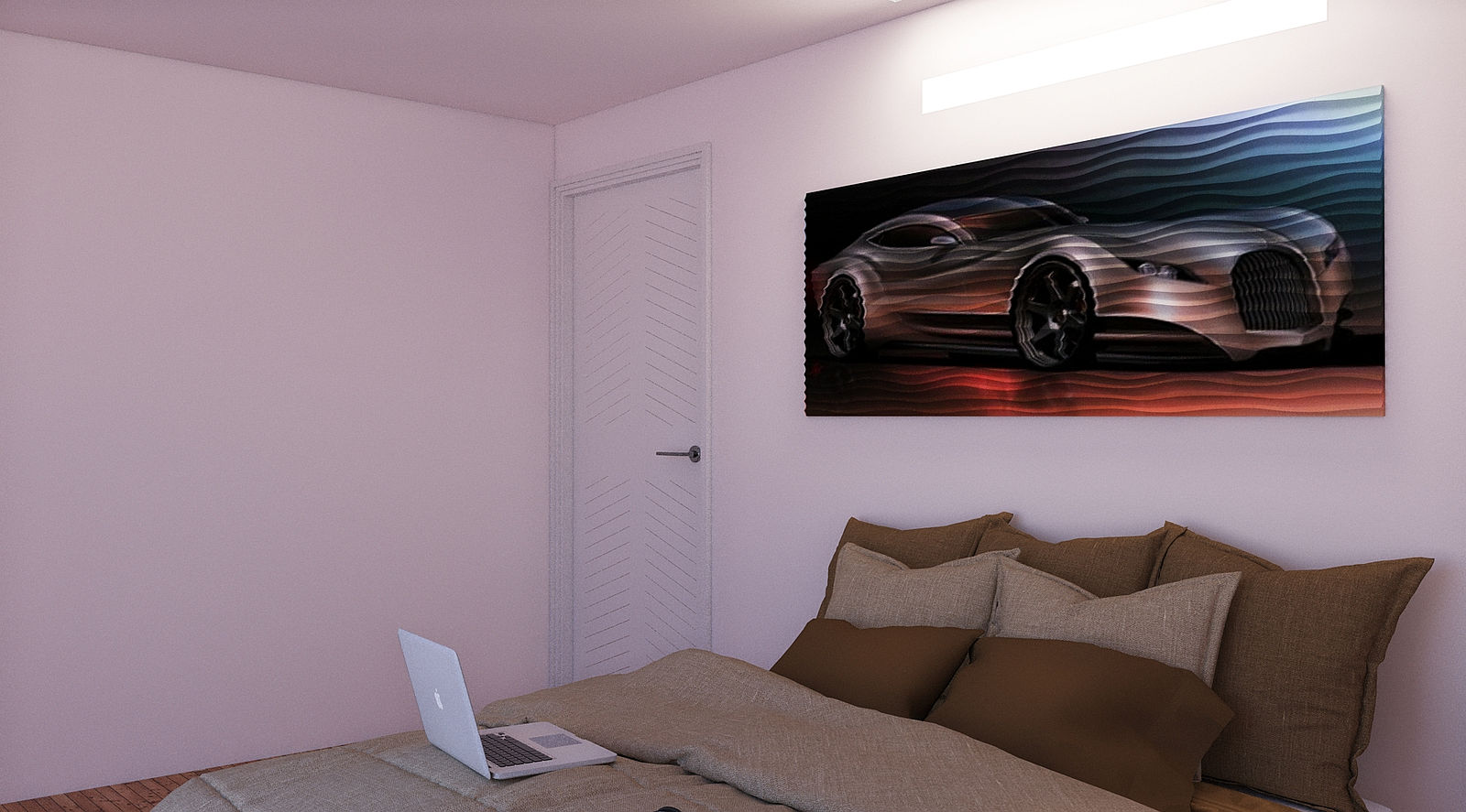
The picture is the point of the render to test a 'picture' with 3d topography and it will need some lighting twists to get the correct image. Take something like rippling sand and extrude it, then drape an image across it and Bob is your mothers brother or something.
The original 2d model is a wall panel repeated to increase the size to a useful level but I shall add an image to demonstrate better later.
-
Is it meant to be fabric?
I'm not sure what I am supposed to see. The ripples suggest a fabric but the geometry is to perfect to sell fabric.
-
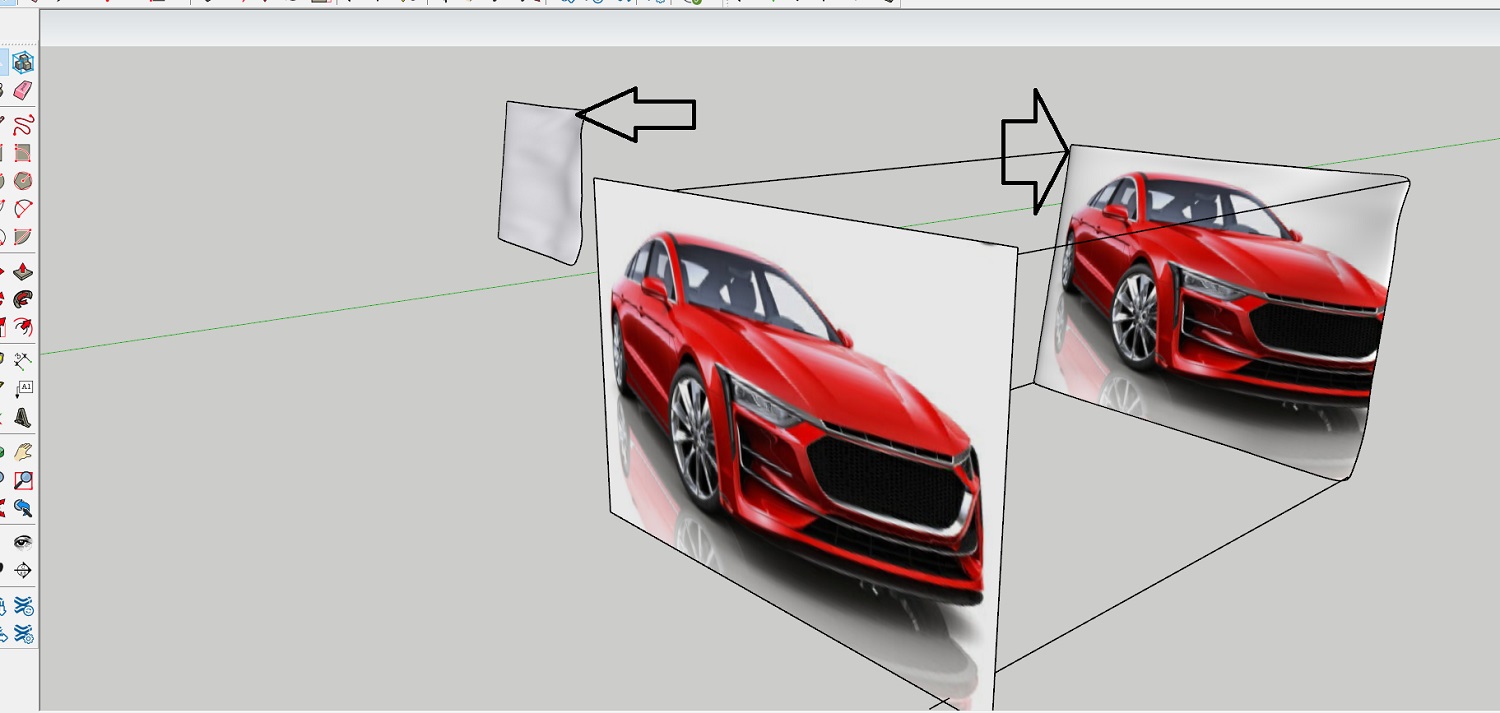
Hi Mike, if I read your correctly that you want a picture on a wall hanging. I downloaded this model https://3dwarehouse.sketchup.com/search/?q=cloths%20line&searchTab=model And chopped it up so to get a "hanging fabric" I projected it using this method:
https://www.google.com/search?q=project+onto+shape+sketchup&rlz=1C1CHBF_en-GBAU948AU948&oq=project+onto+shape+sketchup&aqs=chrome..69i57j0i546.18946j1j15&sourceid=chrome&ie=UTF-8#kpvalbx=_0AqvYuHcMoCaseMP89OImAQ53I projected the car image onto the hanging fabric surface as per the image attached

-
Thanks mate, the issue I have been looking at is not the image per se, rather the demonstration of the geometry with the image on it. I have adjusted the lighting to show this better. Just trial and error and I think a variation of this will work reasonably.

-
Ah. I see. Thanks for the explanation.

-
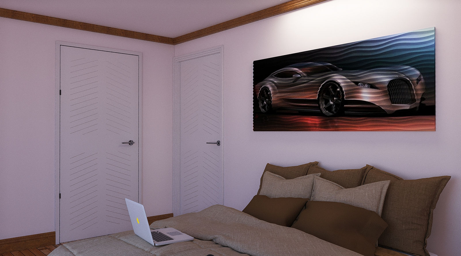
One light only in the final test but much the same result so the need to increase the geometry depth is proven. Light from the right direction helps.

-
That lighting looks really good.

-
Thanks mate, One artificial light and sketchup sun.
-
Interesting concept. Difficult to pull off so average person realizes just what the effect is. I think it’s worth experimenting with.

-
Thanks mate, something else I have thought about is textured glass with light elements (Coloured obs) and used as a moveable room break perhaps.
Hello! It looks like you're interested in this conversation, but you don't have an account yet.
Getting fed up of having to scroll through the same posts each visit? When you register for an account, you'll always come back to exactly where you were before, and choose to be notified of new replies (either via email, or push notification). You'll also be able to save bookmarks and upvote posts to show your appreciation to other community members.
With your input, this post could be even better 💗
Register LoginAdvertisement


