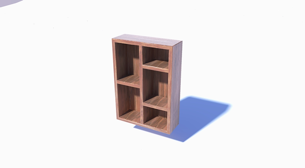
Some tips about why my render looks poor?
-
Hi everybody.
I'm sorry to bother you with this question, but it would be possible someone gives me some advices why this render (I'm starting my first tries with v-ray) looks so blue instead of white and nothing realistic?. I attach my .skp file.
I added different lights, all they white, trying different values, with walls and no walls, I disabled sky and sun light, but this is the best I get.I think there are no reversed faces,I tried some correction controls and changing the exposure value and material override is disabled.

I watched a couple of tutorials in Spanish but I didn't find any tutorial about the setup when you want to render a simple object with no more context like this:

All help is very welcome, it would be great if someone has some file what I can inspect and learn something from the setup, thanks in advance.
-
@baz said:
Had a very quick play with your model.
I dont use Vray, but Twilight. But these tips apply anyway.
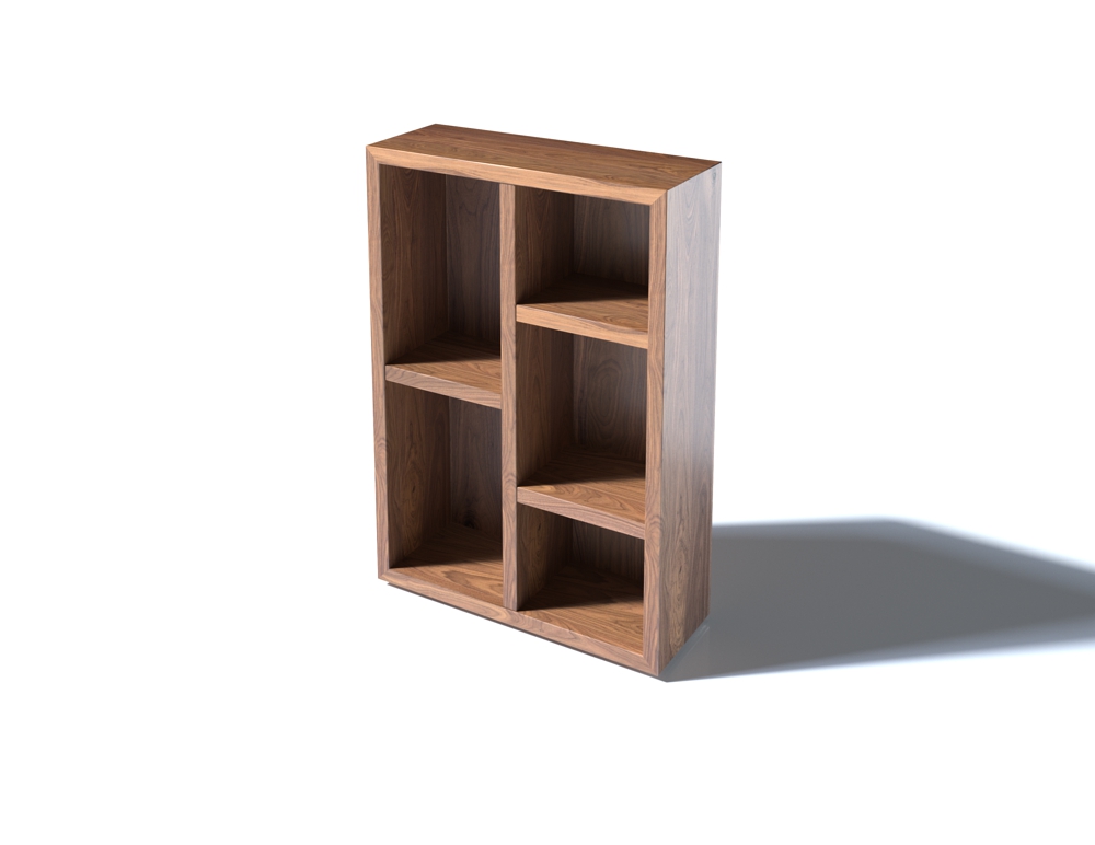
Your model is not very realistic, so grain orientation fixed and impossibly sharp edges softened. Also put your model in a curved stage to eliminate hard shadows. And added some shine and bump to the wood.Suggest you watch some YouTube beginner vids.
Good Luck.[attachment=0:mb3nxs0l]<!-- ia0 -->poor_scene_Escena1-baz.jpg<!-- ia0 -->[/attachment:mb3nxs0l]
Thank you, I cannot see the file till I get home, I think I got the point of the grain orientation (If you mean the texture orientation) and the sharped edges, I watched some videos for beginners last two days but I have no clear why the floor looks blue instead of white despite of the illumination I set, I maybe get this clear when I get home and I can see the file.
-
the Skp wont have any render settings, but has my geometry/texture changes.
PS; your model broke on me when I went 'Round corner'. Needs a complete remodel, me thinks. Just trace over the group paying extreme attention to 'xyz' And make a good simple one? -
Had a very quick play with your model.
I dont use Vray, but Twilight. But these tips apply anyway.
Your model is not very realistic, so grain orientation fixed and impossibly sharp edges softened. Also put your model in a curved stage to eliminate hard shadows. And added some shine and bump to the wood.
Also deleted whole bunch of entities, a sort of studio around the 'badly drawn box'. Vray?Suggest you watch some YouTube beginner vids.
Good Luck.
-
Now thinking original image a bit 'Stinky'?
Or, does it matter which way 'textures' point? Even Wood or Feathers? -
@baz said:
Now thinking original image a bit 'Stinky'?
Or, does it matter which way 'textures' point? Even Wood or Feathers?It's not a real pronect, just to show in the forum because I have same problem with everything.
-
Whats the reason to see it blue instead of white then?, someone knows?
-
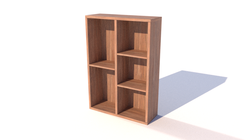
I just quickly rebuilt this. Like others were saying, you need to start with a good model, radius or chamfer the edges. I also set back the dividers a smidge. That helps make things look more realistic. Keep your materials going the right way. I brought it closer to the ground and used an infinte plane with shadow catcher. I am using Thea by the way. I used a basic studio hdri and pressed play.

-
Mr Ib. Lookin good. Post the skp if you have changed it.
-
-
It doesn't have the same materials though.
-
@baz, @l_breault, thank you both for telling me some tips and share a .skp file with some modifications to make it look better.
I was trying to do a better design trying not to look like an idiot (the one in the post was a fast example). I tested several configurations in the render, the only way I can get a floor close to white and not to blue is using the sunlight default option and adding a dome light, I was getting crazy trying to rotate the textured, so ...
I'd like to see some vray light setup to get something like the picture from my first post.

I need a little rest after so much sketchup

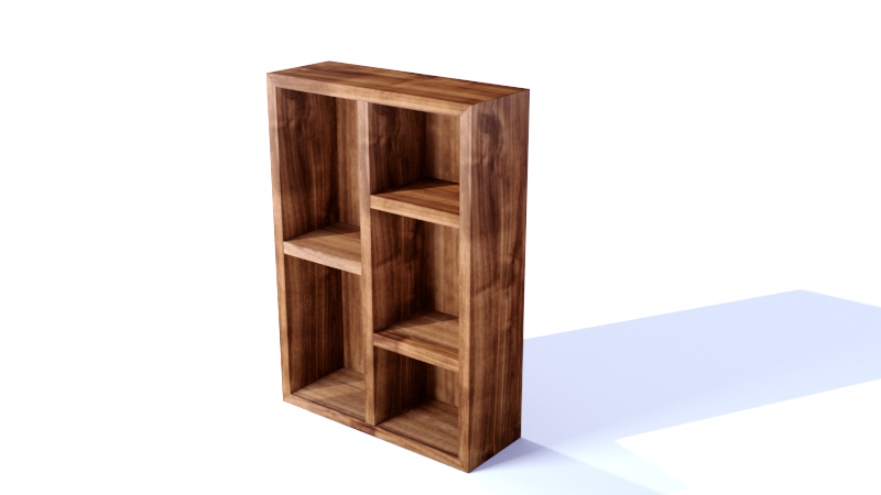
This is the best I got so far:
I think I fixed the grain orientation.
I think I fixed the sharped edges.
Now the light looks not blue, but it looks still a little pink, if I try to make it more white intense, then the furniture gets overexposed (not sure about the English word).

-
Keep in mind most renderers use some (a lot) of post processing in Photoshop or similar after their bake their renders. With post processing you can fix things like white balance much easier than fiddling with settings via the render software.
-
@rspierenburg said:
Keep in mind most renderers use some (a lot) of post processing in Photoshop or similar after their bake their renders. With post processing you can fix things like white balance much easier than fiddling with settings via the render software.
I think you're right, using the .skp file from l_breault and using post processing from v-ray through corrections control, I can get something like this (not as good as him, but better than my first try):

-
Much better. I don't know what vray has for white balance, but that could help. I also use an all white color for a background image and that helps.
Hello! It looks like you're interested in this conversation, but you don't have an account yet.
Getting fed up of having to scroll through the same posts each visit? When you register for an account, you'll always come back to exactly where you were before, and choose to be notified of new replies (either via email, or push notification). You'll also be able to save bookmarks and upvote posts to show your appreciation to other community members.
With your input, this post could be even better 💗
Register LoginAdvertisement


