Interior rendering
-
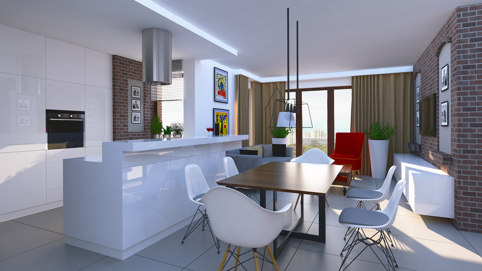
Hi guys, yesterday i did my first interior render and im looking for tips to make it better. Any kind of criticism aprreciated
 The picture is in the attachment.
Sketchup 2017 + Vray 3.4, design provided by contractor
-
I think rounding corners of objects is needed.
Nothing is 100% 90deg in the real world. Edge bevels add more little highlights
-
2 sided material on the curtains
Add some downlights, recessed cans maybe.
As far as the image is concerned, there is no focal interest. Remember the rule of 3rds. Break the image up and see what's happening at those intersections. My eye does right to the empty table, put some flowers there, Maybe open the curtain a little more.Feels cold in there, lots of blue light from your sun GI system, make sure to warm it up in post with a warming filter or something.
-
Overall i like it. Its a clean with realistic feeling.
Below are my suggestion to further to further improve the composition for your consideration:-Ambient requirement to be produced by one light source seems need to improve, propose to add light sources such as task light and accent light.
-Propose to change the material or design of tv rack it seems like a work station.
-change pillow, use a lighter colored textile
-Pendant seems floating add base plate.
-Depth of wall cladding at the picture frames near the tv seems not enuf.
-Enhance the Ambient occlusion a little bit to emphasize lines.
Hello! It looks like you're interested in this conversation, but you don't have an account yet.
Getting fed up of having to scroll through the same posts each visit? When you register for an account, you'll always come back to exactly where you were before, and choose to be notified of new replies (either via email, or push notification). You'll also be able to save bookmarks and upvote posts to show your appreciation to other community members.
With your input, this post could be even better 💗
Register Login


Advertisement