What is the best background colour for working on computer
-
I sample the top menu bar's 'grey' [#dadada] and use 'steel' [#4c4c4c] instead of black...
john
-
I use the grey background colour used for default Architectural templates: #ccccc9

-
+1 for grey. Although when starting importing SU files in LayOut, I switch to white. For some reason, making updates to styles sometimes cause havoc in my LayOut files.
-
I use the attached

-
I keep changing mine, and now I'm working with grey too, but I think you should change as it keeps you fresh and not repetitive. I have also done some cool stuff with white backgrounds and changing face colors.
The main thing for me is that a white/grey face never gets mixed up with a white/grey background.
However, I believe what you want is something that hurts less the eys and I think if that's the case you should avoid blue and go to yellowish soft whites.
-
I like the soft green. I also think a slight desaturated default color works best shading and seeing surfaces against other geometry.
-
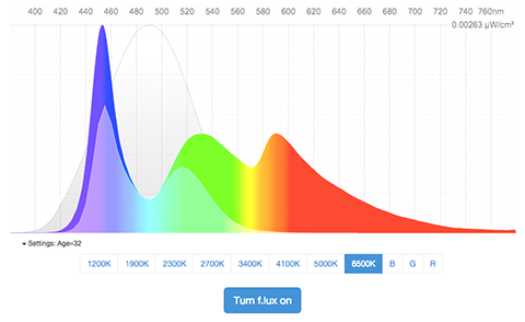
Here is a good article by Wired,Keep Your Computer From Destroying Your Eyesight
http://www.wired.com/2013/09/flux-eyestrain/They reccomend f.lux https://justgetflux.com I've tried it and it makes working through the day to nite transition period less stressful.

-
Try RGB 240, 240, 240
I've used it for years with Flux
-
I've had mine set to 204/204/204 [80% black / white] for some time but I actually like 240/240/240 better. Thanks Rich!!
While on base colours, does anyone stick with the standard default front / back colours?
-
@utiler said:
I've had mine set to 204/204/204 [80% black / white] for some time but I actually like 240/240/240 better. Thanks Rich!!
While on base colours, does anyone stick with the standard default front / back colours?
The 240 is great, never occurred to me to change before, despite eyestrain.
And yes, never saw the need to change the default front/back, except when I need a good 2d graphic export, then I use black for the back. -
I'm always changing, but for work, my back color is usually saturated.
However, recently I've made my backface color transparent and saturated with a small hack

Now, when I'm inside walls I can see the rest of the project interior, but as the transparency has some color, I understand where I am in the model:
-
How to set the backface with transparent value?
-
Aha! That's the hack!
It only works if you are used to painting faces directly and you know how to control backfaces/front faces (wich I'm sure matches youreself Rich...):
- You wrap your geometry in a component/group and paint it with a transparent material;
- This results in the component being fully transparent (backface and front face);
- You paint faces directly and the face you'll paint will become opaque, while the other will keep transparency.
Now, if you know what you're doing you won't have reverse faces on your renders, if you don't know what you're doing, you'll probably mess your whole model, if you really don't render much, probably you'll never see the problem.
Two tools by Fredo will help you with this:
- Reverse Orient Faces - When activated this allows you to quickly flip your reversed faces and it uses front face style to show you the backcolor/frontcolor of faces for easy fixing;
- Thrupaint will allow you to paint on faces directly, so you never paint the full component, it will allow you to, paint only the front face too and override default paint bucket tool.
It's probably an advanced technic wich is only useful for specific scenarios.
I asked trimble for a way to set front face/back face transparency, but I bet it's way down on the priority list.
NOTE: One more thing, this is the way, Unity, UE4, Substance and Sketchfab works, and it allows for great things like this one:
-
OK, i thought you had figured out an easier method.
Hello! It looks like you're interested in this conversation, but you don't have an account yet.
Getting fed up of having to scroll through the same posts each visit? When you register for an account, you'll always come back to exactly where you were before, and choose to be notified of new replies (either via email, or push notification). You'll also be able to save bookmarks and upvote posts to show your appreciation to other community members.
With your input, this post could be even better 💗
Register LoginAdvertisement


