Shading and bump issues (VfS 1.6)
-
Can you post the bump map file and show us your material settings?
Are you on 1.6 or 2.0? 1.6 was only a beta and you should be on 2.0 now.
-
Thanks for the replies.
@rspierenburg - Yeah, I'd thought about modelling the grout lines as a last resort... guess that's the plan now.
@valerostudio - I'm using 1.6 at the moment because I couldn't access the 2.0 demo until just this morning. Just a little wary on upgrading now... I'm worried the profiles won't save...? Also, just realizing now how massive my materials are (perhaps this is where the problem lies?). Can't upload the image so this link will have to suffice: http://img834.imageshack.us/img834/8596/uwy8.png
-
Sorry, forgot to give you my bump settings. I should also note that I'm using a reflection map for the grout, but the tiles appear smooth regardless of whether it's enabled.
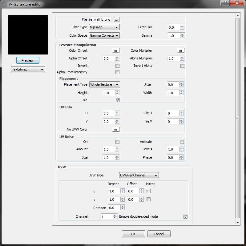
-
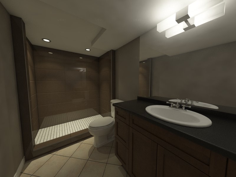
And yet another issue - I'm getting this weird blotchy lighting from my wall lamp. The cover is a two-sided material and the bulbs are just basic emitters. Any ideas?
-
Emitters as in Emissive material? Its been strongly suggested against using emissive materials as primary lights for this exact reason.
-
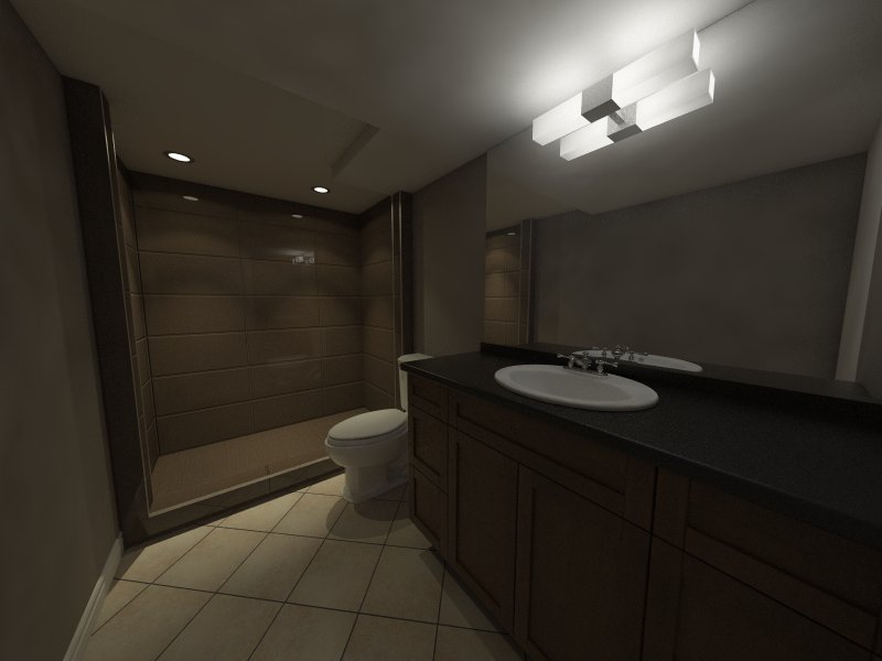
I'm still getting the blotchiness with the sphere lights...
-
- I actually don't mind how the grout lines are rendering. I have more problems with the general lighting of the scene. Seems a bit dark and uninviting. I would also reduce the reflection on the tile, it is distracting and seems unrealistic. Look at this link below.
- What I meant about settings was the amount you have set. Is it set to 1? I have found using 1 is a bit problematic, so try something like .85
- 1.6 is a beta, and its a beta that had a lot of bugs. The most current 2.0 is where you want to be and it will not affect any settings you have.
- The splotches are most likely from your render settings. Interiors that are low light, like this one will need 2 things. A - more light B - higher light cache settings. Chaos has given us the lovely feature of presets. Try them out. Use Interior - High Quality.
-
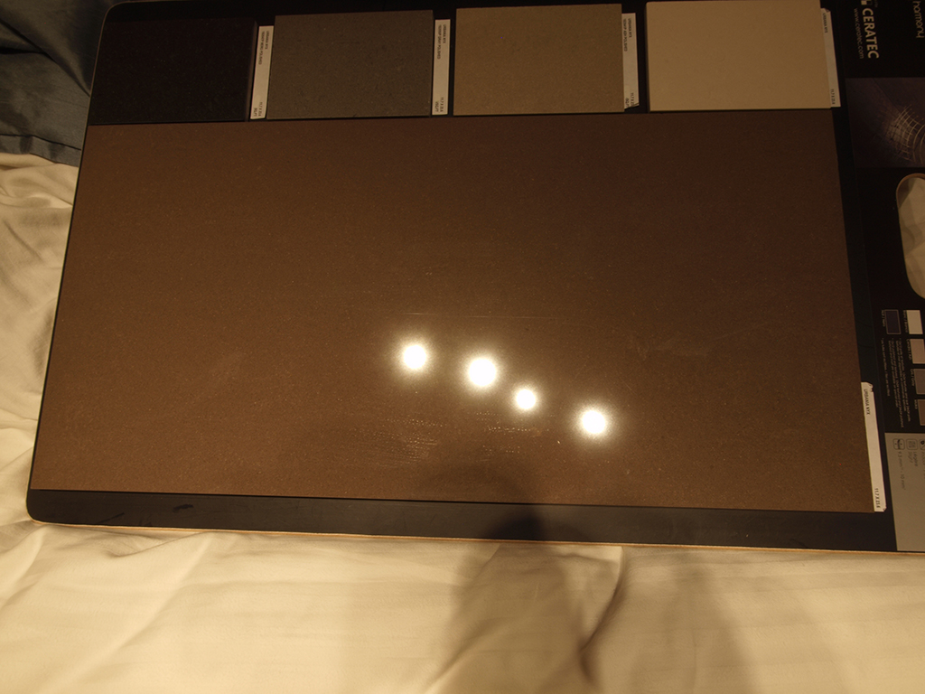
- I'd be happy keeping it the way it is, but I'm trying to simulate actual brand materials since this is a real project. I've attached a picture of a sample tile for context (it's quite a bit less red irl). Also, the lighting is work in progress.
- Sorry, it's set to 1.
- Perfect, I'll get it running in a moment.
- Handy, I had no idea there were presets. I'll give them a go when I get 2.0 running.
-
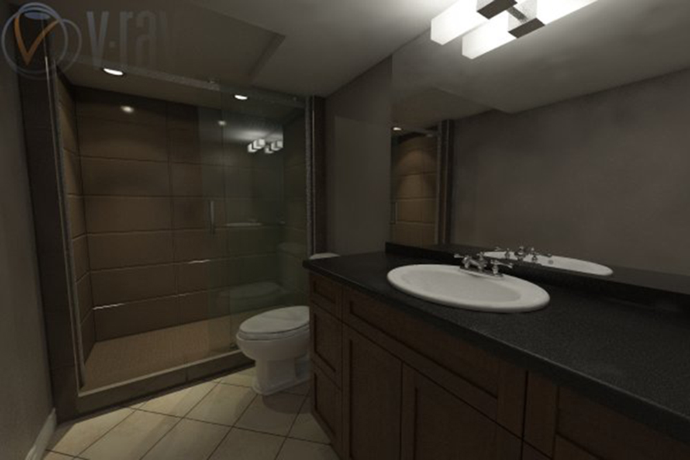
Here's a new render with 2.0. I had to scale up the image quite a bit since the demo version only permits a max output size of 600 x 400. And obviously some materials need tweaking...
Anyways, setting the bump to 0.85 didn't seem to help. Also, I tried using the high quality interior preset, but it didn't seem to remedy the splotchiness.
-
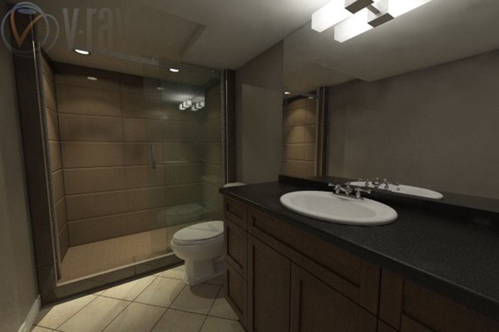
Agh, sorry for spamming, but a new idea's yielded some promising results. Getting a lot less splotchiness after cranking up the down lights in the shower. I gather it has something to do with the way V-Ray handles scenes without environmental lighting?
-
If you looking for sharp corners on the tile, maybe I would just model it. It's not a ton of modeling and would yield the most realistic result. Would you mind packing and sharing the model?
-
Have you tried increasing the HSph subdivs (under the irradiance map rollout) to something like 80-150 to reduce the blotchiness?
-
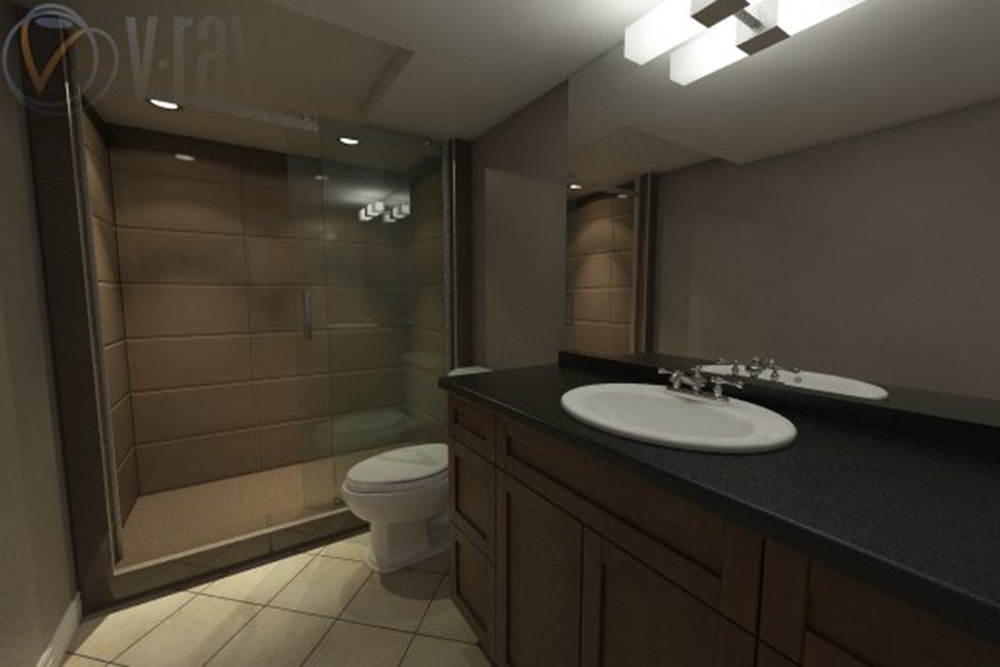
Just tried increasing the HSph subdivs to 150 and it seems to be doing the trick. Thanks for the suggestion.
Hello! It looks like you're interested in this conversation, but you don't have an account yet.
Getting fed up of having to scroll through the same posts each visit? When you register for an account, you'll always come back to exactly where you were before, and choose to be notified of new replies (either via email, or push notification). You'll also be able to save bookmarks and upvote posts to show your appreciation to other community members.
With your input, this post could be even better 💗
Register LoginAdvertisement


