Learning to Render (using Twilight)
-
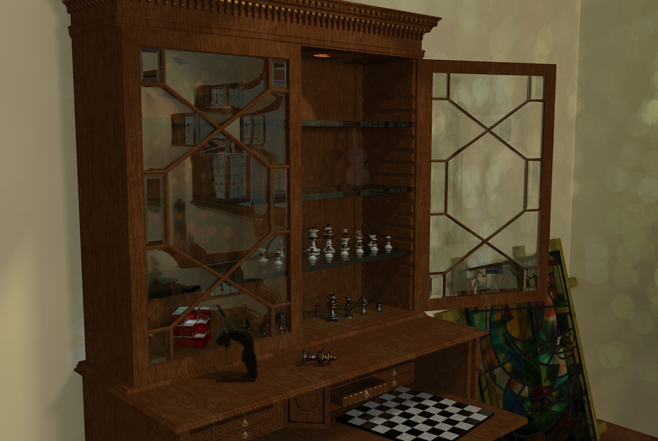
Yeah Box, they all look a bit dull or muddy. I think you need to calibrate your rendering monitor as you have said. Loving the work though, with some contrast adjustment and exposure tweaking they'll be gold. Get some more light coming in to see the caustics from the coloured glass, using interior+ preset works best for scenes with refraction and caustics

-
Oli, I've decided everyone else needs to change their settings as mine are obviously perfect.

-
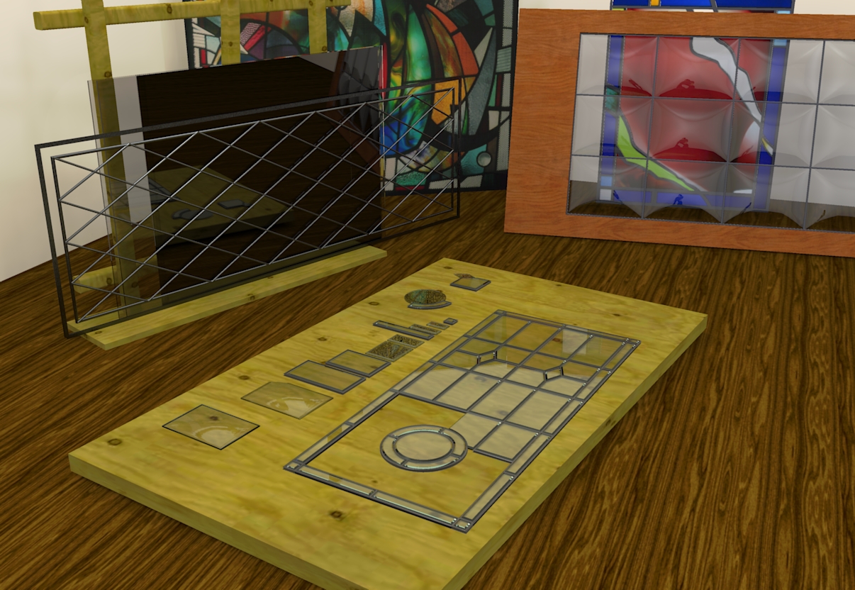
Wow, bubble wrap doors. You should put those on Kickstarter
-
They'd certainly add a little something to your rubber room Rich.
-
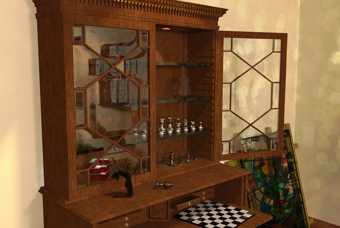
Done a quick calibration of my Monitors.
Can anyone tell me if this looks clearer and brighter?

-
@box said:
Done a quick calibration of my Monitors.
Can anyone tell me if this looks clearer and brighter?Yes! Much better!
-
Excellent John, thanks for letting me know.
-
1000x better. Great image too.
Looks great on my mac. Not like anyone cares. I'm counting down the days til I get a real computer!! Sick to death of mac.

If you're looking for crit I suggest much more reflection to the wood textures. Gives a bit more oomph!
-
Thanks Oli, I know what you mean about the wood, but I'm still getting my head around the glass.
-
Looks pretty damn good to me. With Twilight, I have found default glass material is not reflective enough. If you increase IOR you get a better result IMO. A subtle bumpmap also works well; you can bump any flat colour by applying the bumpmap texture to your window and then link the bump and unlink the texture, then apply template as normal. You can use this to bump a flat colour, good for adding 'scratchmaps' to metal and undulations to stained glass etc.
-
I have to admit I still haven't worked out what a bump map really is. I will get there I promise.
I'm happy slowly working things out, doin a bit of reading and listening to others advice, I'll get there, it sticks better that way for me.
In the mean time I'll drop this one in here too, you've probably already seen it from woodwork, but I like to have a bit of a chronology going on.

-
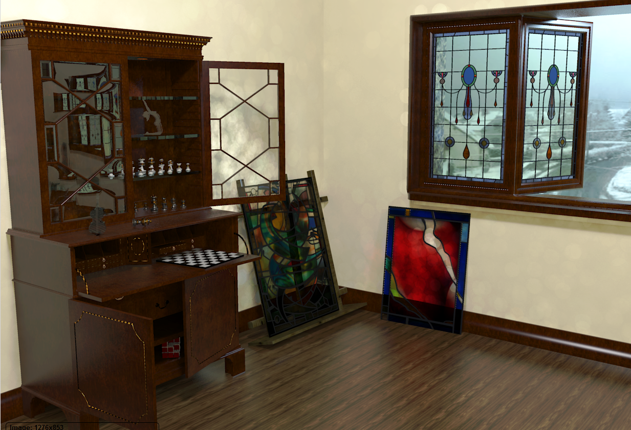
i hope you dont mind, i just modified the levels. what are the circles on the wall?
for wood try using Plastic>Satin template or shiny. Great scene!!

-
Yeah, the levels are a problem for me. Seems fine then it aint, I've calibrated and things look the same on two screens then render and it goes dark on me, but this is a learning thread so I post em anyway. I've not bothered with any post work either, would rather know how to sweep the floor before I paint the house..
The circles on the walls,....mmmm.... well ummm..... think it might be light bouncing around too much. I had set it up using the basic fast settings, then let it run on high while I went shopping. Came back and some twat had been blowing bubbles around in it. -
Box,
Nice glass all around. The proper response is "That's dappled light refracting from objects outside. I worked on that for hours."
Good Luck. Peter
-
You read my mind Peter. My excuse is I was watching a program about the Rijksmuseum while I was doing it so all those Dutch Masters influenced it.
-

I have found render previews look lighter than they actually are. As soon as you click save, the saved image goes dark. So good idea to check the saved image and then increase exposure and save again. I get the same issue with Twi and Thea.
-
I must say the exposure business is driving me nuts, but I'm choosing it ignore it for now as I will be replacing my screens fairly soon, Seems no matter how well I balance/calibrate these they are still very different.
As I will be relocating across the world again soon I will wait till then to replace them.
I worked out what the circles are, reflections from the distorted glass. I had lights in all the wrong places so they were throwing randomly. I placed lights in what would be the correct place in reality and who would have thunk it but you can sort of control things properly, D'oh.
So anyway, with a bit of plastic as you mentioned things look a bit more interesting. I'm sure on some screens this will be dull and on others washed out, but it is here anyway.

-
@olishea said:
:lol:
I have found render previews look lighter than they actually are. As soon as you click save, the saved image goes dark. So good idea to check the saved image and then increase exposure and save again. I get the same issue with Twi and Thea.
I second that! Took awhile to catch that for me though.
-
@box said:
I must say the exposure business is driving me nuts, but I'm choosing it ignore it for now as I will be replacing my screens fairly soon, Seems no matter how well I balance/calibrate these they are still very different.
As I will be relocating across the world again soon I will wait till then to replace them.
I worked out what the circles are, reflections from the distorted glass. I had lights in all the wrong places so they were throwing randomly. I placed lights in what would be the correct place in reality and who would have thunk it but you can sort of control things properly, D'oh.
So anyway, with a bit of plastic as you mentioned things look a bit more interesting. I'm sure on some screens this will be dull and on others washed out, but it is here anyway.Now that is nice , but I really don't like floor texture at all.
-
I agree on the floor John and that highlights why I was reluctant to learn rendering.
Each little imperfection becomes a glaring error.
It's not a criticism of your comment it's just the nature of the beast. You concentrate on tiny details of something and ignore the unimportant, and it's the unimportant that everyone notices.
I started this render to get an understanding of how the curved glass would work, throw in a few bits to make it interesting and I find myself trying to get the chess set to show up and then add some gold leaf to the secretaire oh and the window frame looks crap, hang on that's changed now that I have moved the light, should I bump up the lights inside the cabinet ................
Which is why I'm happy to post them, I'm content to show my flaws, errors and frustrations, it is a WIP thread after all, and I've never been afraid to look like a loon.
Thanks for the comments, I need them all.
Hello! It looks like you're interested in this conversation, but you don't have an account yet.
Getting fed up of having to scroll through the same posts each visit? When you register for an account, you'll always come back to exactly where you were before, and choose to be notified of new replies (either via email, or push notification). You'll also be able to save bookmarks and upvote posts to show your appreciation to other community members.
With your input, this post could be even better 💗
Register LoginAdvertisement


