[Poll] What do you think of the new SketchUp logo designs ?
-
 Add a post to this poll with more detail on your feelings, if you like.
 Don't forget to vote in this poll also:
[Poll] What do you think of the new SketchUp logo color ?~
-
I think it feels too corporate and not very personal. It could be a logo for anything in the corporate world...

-
It seems undefined and almost blurry, with all that red. Less cartoony certainly but more blocky -- in relation to the program's image.
-
It's a clever play on 3D and 2D if a little over simplistic but I hate the red, please can we have it in Trimble blue. At least with the new icons I am more likely to click the right one, I was always "blinded" by the pencil in the old icons when clicking in a hurry.
-
More quiet in bleu and more Trimbling

I see some kites flying in the sky
-
Here's a post on the SketchUp blog about the new icons:
http://sketchupdate.blogspot.no/2012/08/a-brand-new-brand-for-sketchup.html -
I'm not crazy about it, but I didn't like the old one(s) either -- having done some logo design work over the years I have different ideas (especially about the type portion) but I'll keep those to myself. One good thing about this is it might be a harbinger of a full UI overhaul in v9...
Best,
Jason. -
Just a note, that you can change your vote if the design grows on ya'... or the logo design is revised later.
-
To me, the new logo indicates a shift to the more engineering mindset of Trimble. There are a lot of trained architects on the SketchUp team and the original vision of SU was likely as an architectural visualization tool. The latest icons with the house seemed to reflect those roots (and the largest user base? - not sure about that one). As we all know, SketchUp is used for a lot more than building architecture. In that sense, the new logo may be more applicable to the wider SU audience. That being said, I had to really hunt for the new icon on my taskbar this morning.

Edit: I do really like the visually consistent icons for Layout and Style Builder.
-
I wonder if the team who developed this logo knew that Microsoft was going to change theirs. The two are very similar.
The mark itself is successful; it shows an object, in perspective—the default view for SketchUp—and it has clearly been push-pulled, another SketchUp original. The color doesn't even matter to me. It can be any color and still be a successful mark. To the R-G colorblind out there it's probably brown.
-
I thinks, it's like they give low opportunity to Sketchup as the famous and easy 3d modeling software, unlike C4D & Max's logo.
-
On a positive note. When searching through windows explorer, the 2D & 3D logo versions signifying Layout & SketchUp files respectively are a lot easier to identify than the old logos, which were a little difficult to tell apart if you using small icons.
-
yes we all did notice right ?

-
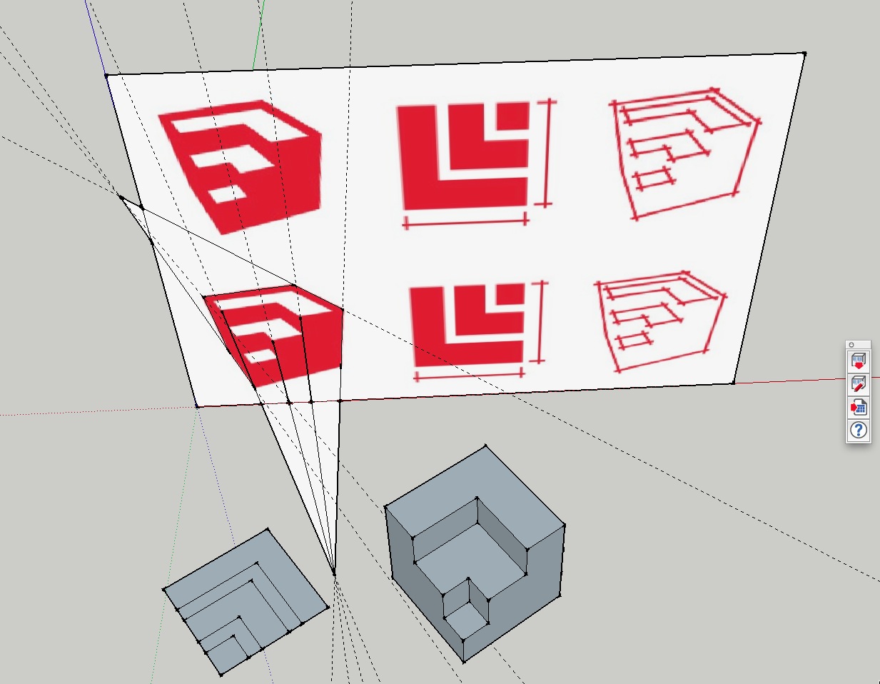
Has anyone played around with the actual logo model? See attached file. It looks to me the the plan view does not correspond to the 3d view!
I take the point regarding a logo's requirement to 'look good' when zoomed out but we are now entering the age of retina display! So does this principle still apply?
Co-incidentally I tried out the 15" MBP Retina today in my local Apple store. It was hard to drag myself away and found my right hand reaching for the wallet in my back pocket but I resisted as I want to wait a few months to check out the 13.3" MBP Retina which is rumored to appear shortly.
My point being that things will look just as good, if not better on the 13.3" than my current 17" MBP.
So, my question is, should the 3D logo be a little more defined with line edges? We are going to be looking at this logo for some time to come
-
-
-
It's inevitable, TT.
(actually that was my thought on the logo too. I dig your cubes.)
-
-
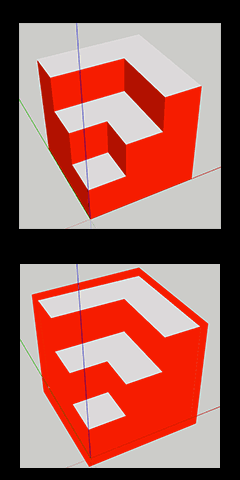
Hi Takahiro, I initially thought it would turn out like your model (which I like) but I don't think it is like this. Have you studied the line projections in my model?
-
@mike lucey said:
Has anyone played around with the actual logo model? See attached file. It looks to me the the plan view does not correspond to the 3d view!
I take the point regarding a logo's requirement to 'look good' when zoomed out but we are now entering the age of retina display! So does this principle still apply?
Co-incidentally I tried out the 15" MBP Retina today in my local Apple store. It was hard to drag myself away and found my right hand reaching for the wallet in my back pocket but I resisted as I want to wait a few months to check out the 13.3" MBP Retina which is rumored to appear shortly.
My point being that things will look just as good, if not better on the 13.3" than my current 17" MBP.
So, my question is, should the 3D logo be a little more defined with line edges? We are going to be looking at this logo for some time to come
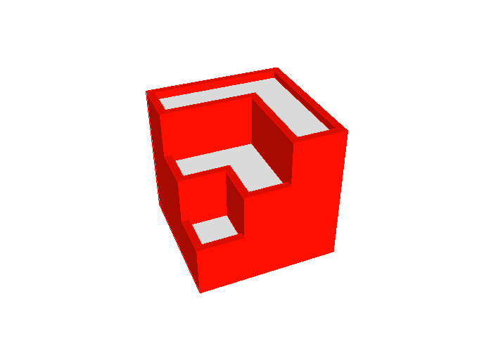
I was looking at your image, Mike, and I THINK that it is extruded "squares" with a heavy, 2D outline:
I drew an "extruded" square with red sides and white tops.
Then I used photoshop to trace around the outside with a thick outline, and changed all red to the same hue...


Hello! It looks like you're interested in this conversation, but you don't have an account yet.
Getting fed up of having to scroll through the same posts each visit? When you register for an account, you'll always come back to exactly where you were before, and choose to be notified of new replies (either via email, or push notification). You'll also be able to save bookmarks and upvote posts to show your appreciation to other community members.
With your input, this post could be even better 💗
Register Login


Advertisement