sketchucation logo sketchucation
    • Login
    ℹ️ Licensed Extensions | FredoBatch, ElevationProfile, FredoSketch, LayOps, MatSim and Pic2Shape will require license from Sept 1st More Info

    [Poll] What do you think of the new SketchUp logo designs ?

    Scheduled Pinned Locked Moved SketchUp Discussions
    sketchup
    32 Posts 20 Posters 4.3k Views 20 Watching
    Loading More Posts
    • Oldest to Newest
    • Newest to Oldest
    • Most Votes
    Reply
    • Reply as topic
    Log in to reply
    This topic has been deleted. Only users with topic management privileges can see it.
    • thomthomT Offline
      thomthom
      last edited by

      Here's a post on the SketchUp blog about the new icons:
      http://sketchupdate.blogspot.no/2012/08/a-brand-new-brand-for-sketchup.html

      Thomas Thomassen — SketchUp Monkey & Coding addict
      List of my plugins and link to the CookieWare fund

      1 Reply Last reply Reply Quote 0
      • jason_marantoJ Offline
        jason_maranto
        last edited by

        I'm not crazy about it, but I didn't like the old one(s) either -- having done some logo design work over the years I have different ideas (especially about the type portion) but I'll keep those to myself. One good thing about this is it might be a harbinger of a full UI overhaul in v9...

        Best,
        Jason.

        I create video tutorial series about several 2D & 3D graphics programs.

        1 Reply Last reply Reply Quote 0
        • Dan RathbunD Offline
          Dan Rathbun
          last edited by

          Just a note, that you can change your vote if the design grows on ya'... or the logo design is revised later.

          💭

          I'm not here much anymore.

          1 Reply Last reply Reply Quote 0
          • W Offline
            wyatt
            last edited by

            To me, the new logo indicates a shift to the more engineering mindset of Trimble. There are a lot of trained architects on the SketchUp team and the original vision of SU was likely as an architectural visualization tool. The latest icons with the house seemed to reflect those roots (and the largest user base? - not sure about that one). As we all know, SketchUp is used for a lot more than building architecture. In that sense, the new logo may be more applicable to the wider SU audience. That being said, I had to really hunt for the new icon on my taskbar this morning. 😕

            Edit: I do really like the visually consistent icons for Layout and Style Builder.

            1 Reply Last reply Reply Quote 0
            • Phil MeadowsP Offline
              Phil Meadows
              last edited by

              I wonder if the team who developed this logo knew that Microsoft was going to change theirs. The two are very similar.

              The mark itself is successful; it shows an object, in perspective—the default view for SketchUp—and it has clearly been push-pulled, another SketchUp original. The color doesn't even matter to me. It can be any color and still be a successful mark. To the R-G colorblind out there it's probably brown.

              1 Reply Last reply Reply Quote 0
              • N Offline
                ninopiamonte
                last edited by

                I thinks, it's like they give low opportunity to Sketchup as the famous and easy 3d modeling software, unlike C4D & Max's logo. 😕

                1 Reply Last reply Reply Quote 0
                • emerald15E Offline
                  emerald15
                  last edited by

                  On a positive note. When searching through windows explorer, the 2D & 3D logo versions signifying Layout & SketchUp files respectively are a lot easier to identify than the old logos, which were a little difficult to tell apart if you using small icons.

                  1 Reply Last reply Reply Quote 0
                  • E Offline
                    etobic
                    last edited by

                    yes we all did notice right ?

                    http://content.screencast.com/users/Etobic/folders/Jing/media/0a5eacd1-4d97-4b7c-966f-cccd7e84c3d6/Did you notice.png

                    1 Reply Last reply Reply Quote 0
                    • Mike LuceyM Offline
                      Mike Lucey
                      last edited by

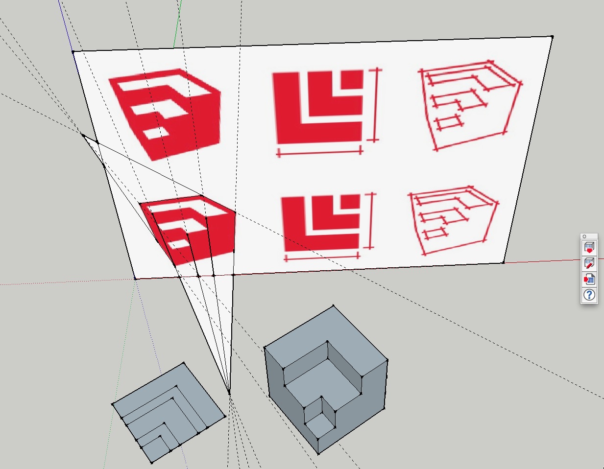
                      Has anyone played around with the actual logo model? See attached file. It looks to me the the plan view does not correspond to the 3d view!

                      I take the point regarding a logo's requirement to 'look good' when zoomed out but we are now entering the age of retina display! So does this principle still apply?

                      Co-incidentally I tried out the 15" MBP Retina today in my local Apple store. It was hard to drag myself away and found my right hand reaching for the wallet in my back pocket but I resisted as I want to wait a few months to check out the 13.3" MBP Retina which is rumored to appear shortly.

                      My point being that things will look just as good, if not better on the 13.3" than my current 17" MBP.

                      So, my question is, should the 3D logo be a little more defined with line edges? We are going to be looking at this logo for some time to come 😄


                      Exploring Logo.skp


                      Exploring Logo.jpg

                      Support us so we can support you! Upgrade to Premium Membership!

                      1 Reply Last reply Reply Quote 0
                      • GaieusG Offline
                        Gaieus
                        last edited by

                        @mike lucey said:

                        Has anyone played around with the actual logo model?


                        trimble.jpg

                        Gai...

                        1 Reply Last reply Reply Quote 0
                        • thomthomT Offline
                          thomthom
                          last edited by

                          @gaieus said:

                          @mike lucey said:

                          Has anyone played around with the actual logo model?

                          ❗

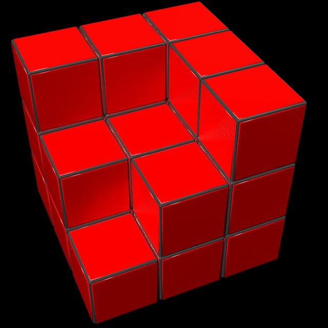
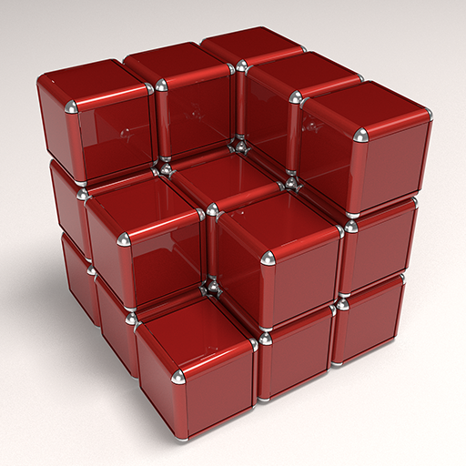
                          Yesterday I was playing around with a Cover Photo for Vertex Tools' G+ page:
                          G+ Cover Photo

                          I was just throwing some vertices randomly around - but I now realize I was building the Trimble logo!

                          Vertex Trimble

                          Thomas Thomassen — SketchUp Monkey & Coding addict
                          List of my plugins and link to the CookieWare fund

                          1 Reply Last reply Reply Quote 0
                          • pbacotP Offline
                            pbacot
                            last edited by

                            It's inevitable, TT.
                            http://3.bp.blogspot.com/-bDN7R5ObQWg/T6VKYrSf7qI/AAAAAAAAB00/aRI9oQ9xKZU/s1600/close%2Bencounters%2Bof%2Bthe%2Bthird%2Bkind.jpg

                            (actually that was my thought on the logo too. I dig your cubes.)

                            MacOSX MojaveSketchUp Pro v19 Twilight v2 Thea v3 PowerCADD

                            1 Reply Last reply Reply Quote 0
                            • genki.ttG Offline
                              genki.tt
                              last edited by

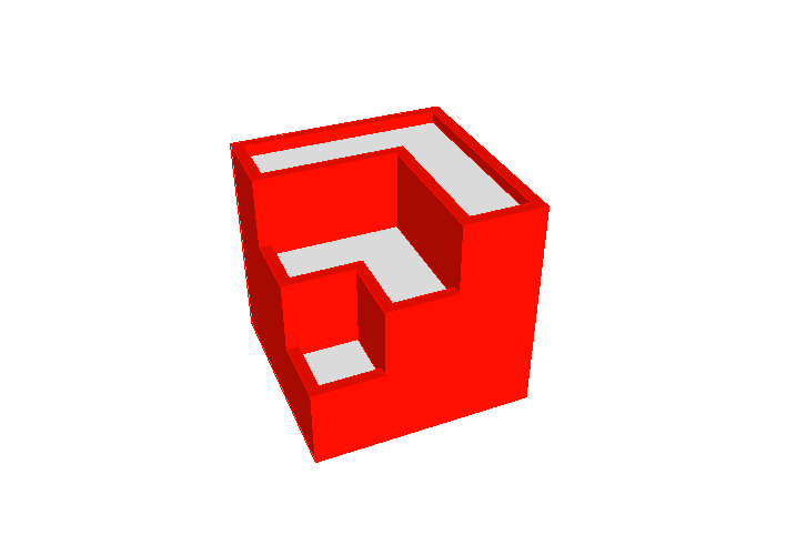
                              I think it has wall width and parapet .. ?
                              SketchUp_NewLogo.png


                              SketchUp_NewLogo.skp

                              1 Reply Last reply Reply Quote 0
                              • Mike LuceyM Offline
                                Mike Lucey
                                last edited by

                                Hi Takahiro, I initially thought it would turn out like your model (which I like) but I don't think it is like this. Have you studied the line projections in my model?

                                Support us so we can support you! Upgrade to Premium Membership!

                                1 Reply Last reply Reply Quote 0
                                • aarondietzenA Offline
                                  aarondietzen
                                  last edited by

                                  @mike lucey said:

                                  Has anyone played around with the actual logo model? See attached file. It looks to me the the plan view does not correspond to the 3d view!

                                  I take the point regarding a logo's requirement to 'look good' when zoomed out but we are now entering the age of retina display! So does this principle still apply?

                                  Co-incidentally I tried out the 15" MBP Retina today in my local Apple store. It was hard to drag myself away and found my right hand reaching for the wallet in my back pocket but I resisted as I want to wait a few months to check out the 13.3" MBP Retina which is rumored to appear shortly.

                                  My point being that things will look just as good, if not better on the 13.3" than my current 17" MBP.

                                  So, my question is, should the 3D logo be a little more defined with line edges? We are going to be looking at this logo for some time to come 😄
                                  I was looking at your image, Mike, and I THINK that it is extruded "squares" with a heavy, 2D outline:

                                  I drew an "extruded" square with red sides and white tops.
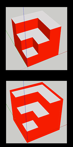
                                  Screen-Shot.gif
                                  Then I used photoshop to trace around the outside with a thick outline, and changed all red to the same hue...

                                  "Imagination is more important than knowledge..."
                                  - Albert Einstein

                                  1 Reply Last reply Reply Quote 0
                                  • genki.ttG Offline
                                    genki.tt
                                    last edited by

                                    How about this model ?-? 3 logo scene with same model, different style setting.


                                    SU_LOGO.png


                                    LO_LOGO.png


                                    SB_LOGO.png


                                    NewLogo.skp

                                    1 Reply Last reply Reply Quote 0
                                    • aarondietzenA Offline
                                      aarondietzen
                                      last edited by

                                      I think that is close, but based on mike breakdown, I don't think it can be models purely in 3d.

                                      "Imagination is more important than knowledge..."
                                      - Albert Einstein

                                      1 Reply Last reply Reply Quote 0
                                      • cheddaC Offline
                                        chedda
                                        last edited by

                                        I think the previous logo was a little toy like. A change of image is good i think.

                                        Kraken Wrangler https://www.flickr.com/photos/132441293@N03/

                                        1 Reply Last reply Reply Quote 0
                                        • thomthomT Offline
                                          thomthom
                                          last edited by

                                          @unknownuser said:

                                          I think that is close, but based on mike breakdown, I don't think it can be models purely in 3d.

                                          They did make tweaks in post. 😉

                                          Thomas Thomassen — SketchUp Monkey & Coding addict
                                          List of my plugins and link to the CookieWare fund

                                          1 Reply Last reply Reply Quote 0
                                          • sfto1S Offline
                                            sfto1
                                            last edited by

                                            When I use small icons in my explorer folders, it is hard to distinguish between SU and LO. It did inspire me to create an avatar though. 😄

                                            1 Reply Last reply Reply Quote 0
                                            • 1
                                            • 2
                                            • 1 / 2
                                            • First post
                                              Last post
                                            Buy SketchPlus
                                            Buy SUbD
                                            Buy WrapR
                                            Buy eBook
                                            Buy Modelur
                                            Buy Vertex Tools
                                            Buy SketchCuisine
                                            Buy FormFonts

                                            Advertisement