Trimble Version
-
Yes... same dross as before... everything deemed to be included is deemed to be excluded, and vice versa etc - just sign in blood...

Lawyers have a great time writing such stuff so that later on 'they' as a profession can make more money arguing about every misplaced comma and what was 'really' meant by the agreement...
The more words they add the more it can go wrong !
What ever happened to a simple contract ? -
I didn't read it... I just click and wait for something wonderful to happen. I'm often disappointed. as with this all I get is new Icons I won't recognized for a month or two.
-
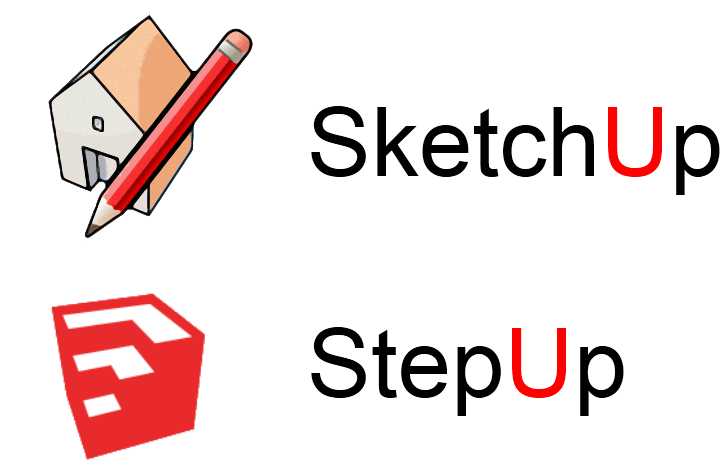
I miss the old logo.
-
@unknownuser said:
"By agreeing to these Terms and Conditions, you represent that you are 18 years old or older and capable of entering into a legally binding agreement."
I have to speak to my son - he is 9

-
Interesting. I just downloaded and installed the Trimble Branded version and while it sports the new logo, it still installs into a Google SketchUp 8 folder ....

-
As I understand it... Trimble decided that until at least v9 Trimble they would keep the original 'Google folder structure', to avoid any unneeded upset to users with custom plugins in these etc...
-
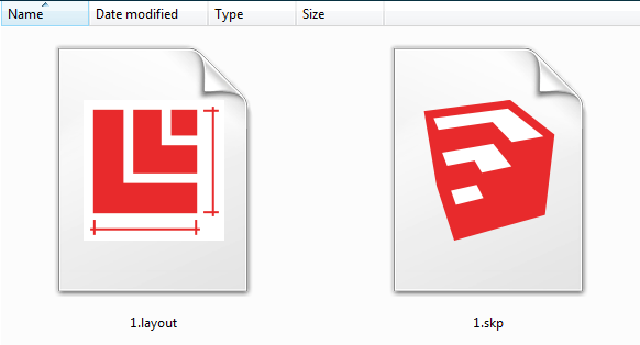
Folder with SKP files looks different too


-
Someone got paid good money to come up with a coherent "treble of related logos" - I for one think they are 'OK' - they ARE different... but then this is no longer @Last OR Google - so embrace Trimble - at least with a tiny hug ?

-
Will this site be Trimblucation now lol?
-
I'm not too fond of these new logos to be honest.

-
@unknownuser said:
Will this site be Trimblucation now lol?
No, as it wasn't @Lastucation or Googlecation before.

-
Does this version overwrites the old one or we are free to install it in another folder ?
-
@unknownuser said:
Does this version overwrites the old one or we are free to install it in another folder ?
It overwrites your previous version 8. (Your version 6 is safe
 )
) -
@marian said:
I'm not too fond of these new logos to be honest.
+1
the new logo is so crappy and anonymous..
if the icon is the one and only "improvement" i will stay with m3 for now.. -
@panixia said:
@marian said:
I'm not too fond of these new logos to be honest.
+1
the new logo is so crappy and anonymous..
if the icon is the one and only "improvement" i will stay with m3 for now..I posted two polls. Come and vote!
Add your thots in those threads, if you like.
Should be interesting topic(s).[Poll] What do you think of the new SketchUp logo designs ?
[Poll] What do you think of the new SketchUp logo color ?
~
-
@krisidious said:
I didn't read it... I just click and wait for something wonderful to happen. I'm often disappointed. as with this all I get is new Icons I won't recognized for a month or two.
You should read before agreeing, ever watched the south park episode "the human centipad"?
-
I'll keep an original Google SU 8 installer and a not updated version on one of my many computers just for the sake of old times.
-
I don't like this so called "professional" minimalist look that's popular today with companies... e.g. Microsoft's new logo is a joke...you mean to tell me that people really got paid for that?
The new SU logos are not as bad as that, but the old logo seemed more friendly and gave an idea of what the program does. The colours stood out but were not "screaming" at you.The new logo seems disconnected from the program it represents.
I think visually it looks ok, but it doesn't fit SU at all. First it lacks recognition, that can be fixed, second it doesn't show any clue as to what the program does if you aren't familiar with it, third the color just doesn't work.
They could have at least kept the lines on the edges or different shades on the faces.

-
What should have happened was an open competition for logos. Crowd source the logo and make it born from the community of avid users who understand the product.
-
Are there any changes other than to the logo? I don't see anything obvious.
I just downloaded and installed it and now I realize that was a bit of a mistake. I rarely ever read the disclaimers, I just Accept, but in this case I should have looked for any comments about our original license status and if it changes at all.
Hello! It looks like you're interested in this conversation, but you don't have an account yet.
Getting fed up of having to scroll through the same posts each visit? When you register for an account, you'll always come back to exactly where you were before, and choose to be notified of new replies (either via email, or push notification). You'll also be able to save bookmarks and upvote posts to show your appreciation to other community members.
With your input, this post could be even better 💗
Register LoginAdvertisement


