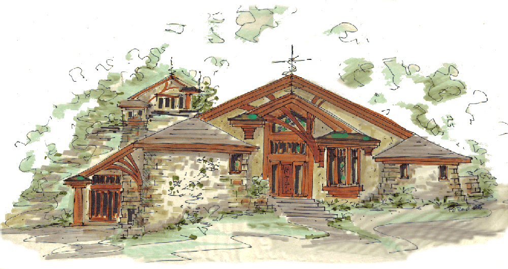
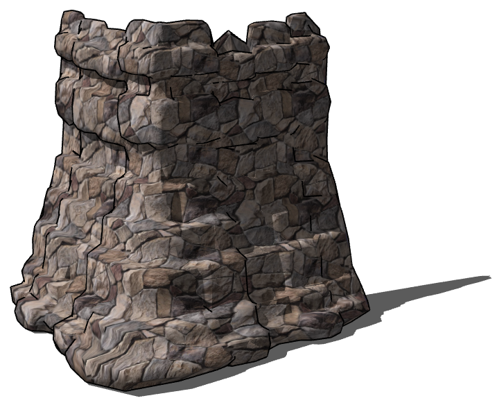
I need to build this.
-
To create less polys, use a smaller bitmap. Very small.
-
I like that mesh from the bitmap. But yes, too much detail. There are a couple of things that come to mind to make it more manageable... poly reduce and/or selectively make planar the tops in artisan?
But I think designing a specific bitmap,(as you say) would give the most natural result. Then you could isolate individual 'stones', de-poly them, (is that a word? it is now:) and component them.
In my attempt, most of the entities are copied, scaled and rotated from perhaps 3 or 4 base entities.The smaller stones are literally quick fill ins and need no detail.
Go for it Kristoff, model one good patch of stones and you are good to go for many projects.
(You will share, won't you?:)Baz.
PS: you can have my skp. for what it's worth if ya want. -
Here is my attempt at free hand. it turns out well and is fairly low poly. but not in the shape I need.
-
ShapeBender?
-
used that Rocksolver stones to build start a corner by hand. high poly and very time consuming.
next going to try shapebender on the triangular shape drawn in 2D and then bent afterwards...
-
architecturally, what would you call this feature?
-
Chris,
It's called random stacked stone. Looks like some kinda of false buttress.
I don't think you need to go through that much effort with 3d. I would model the basic shape and texture it as you desire. Anything like this can be handle with a good "character refence guide" indicating color,pattern, texture and dimension you require. I good mason should be able to build this with a little art direction in the field. ofcurse the traditional cross section showing construction elements is necessary. -
Lapx,
That's probably the closest thing I've heard to describe it. however what I'm looking for is more natural and random than ordered like buttresses. I know my shape shown in the screenies is rather perfect, but the randomness is what I'm after, I was using that buttress shape as a guide.
I call it a spilling stone corner or a spread stone corner. but searches give me no examples. this is one I happened across on the net and it's close to what I want except it's too narrow through it's length. I would like it to be wider and seem to come up from the ground instead of down into it.
here's one of our sketches.

imagine this wrapping a corner and coming up higher.
[xxl-img:23d2t063]http://1.bp.blogspot.com/-rZ--zwlBk3A/T72Zb1hwU8I/AAAAAAAAB-o/UnPpkFqbmsM/s1600/Retaining+wall+falling+WM.jpg[/xxl-img:23d2t063]
-
Here we call it a 'Dry stone wall'. Dry because no grout or cement is used.
Check this google images page for plenty of examples. Or Google 'dry stone wall'
https://www.google.com.au/search?q=dry+stone+wall&hl=en&client=firefox-a&hs=rHV&rls=org.mozilla:en-US:official&prmd=imvns&tbm=isch&tbo=u&source=univ&sa=X&ei=v1EbULm-HezxmAWL-YHYBA&ved=0CF8QsAQ&biw=1624&bih=845 -
Baz we're more speaking of the wall itself and how it flares out, instead of the form of pattern.
-
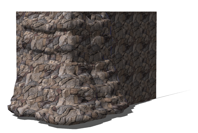
Here's a rather quick Artisan attempt.
-
results for use if anyone wants.
-
looking good

-
That works, that works very well

Sometimes its hard to accept that something is good enough when your trying to achieve a specific look/goal.Kris.....
That is good enoughunless that is .....

No, no no stop it, its good enough, on to the next thing...

In any case can always go back to later if it's truly bugging you..

-
Do you have the proxy Kris?
-
That looks well, I wouldn't of came up with that technic but I'll be using this technic for a future project on the cards

-
@rich o brien said:
Do you have the proxy Kris?
No Rich I don't I just went through and saved it, didn't save the original like I should have.
-
It's totally under my skin Paul... But yeah I think it's probably good enough. probably... I want 3D Hatching damnit!
-
-
That with a bump map would look quality!
Hello! It looks like you're interested in this conversation, but you don't have an account yet.
Getting fed up of having to scroll through the same posts each visit? When you register for an account, you'll always come back to exactly where you were before, and choose to be notified of new replies (either via email, or push notification). You'll also be able to save bookmarks and upvote posts to show your appreciation to other community members.
With your input, this post could be even better 💗
Register LoginAdvertisement


