Render Question
-
Thanks irwanwr and Barry.
Barry, you make a good point. I do have several copies of this one already because I've been using it as a training tool for some instruction I'm doing. I can draw this box now in about 6 minutes including the dovetails all around. Usually I don't care about the bevels and I don't expect to be doing a lot of this rendering business.

-
btw, what rendering method did you use there, Dave?
i like the soft shadow. -
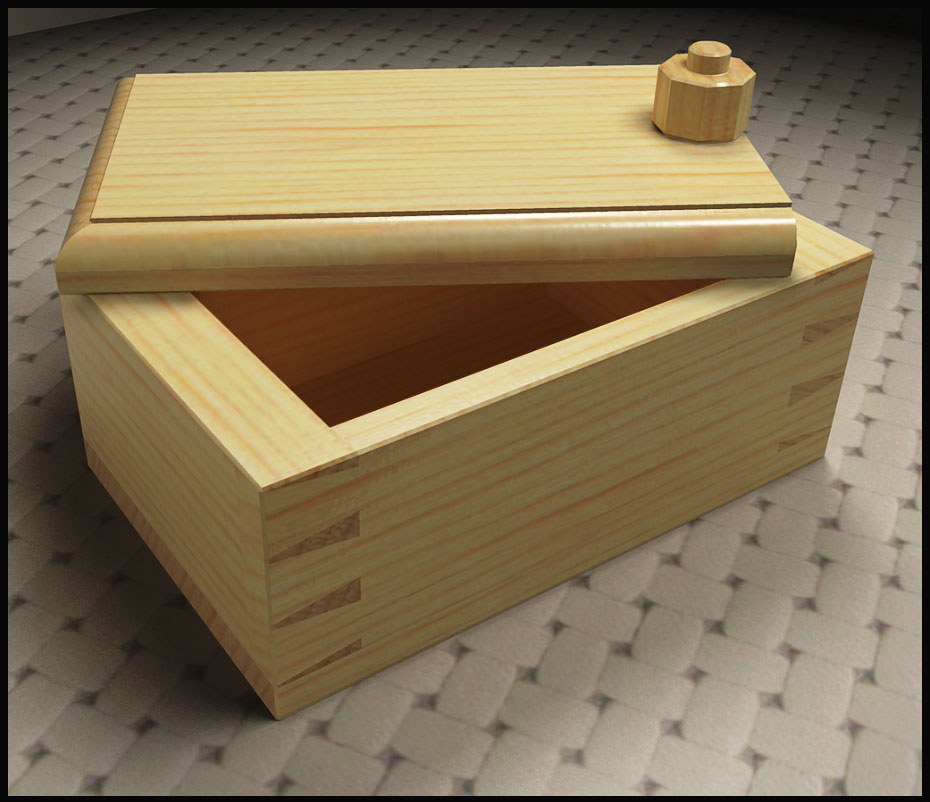
This last one was done in KT using preset #8. there are two spotlights both set to cast soft shadows. The radius of the light more to the front is set at 0.15 and the other light is set to 0.10.

-

Thank you, Dave. I've never thought of using either soft shadows or lights.
Mostly using the preliminary custom preset for quick setting and rendering. -
Having been a professional photographer in a former life, I tend to think in terms of studio lighting for renders so Massimo's suggestions make a lot of sense to me. Still, I much prefer the sketchy stuff I normally do.
-
Model the tabletop surface instead of using a bump map. Also light from the top left rear (shadow cast forward) and set up a reflector off camera to bounce light back into the resulting dark front of the box.
Trust me.

-
Here is a quick go with Photoshop and Dave's rendering. Posted with his permission of course.

-
@unknownuser said:
Here is a quick go with Photoshop and Dave's rendering. Posted with his permission of course.
That is pretty close to what I had in mind. Nice word to the Dave/Eric team.
-
-
So that means I've taken a step or two back?
-
That would depend on which way you were facing in the first place.
-
Totally unconvincing render Dave. And where did you get that woodgrain material, awful!
Baz -

-
-
Sublime

Hello! It looks like you're interested in this conversation, but you don't have an account yet.
Getting fed up of having to scroll through the same posts each visit? When you register for an account, you'll always come back to exactly where you were before, and choose to be notified of new replies (either via email, or push notification). You'll also be able to save bookmarks and upvote posts to show your appreciation to other community members.
With your input, this post could be even better 💗
Register LoginAdvertisement


