Render Question
-
If you had displacement then you could raise the carpet pile. The bump won't do much for the grounding element. Is your bump grayscale or normal?
-
I'd bevel all those sharp edges. That can make a huge difference. Naturally bump and specular maps for materials would help also. Take a look on this basic diffuse specular material http://www.kerkythea.net/phpBB2/viewtopic.php?t=9768
-
Thanks guys. when I get back to it, I'll see if I can incorporate that info.
-
I think the edges PP'd there do not help on the "realism" front either. (Although I like these mixed styles myself). Look at the bottom left corner where the edge extension adds a visual extra to the box while the shadow is still cast from the "real" corner. That's why it looks floating. Also, what will you do to it when bevelled? doubling those edge lines (or simply using the profile lines only)?
-
It looks like it is floating without the lines, too.
Csaba, you know me well enough by now to know that I have no interested in extreme realism in my drawings. If I wanted it to really look like a photograph, I'd be building the real thing and taking a picture of it.

-
No, I did not mean that but I suspected that the small edge extension also has a role in it.
-
Well Massimo is lurking so except another viewpoint soon

I'd like to see it in a nice studio with a HDR lighting and clay output with opacity to 35% and blend to overlay on SU output. I like your Line Styles overlays alot.
Anyway, me and Csaba are far from Pro's we just regurgitate very eloquently
-
@unknownuser said:
Well Massimo is lurking so except another viewpoint soon

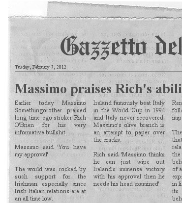
You're doing well Rich. You have my absolute approval.

-


-

-
Put it on the calendar.
-
-
MArk down the date that Massimo praised your abilities.

-
Well it is 2012 and the world is about to end so anything is possible.
Dave I look forward to seeing your rendering progress.
-
Thanks Eric,
I've got one cooking now after adding some tiny bevels to the edges and modifying the materials a bit. We'll see what it looks like. My sketchy looking drawings don't take anywhere near this much time to create even including making the line style form scratch.
-
-
That's massively better. Especially the shadows.
I think sitting on a plain diffuse 75% grey would make you look at the box more.
What did you change?
-
Thanks Rich.
I put a very tiny bevel on all the edges that would get eased if it was real. The bevel is 1/64" but then the box is only 4" long. I edited the face grain material to give it a slightly golden cast as if it had been varnished. I also made a separate end grain material that I darkened a bit more than the face grain since the end grain would absorb more of the finish.
The box was moved up very slightly so it is actually floating off the ground plane. I exchanged the sun for two spot lights, gave the face grain material a bit of shininess and did the same for the woven background.
You may be right about the flat gray background instead. There's another version cooking. That one only had the lights moved a little bit.
-
-
The box looks better.
 However you almost completely lost the shadows. In the very first image you posted they were too strong. Maybe you could try as a start with this studio setup. You can choose from two setups: with direct mesh emitters (you can apply for example ies lights to them) or with pointlights+umbrellas.
Or also put the box in a very simple studio screen and use one of these HDRi as lighting.
Hello! It looks like you're interested in this conversation, but you don't have an account yet.
Getting fed up of having to scroll through the same posts each visit? When you register for an account, you'll always come back to exactly where you were before, and choose to be notified of new replies (either via email, or push notification). You'll also be able to save bookmarks and upvote posts to show your appreciation to other community members.
With your input, this post could be even better 💗
Register LoginAdvertisement


