Plugin Request: Hide Bounding Box
-
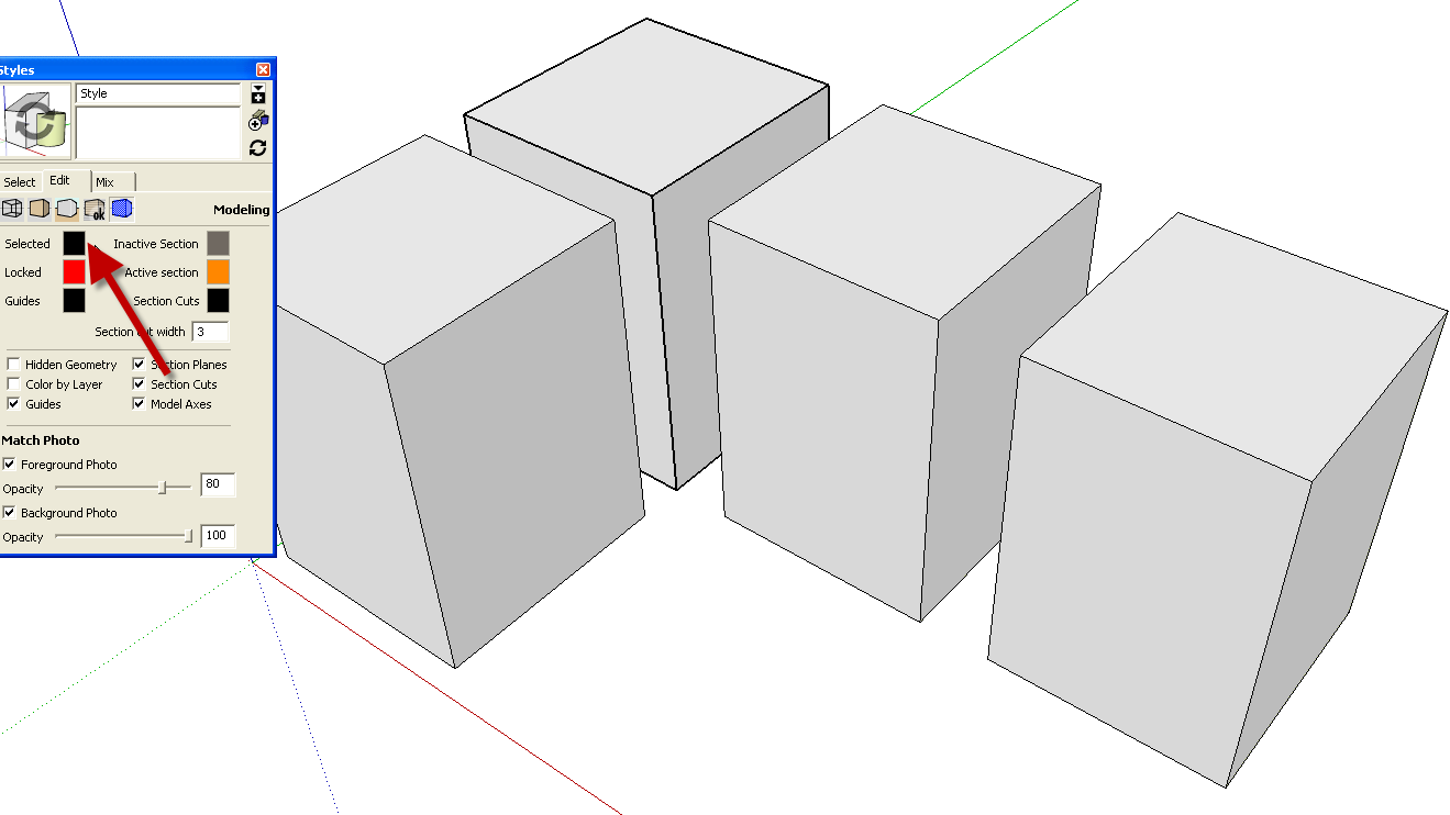
The only feature SU has in that area is being able to display only Boundingbox - and not highlight the selected entities.
-
What is the exact reason you want to do this? The bounding box is generally only interesting when modelling so I cannot imagine anything particular it could be hindering you in.
-
it can be visually impeding when making minute adjustments - especially when adjusting negative space, - details at edges become much more apparent - I'm not sure how else to illustrate it, but I use it all the time in other design apps

-
I would also be interested to know this. It woulda be easier to see things, especially when arranging/moving symmetrical components [how they "touch together"]...
-

-
Yeah but try it with any shape that is not a perfect box and the bounding box is much more visible.
I admit it has never bothered me, but I can see how it could bother others.
-
It doesn't bother me, either.
-
It has always bothered me.
The bounding box is always like this blur of extra lines that are not exactly but very close to the selected edges. And yes it makes working fast and with precision a chore.
How many times have I worked with Models where team members had just missed the precise position and how many hours of unnecessary work have I spent finding and fixing errors due to this display obscurance?
I can't see any reason at all why there wouldn't be a function to turn them off.
To those of you who are not bothered by the bounding box, why would it bother you if anyone else could just turn it off and be happy?
And how much effort would it take to add the function?
Edit: How about replacing the bounding box with a feature that just highlights the faces of the selected object, and maybe the actual edges, with the color chosen in the styles?
-
Another vote for being able to turn it on and off with a hot key.
I find the bounding box distracting and mostly unnecessary; especially when editing groups/components.
just my $0.02
-
Adding my kind upvote for this!!!
Hello! It looks like you're interested in this conversation, but you don't have an account yet.
Getting fed up of having to scroll through the same posts each visit? When you register for an account, you'll always come back to exactly where you were before, and choose to be notified of new replies (either via email, or push notification). You'll also be able to save bookmarks and upvote posts to show your appreciation to other community members.
With your input, this post could be even better 💗
Register LoginAdvertisement


