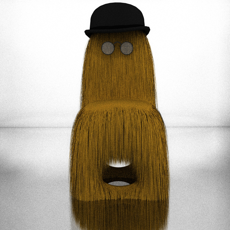
Challenge Chair
-
jsteacy I think those are fantastic.
A great advert for Twilight in my opinion.
Did you use the studio setup or create your own? -
yeah they are cool! but have you unsoftened the edges of the studio backdrop? should be a smooth surface.
-
jsteacy: here are some nice models for testing materials.
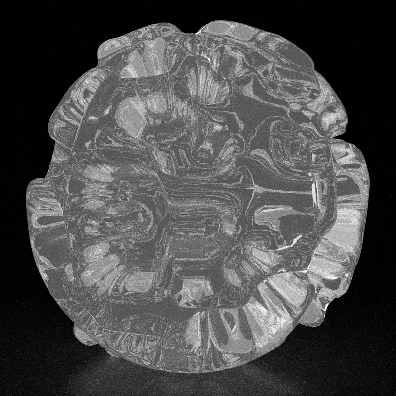
deformed sphere model "pollen".
[images of the model] ----> http://twilightrender.com/phpBB3/viewtopic.php?f=16&t=1231download link:
http://www.box.net/shared/pidnhj8h30ant chair composition.
download link:
http://www.box.net/shared/yvi1x9174a -
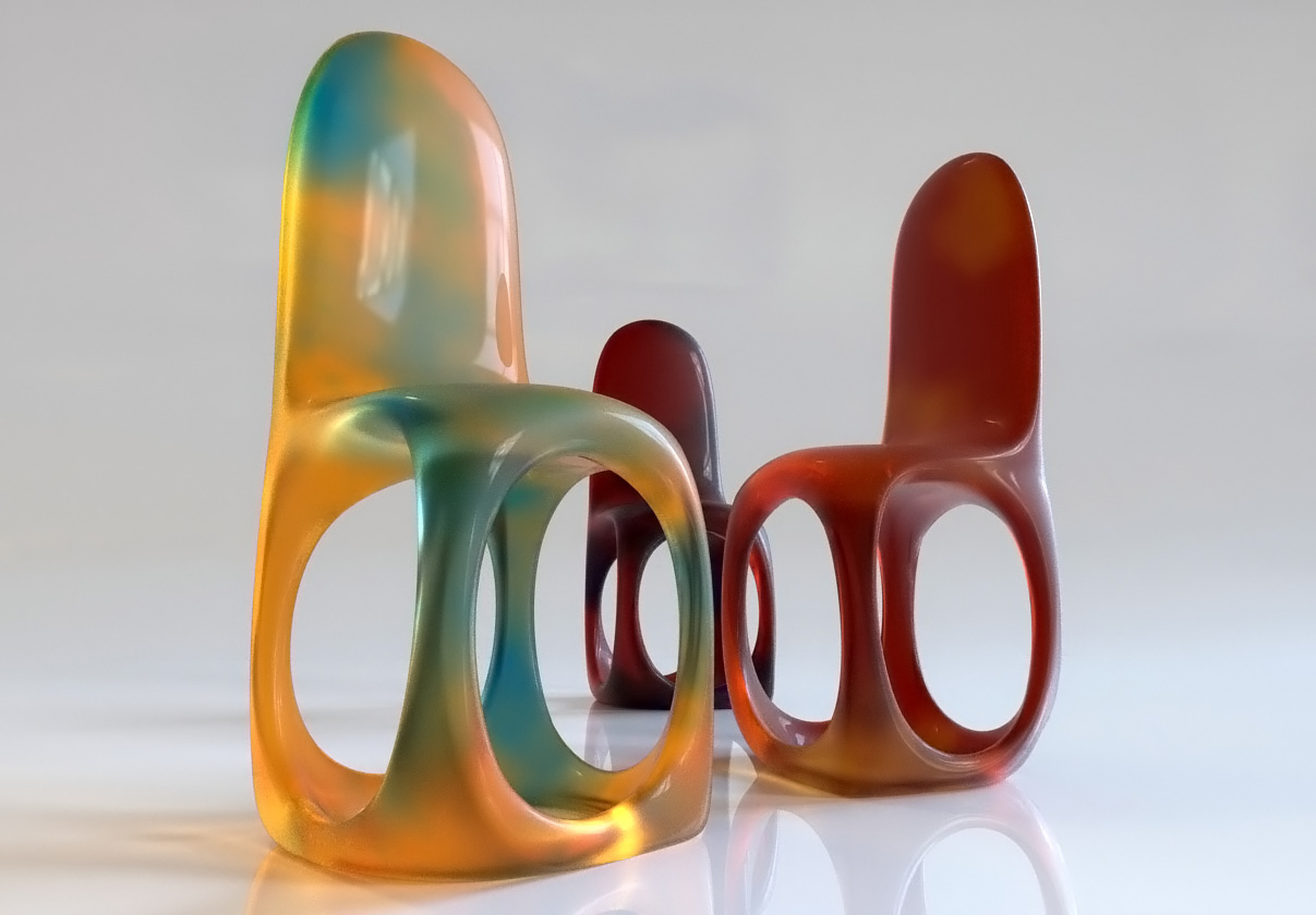
A funny plastic material...

-
And a beautiful one massimo!
-
Thanks Michalis.

-
whats the density of it? dont send me the material file, i wanna learn how to achieve the effect!
most SSS i see are very dense, dont even look translucent, yours is perfect

-
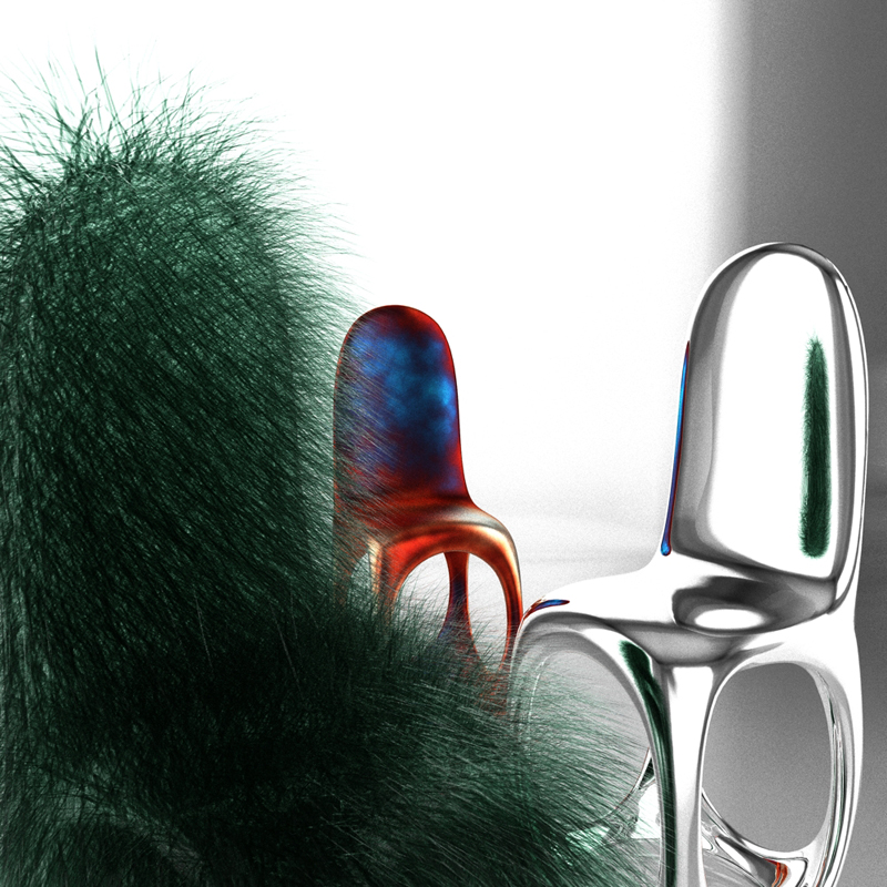
Okay - had to play a little more. I think the top of the chair is looking more and more like Cousin Itt.
-
-
-
Ok no material file then Oli...But it's quite hard to explain

The "basic" material is a layered material made as a mix between a dielectric glass and a layered material made with transmitted colour and specular. By changing the percentage of the weights between the two layers as well as by changing the transmitted & specular shininess you can control the "density" of the material. The balance of that one was: dielectric glass--> 0.2 and transmitted + specular--> 0.8. The IOR used is 1.345.
-
Glad you like it jsteacy
 .
.
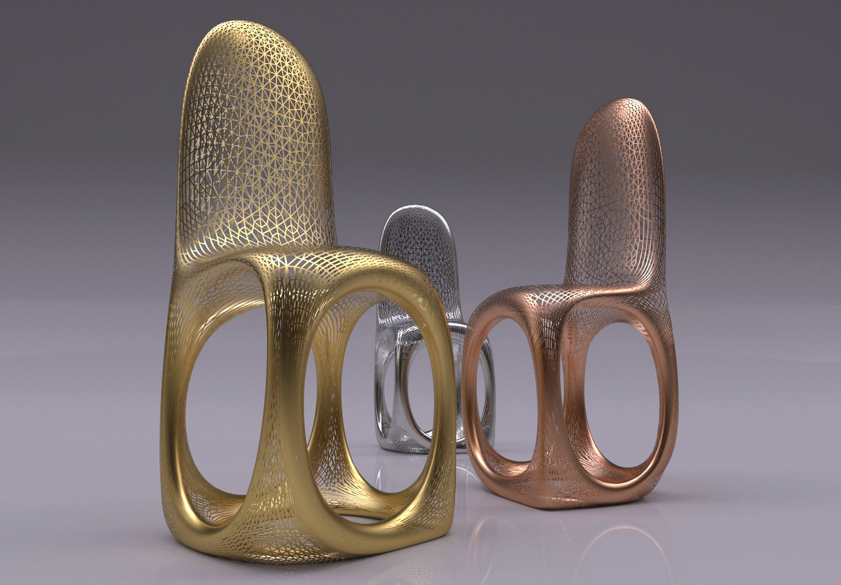
This model is really funny... So here you have a "sculpture chair" . An experiment with a material made with a wireframe procedural used as a clipmap.
-
bloody hell!
these are getting out of control, thats seriously impressive. thanks for material help by the way, Im trying to learn KT material editor.
 how have you mapped that mesh texture so well?! im proper baffled...or does it "add" material to the lines of the geometry?


"wirefame procedural"? not seen these before
 i guess the clue is in the name!!
cousin itt is so funny!!
-
No maps at all.

It's just the mesh of the model... With that procedural you have only to choose on what edges you want to apply it and set the tickness, fadeout etc..
-
Hey Oli why don't you try and sell your chair design to Ikea? Fastest money you've ever made

-
@Olishea - Thanks for the model links, they are great. I attached a quick render of the pollen model. I didn't have the time to let in run for a while but hopefully I will soon. I only got 10 passes on it.
@Massimo - cool wireframe material, I'm curious since twilight can use kerkythea materials if you can use the wireframe material in twilight. That would be really cool.

jsteacy
-
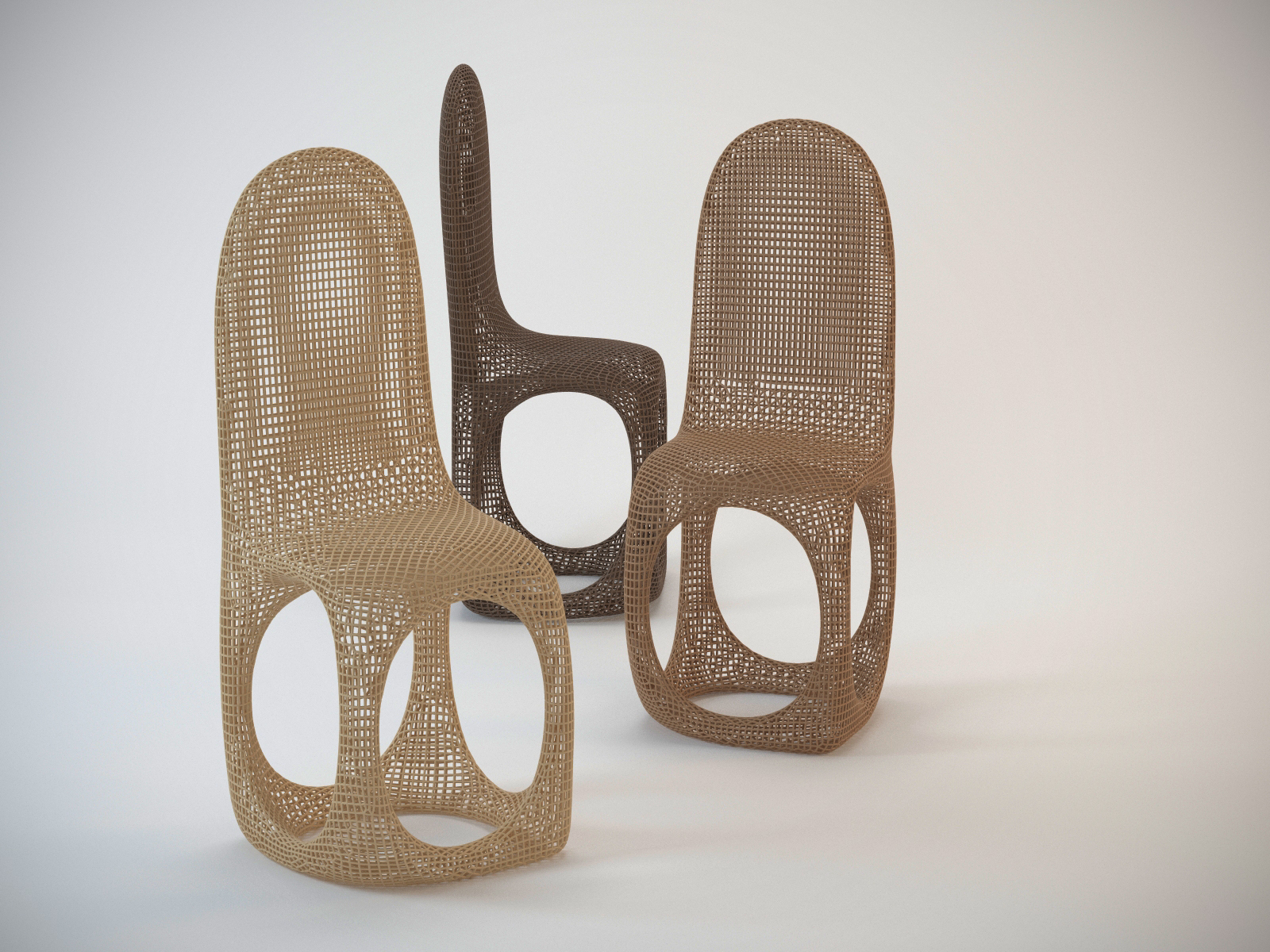
I thought this would make a cool Wicker chair. Done in Max/Vray. Quadrified the SU mesh with a plugin called Wrapit for Max and then converted the quad edges to a renderable shape (spline). Quick three light studio setup.
Hello! It looks like you're interested in this conversation, but you don't have an account yet.
Getting fed up of having to scroll through the same posts each visit? When you register for an account, you'll always come back to exactly where you were before, and choose to be notified of new replies (either via email, or push notification). You'll also be able to save bookmarks and upvote posts to show your appreciation to other community members.
With your input, this post could be even better 💗
Register LoginAdvertisement
