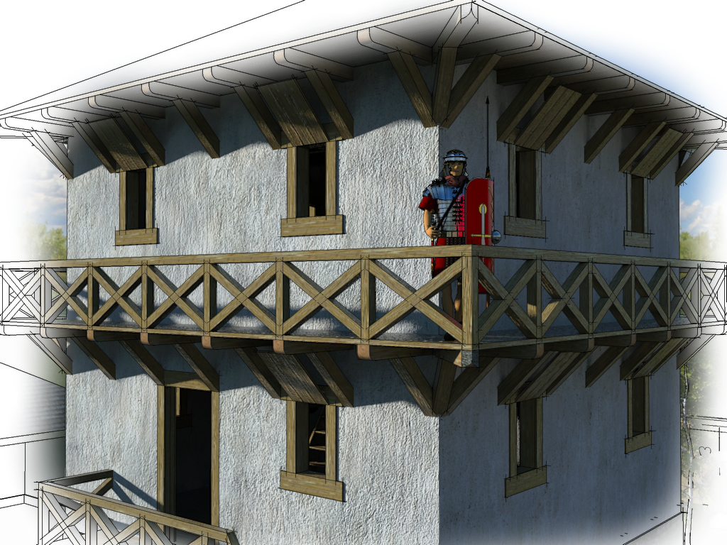
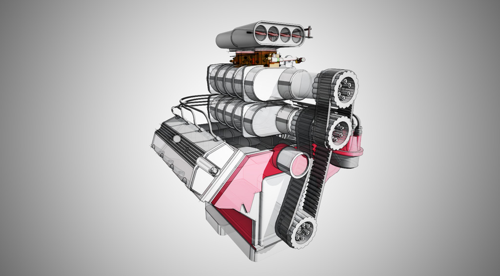
Quick & Easy "Dennis Method" renderings [TUTORIAL]
-
Hi Crankston,
With Gimp, you basically do the exact same steps as with PS (I do not have PS either). One thing maybe; you need to add a transparency channel to your top (B&W) layer as Gimp does not seem to add it automatically.
I made this one - a pdf for a presentation I made the other day - with Gimp (although obviously not as artistically as Dennis and used a rendered image instead of a raw SU export and also I did it somewhat differently)
https://docs.google.com/viewer?a=v&pid=explorer&chrome=true&srcid=0ByaU4EfzYOTSOWI2NjhlYTEtMTYyMS00NjQwLTlmMjQtNDZlM2Q2ZmQ3NmZm&hl=en
and also this one - where I kept the linework on the rendered image as well

-
Thanks!! I am somewhat new to Gimp, but I will give it a whirl later and see how it works.
-
Great post. Had always wanted to know how these renderings from sketchup were done!
-
Dennis,
The one thing I'd like to add that is a game changer is using layer mask in Photoshop. There is no need to ERASE anything and lose it forever. By using the mask you can reveal what is below and if you don't like what you revealed you just switch the color of your brush to white instead of black and paint on the layer mask and you reverse the technique. You can change the opacity and flow of the brush to give all sorts of effects.
Hal
-
An elegant simplicity to your technique, Dennis, with a great effect. All too often, at the exploraty stage, clients get stuck on the hard edges or overly 'realistic' aspects of a model, which stops them entering into the spirit of the proposal. Your technique, without being overly labour intensive, gives them a way in. Thank you for sharing your creative thinking

-
I have tried this and it is great way to generate a presentation from the 3d drawings!
-
A simple but expresive enough technique. That was the first technique I learnt. Thanks, Dennis.
-
Thanks, it is helpful.
-
@dennis_n said:
So, here are the step by step instructions for what became known as the “Dennis Method”
- We start by switching to the Hidden line mode and turning off your shadows. Make sure that your background is white.
- Line up a view that looks the best with these particular settings.
- Save the scene.
- Export the scene as .PNG file 4000 pixels wide. (.PNG files compress the SU graphics without loses).
Thankyou so much for sharing
-
It seems that links to the tutorial is lost or inaccessible to me.
-
With the advances in rendering and compositing DennisN's wonderful output can be produced in an image editor or in some cases even extensions
FluidRay's SketchFX is a good example...

SketchFX - SketchUp Artistic Rendering in 1-Click
SketchFX extends SketchUp capabilities with a complete set of compelling visual effects. No learning required.

Fluid Interactive (www.fluidinteractive.com)
It overlays your viewport in SketchUp with layer effects and the results are very impressive. Creating painterly type images is quite quick. Nothing can replace human handskill but this is a good alternative.
-
@rich o brien said:
.. Nothing can replace human handskill but this is a good alternative...
Rich, I use hand sketching neck by neck during the design process. By the way it seems that it is an obsolete skill in nowadays architectural universities...
-
@dennis_n said:
Thank you everyone for stopping here to read about my little graphic trick.
My name is Dennis Nikolaev, I am a licensed architect, AIA member and a big fan of SketchUP.
Here is a quick and effective method of creating an artistic image from your SketchUP model. It was posted way back in 2005 on the original SU forum. The thread became so popular, it was active for over a year and a half and still could be found here
http://groups.google.com/group/pro-gallery/browse_frm/thread/ac10461fa662ede0/2181e36017e1604fq=dennis+method+review&lnk=ol& .
Here are a few examples:Thank's for this share
Hello! It looks like you're interested in this conversation, but you don't have an account yet.
Getting fed up of having to scroll through the same posts each visit? When you register for an account, you'll always come back to exactly where you were before, and choose to be notified of new replies (either via email, or push notification). You'll also be able to save bookmarks and upvote posts to show your appreciation to other community members.
With your input, this post could be even better 💗
Register LoginAdvertisement


