Tomsdesk website...
-
...finally lauching my new/first: whadaya'll think?
-
I like it, very warm and easy to navigate. Good luck with your business!!!
-
tom
the new site looks great -
Nice layout and very colorful
I've used moonfruit for awhile but have left it untouched in months

How did you find the UI etc?
-
Thanks, Guys...Rich, I found the UI extremely easy to learn and manipulate to my needs (once I found all the limits of "free"...of course :`)
-
Impressive. Obi Wan has taught you well.

-
Tom, as the others have said, you have made a very nice website. I like the look of it.
Not to be critical but on the Gallery 2 page, your name, location and phone number get lost in the background. Otherwise, everything is nice.
-
your site looks good, tom. it shows very clearly what you do. i hope you get new clients with it.
regards,
-
Every time I enter a "moonfruit" website I think about Noni.
Tom, what does this emoticon mean? :`) Seems to be a mix of happy and sad.
-
Nice work Tom. I like the way you have made my eye 'bounce' around the screen, enjoyably
 The only comment I would make is that you might have a look at the area around the Menus. I would like to see the site name 'lined up' with the menus and possibly have the menus in Red as the gray tends to fade into the background. On the other hand, you could also consider removing the images from behind the menus as they would then contrast better!
As Jean (Johnny) would say, 'just ideas'

Mike
-
Very nice Tom.
-
"...very warm and easy to navigate..."
"...shows very clearly what you do..."
"...made my eye 'bounce' around the screen, enjoyably ;) ..." (nice save, Mike :`)Just what I was going for, thanks: relieved to know!
Miguel, "tongue-in-cheek" I think is the general meaning...I use it as "there's a hint of knowing smart-ass in this sincere and friendly comment".
-
Hi Tom,
I dont know about others but in my laptop with Opera i can only see a half page and a bit. have to scroll down to cath it all.
Obviously the one complete is lacking.
is it on purpose ?
if so it gets me difficult to navigate it,
-
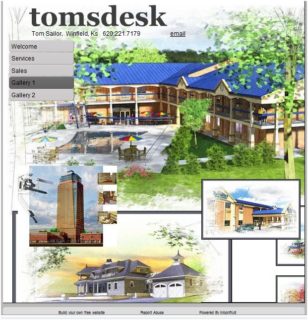
Juan, the site was left at the default (and maybe the max free, I didn't check) 800x800 pixels hoping no one would have your problem...can't imagine what's going on? Anybody else having to scroll to see it all? Here's a full screen capture (reduced here to 600 wide) from my machine:

-
Attractive, refreshing pictures lead you to discover this website.
Congratulations, good wind end good sea.
MALAISE
Hello! It looks like you're interested in this conversation, but you don't have an account yet.
Getting fed up of having to scroll through the same posts each visit? When you register for an account, you'll always come back to exactly where you were before, and choose to be notified of new replies (either via email, or push notification). You'll also be able to save bookmarks and upvote posts to show your appreciation to other community members.
With your input, this post could be even better 💗
Register Login


Advertisement